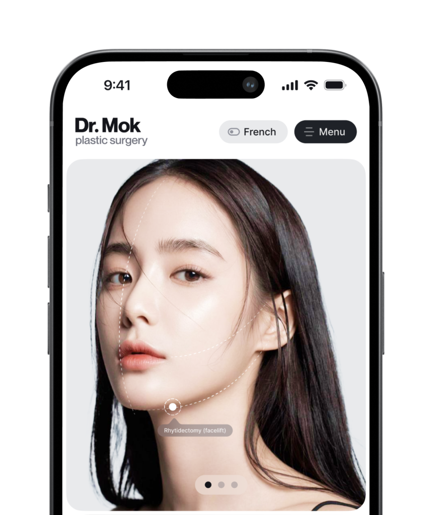
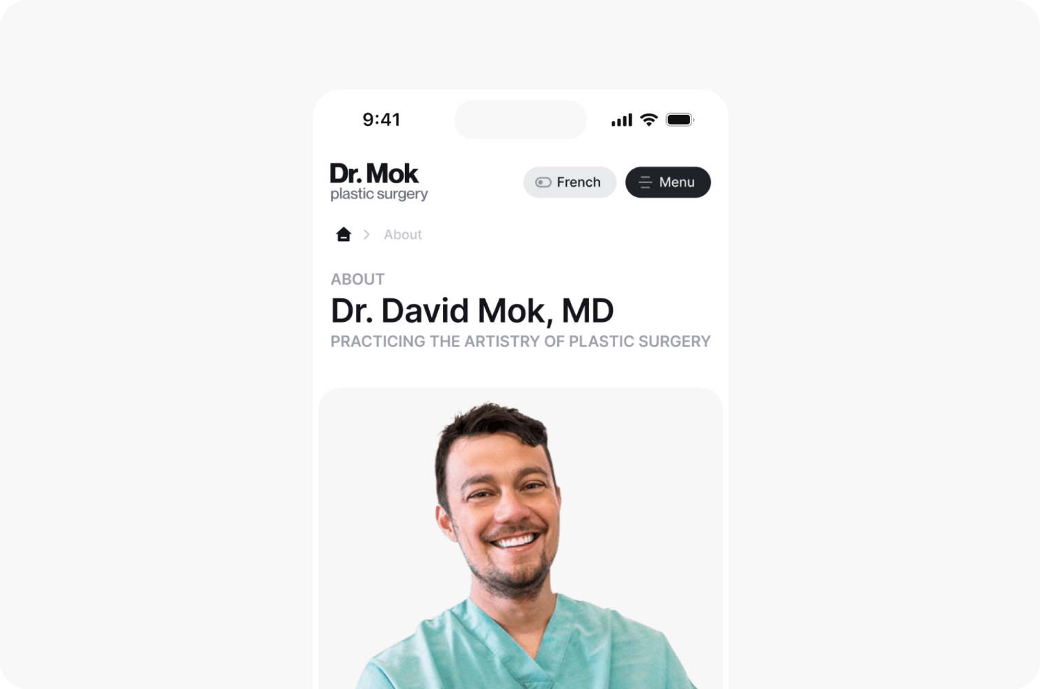
Dr. David Mok’s plastic surgery clinic performs a variety of surgical procedures, including signature breast surgeries, face and neck lifts, abdominoplasty, liposuction, lipoplasty, and much more.
Colors & typography
We chose a color palette that reflects reliability and expertise, combined with sleek, minimalist typography to ensure a clean visual presentation.
Logo construction
The logotype was created using modified typography with sharp, straight lines and balanced proportions, ensuring clarity and a modern, professional look.

Monochrome logo variations
We designed the logo in multiple variations, including both monochrome and color versions.


Developed a visual identity and website for a plastic surgery clinic, highlighting its expertise in aesthetic procedures
Assessing & improving usability
Following a UX audit, we developed a new design strategy. We detailed the surgical procedures, created a clear structural framework, and identified critical areas for improvement.
Sitemap
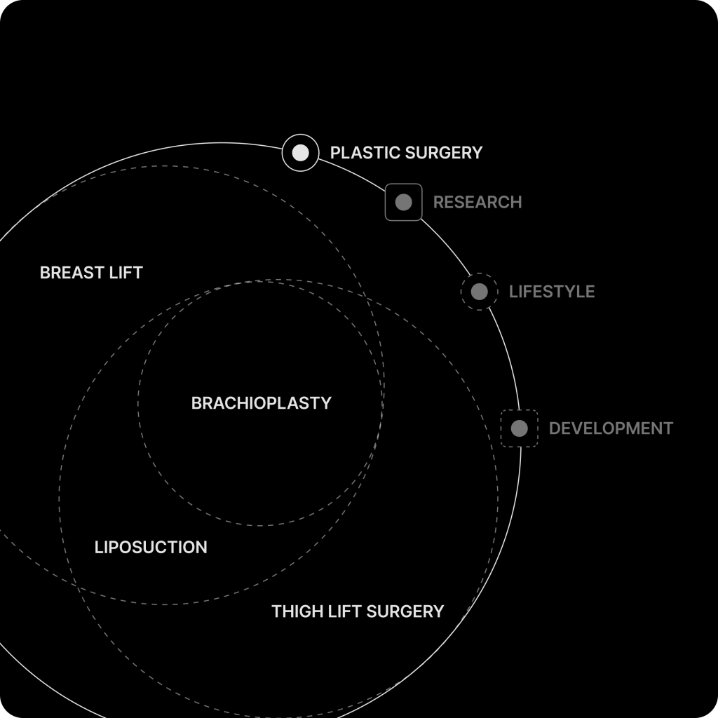
We outlined the current site structure, gathered hypotheses for improving the new site’s functionality, and defined a vision for the new structure.
Page structure
We structured the pages to present information in a clear hierarchy, ensuring relevant details about each procedure are delivered effectively.
Brand discovery & deliverables
During the brand discovery stage, we defined the brand’s character and visual style. Based on this vision, we developed key visual identity elements and implemented the new style across all materials.
Custom icons
A set of custom icons was designed to introduce consistency, improve user experience and navigation across the clinic’s website.
Branded materials
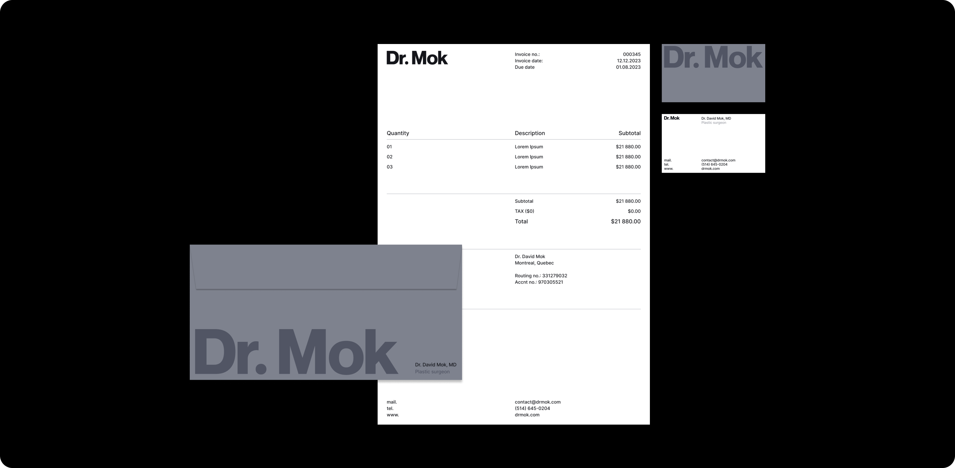
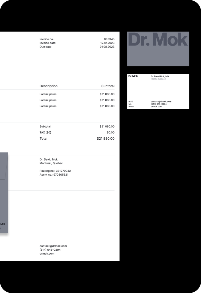
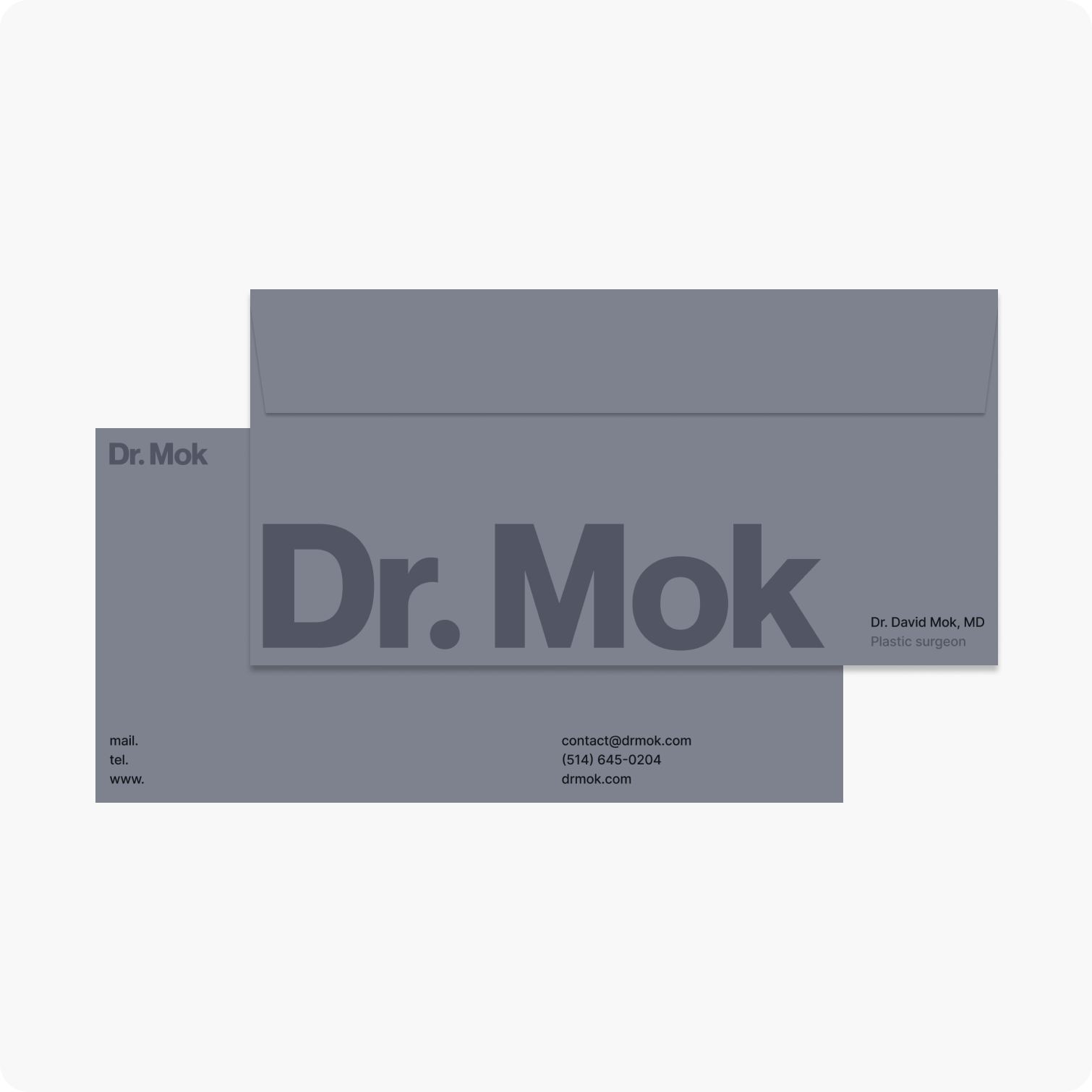
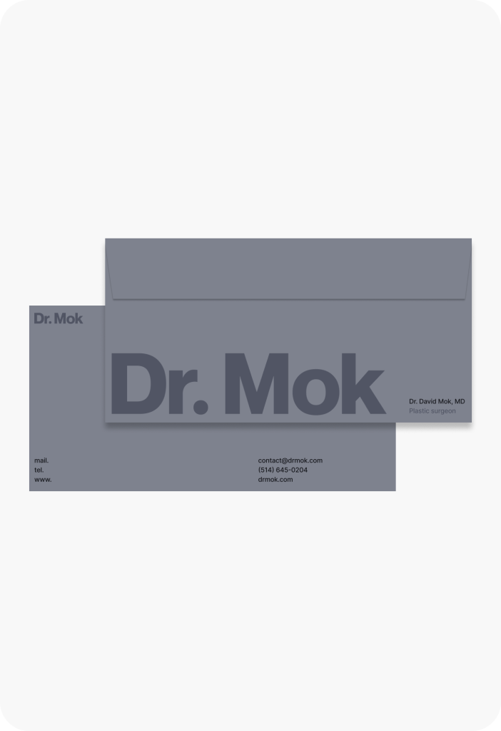
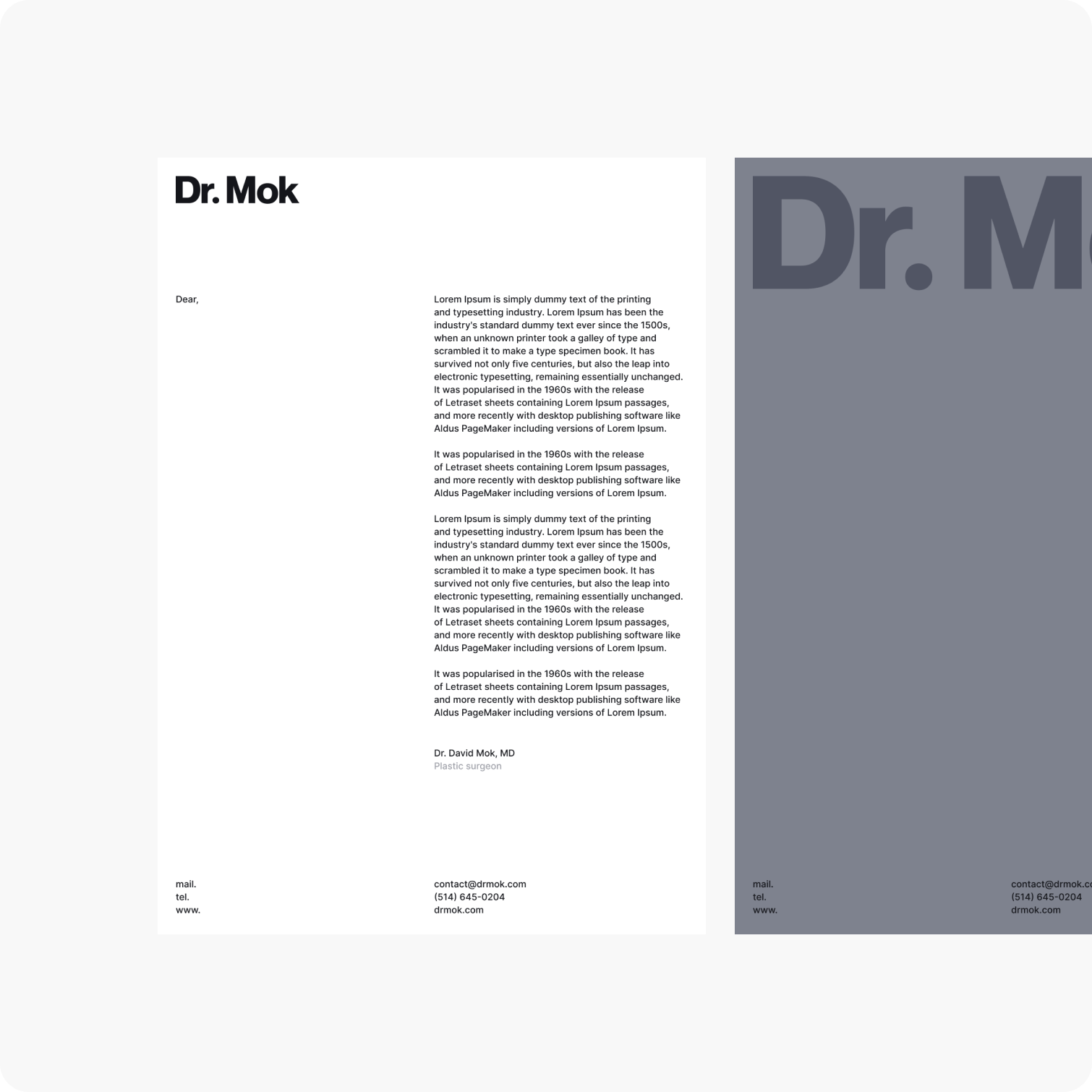
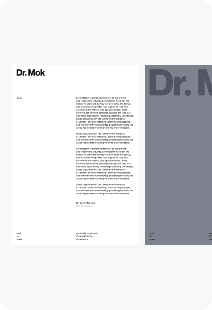
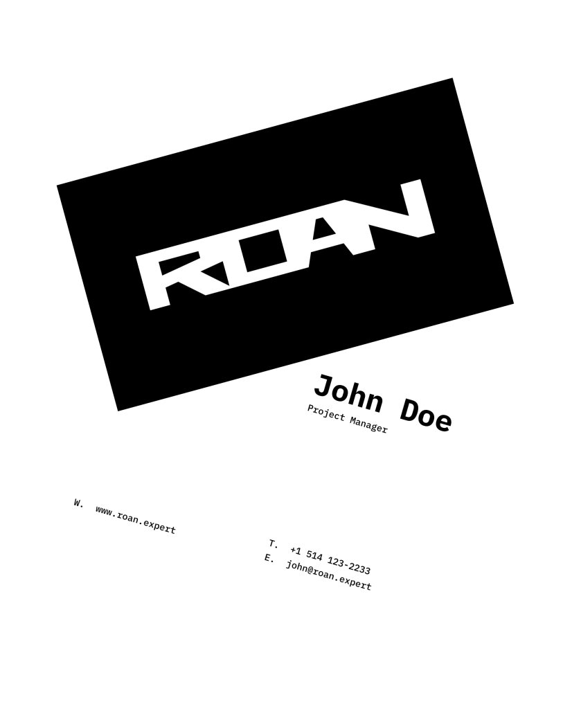
Applied the new brand logo to physical materials, showcasing its integration with the refreshed visual style.
Concept designs
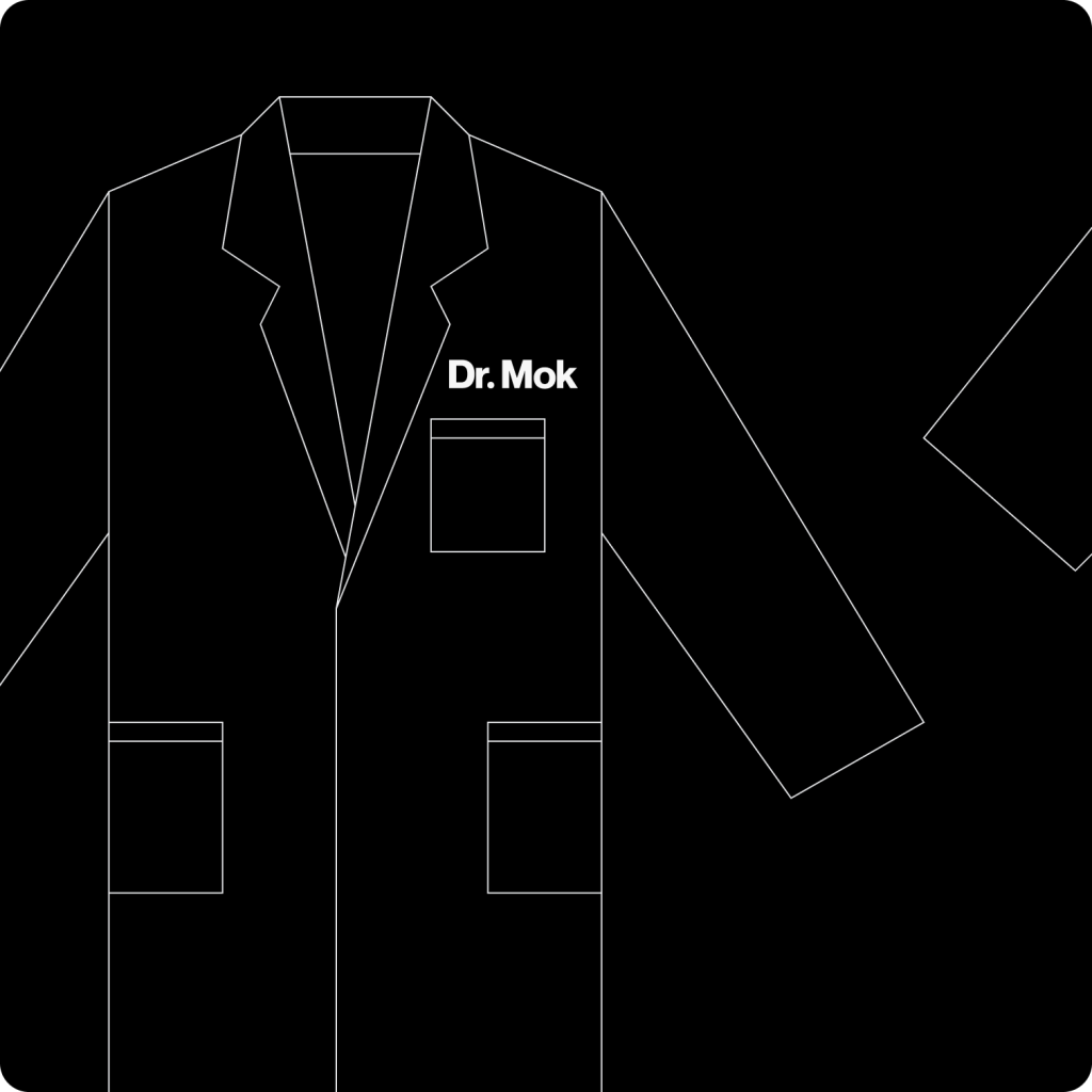
Created staff uniform designs and select interior elements to elevate the overall brand experience.
Interface design & enhanced user experience
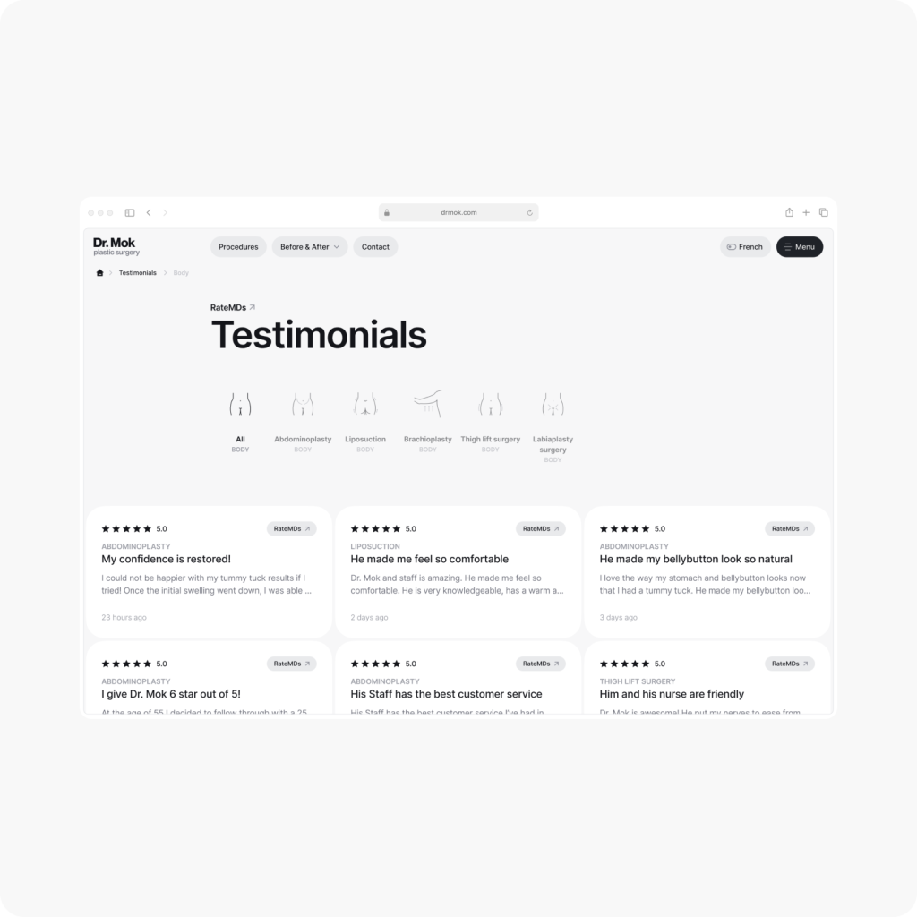
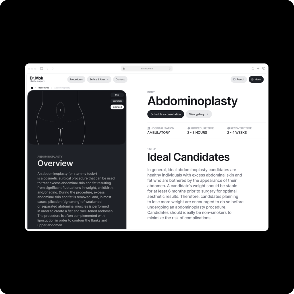
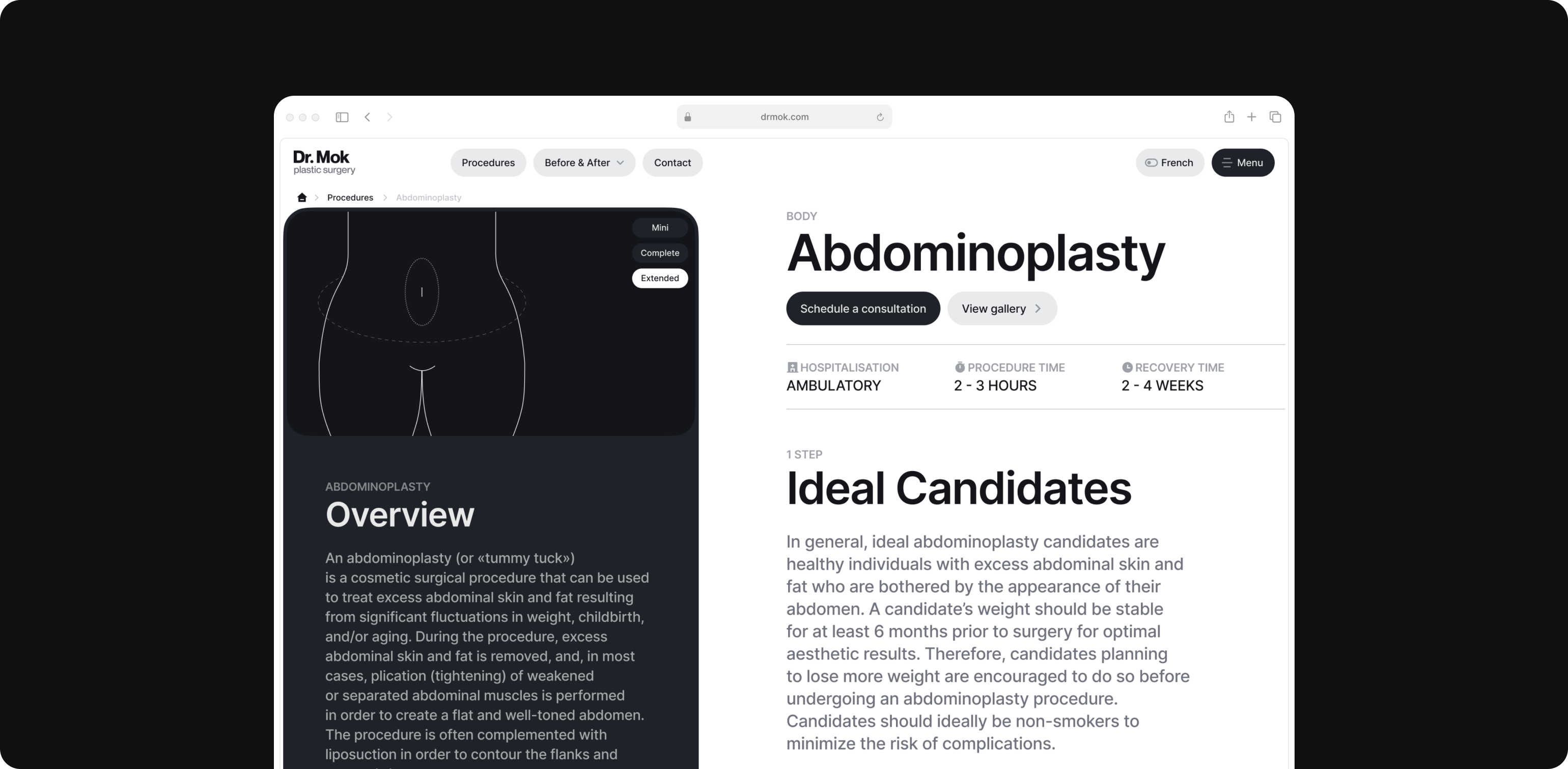
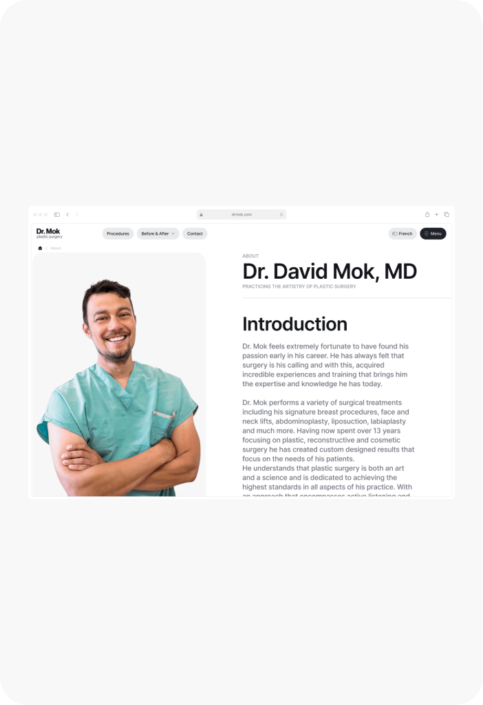
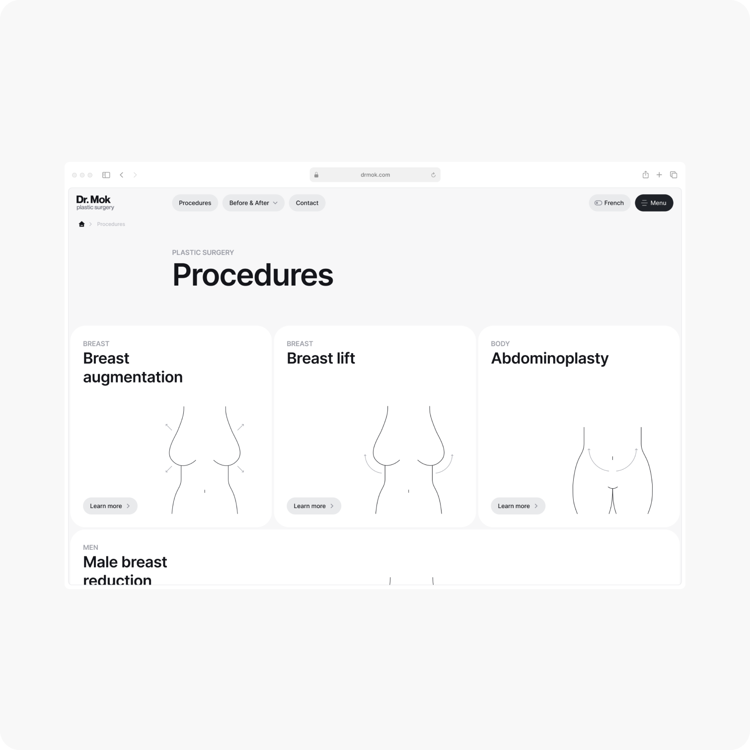
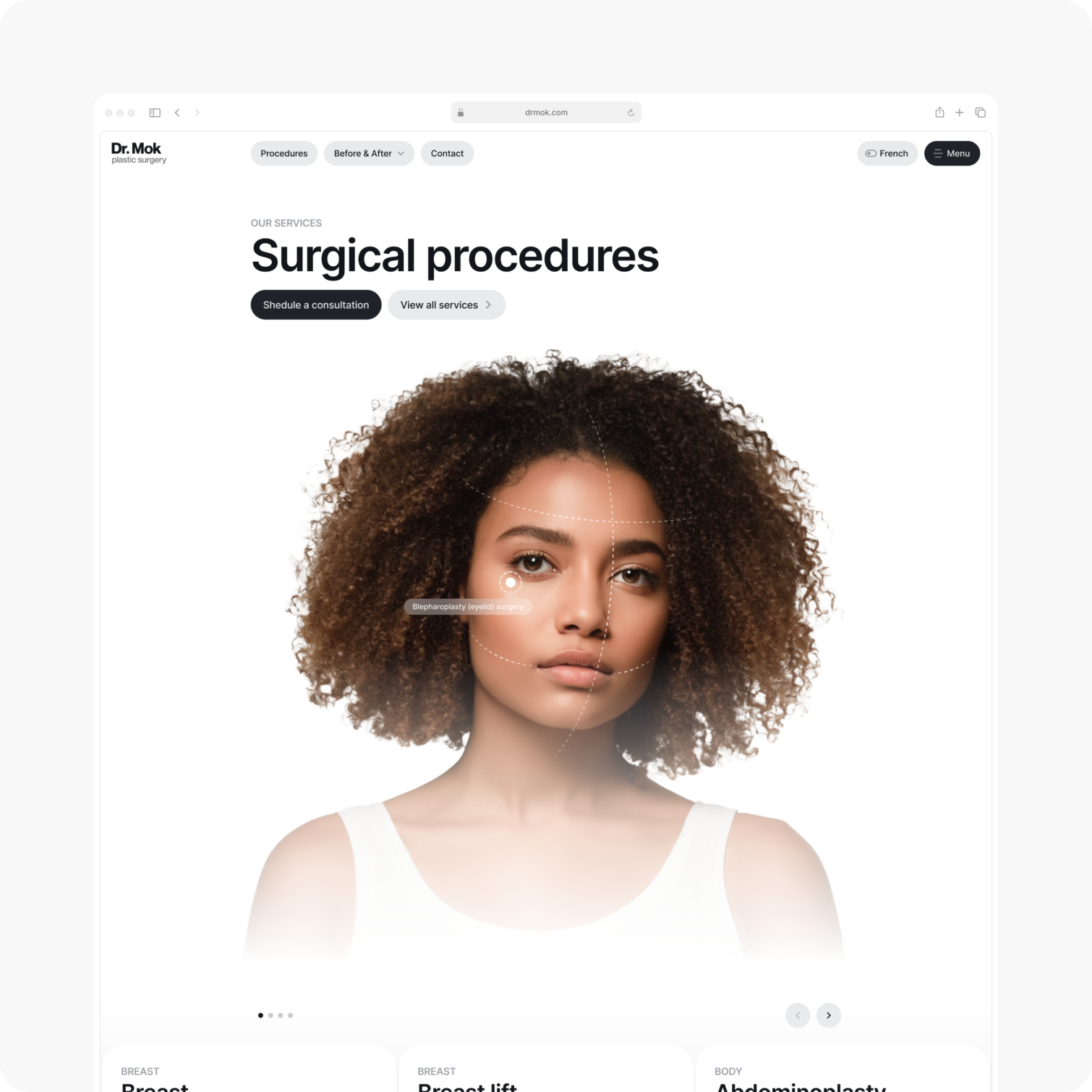
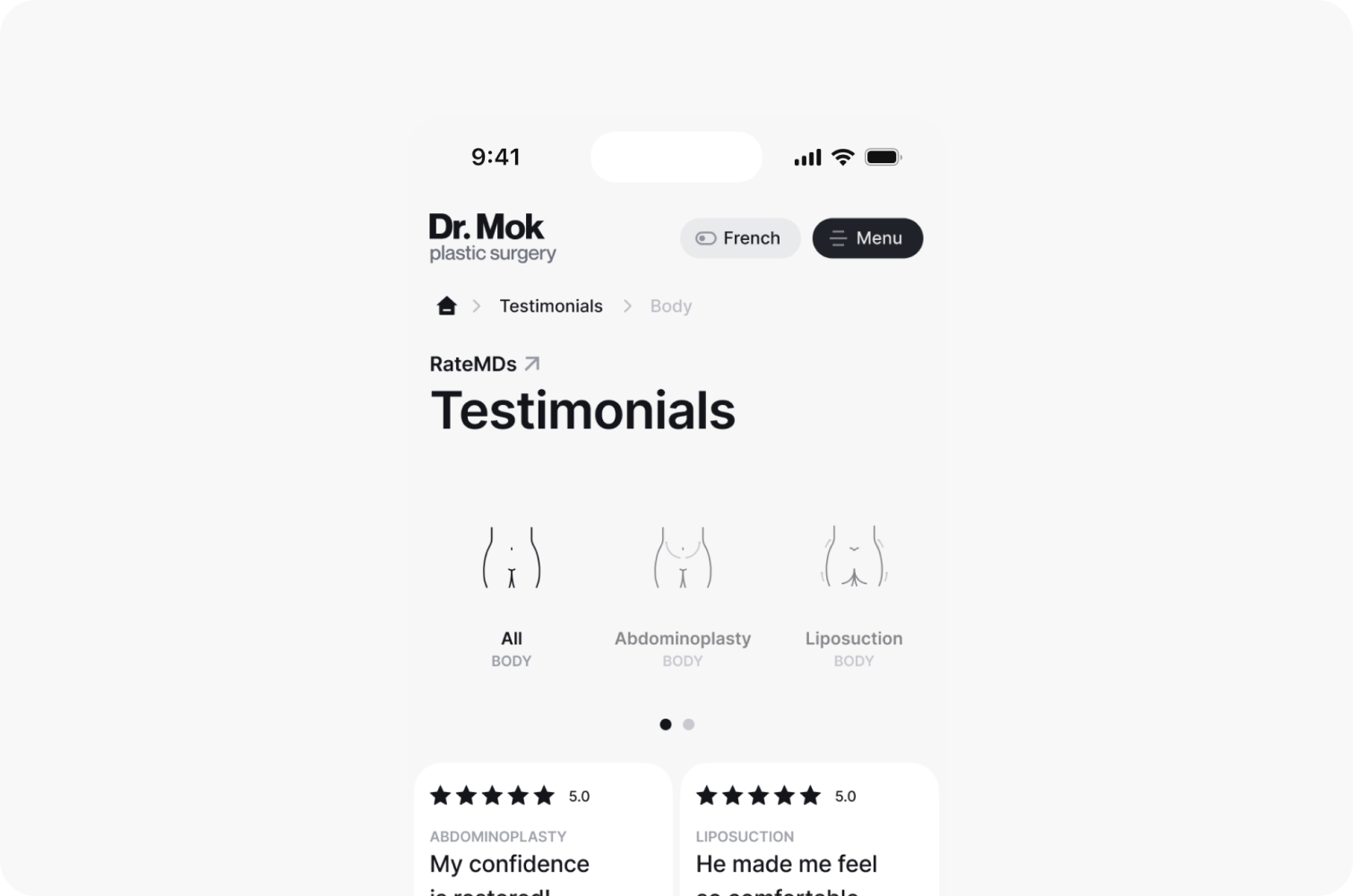
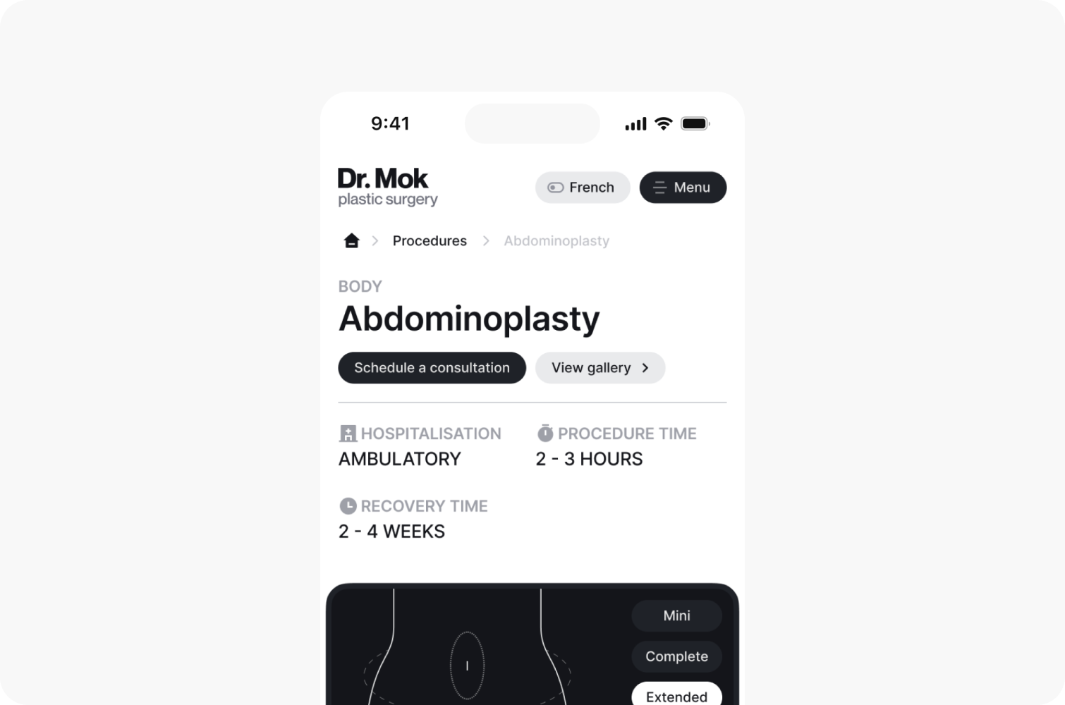
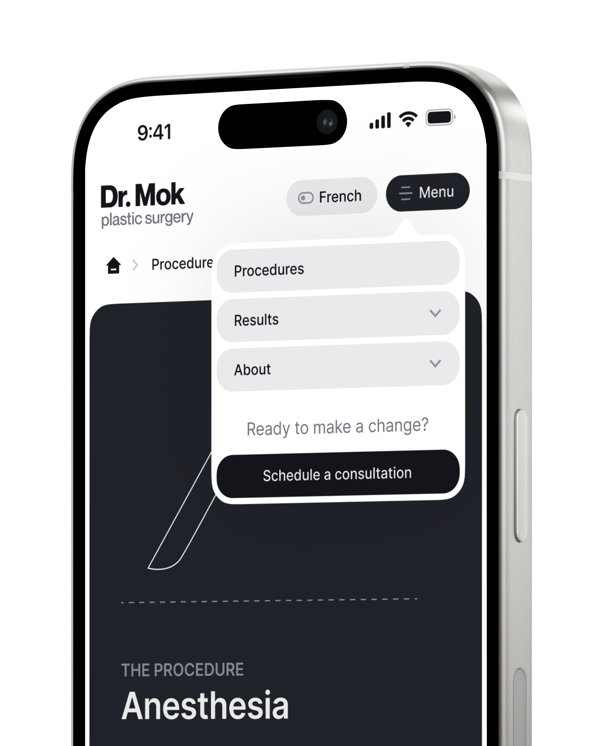
The website follows a minimalist approach to ensure that all information about the procedures is concise and easy to understand.
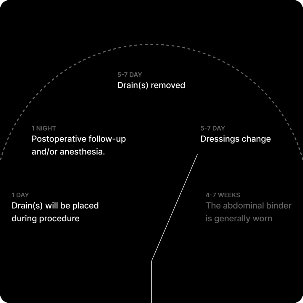
Vector illustrations for webpage sections
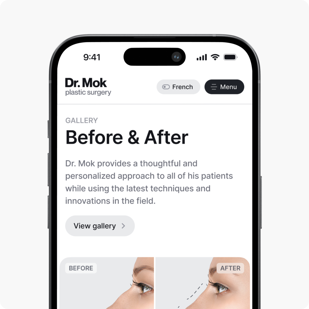
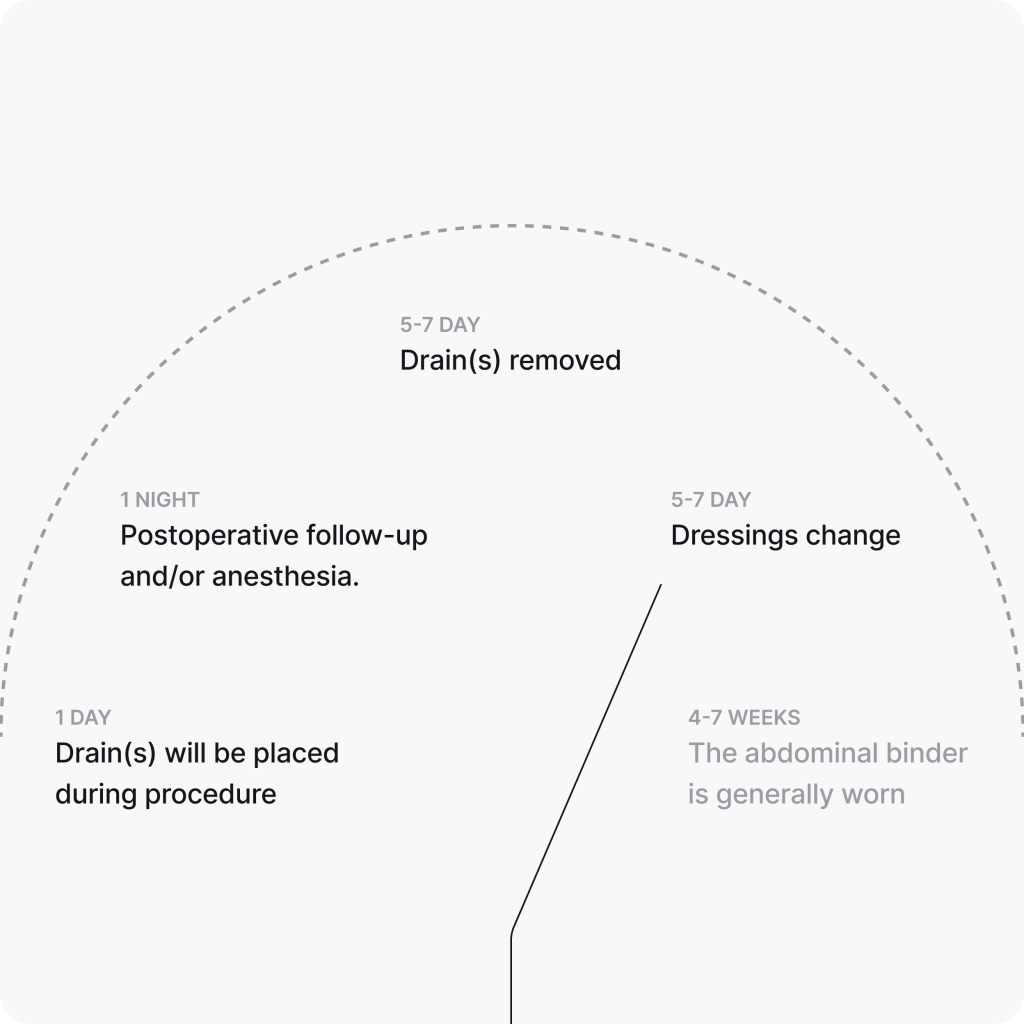
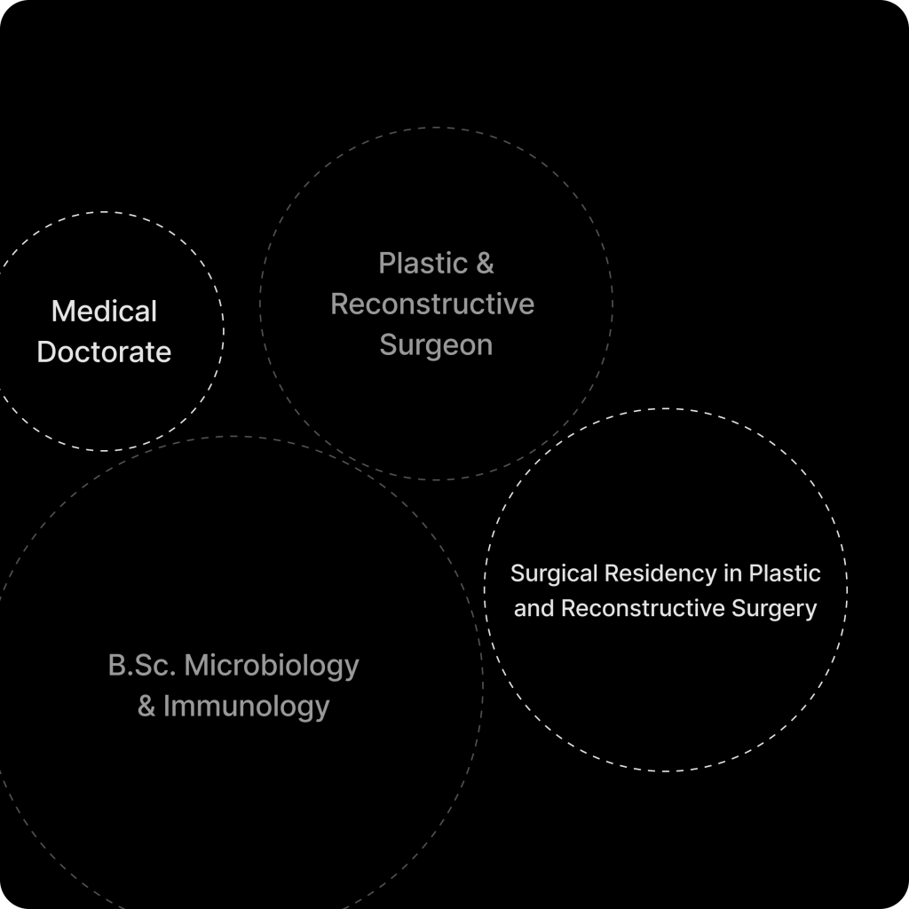
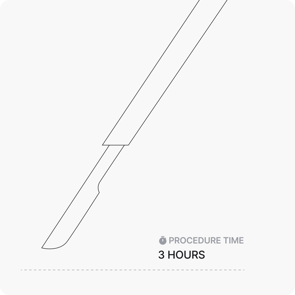
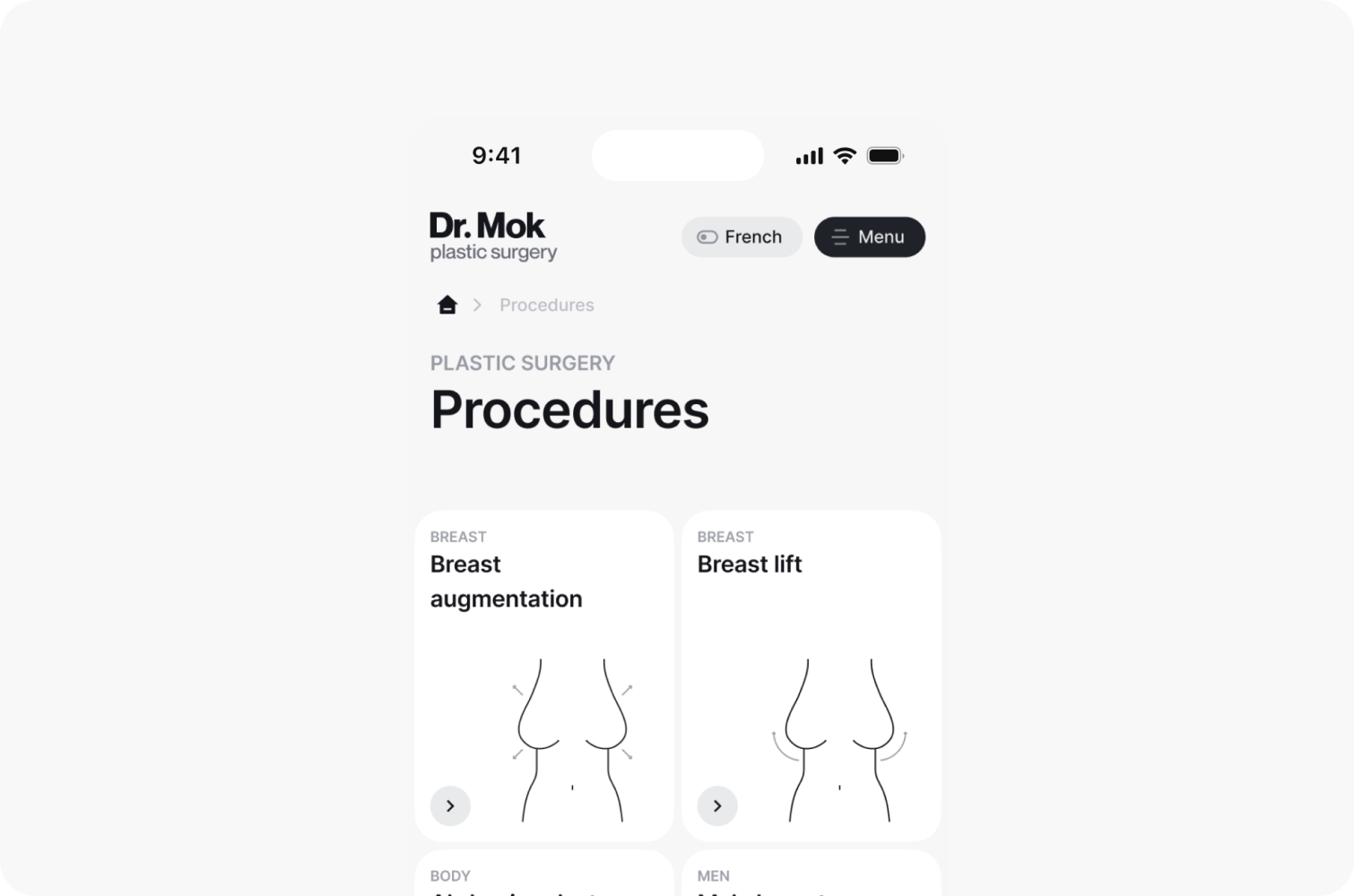
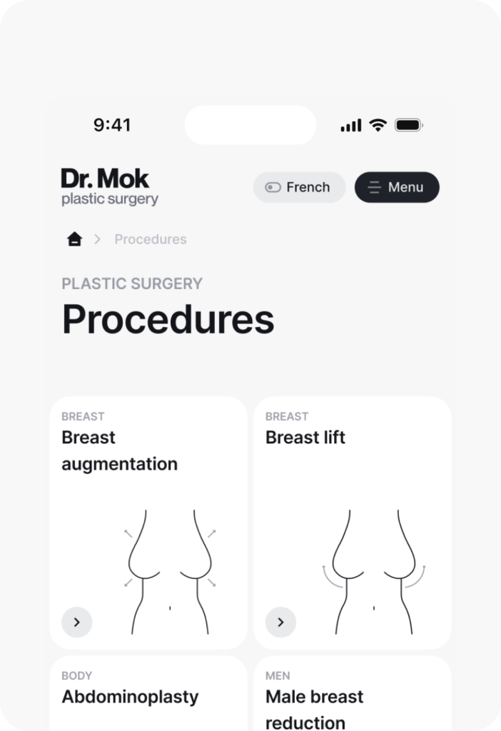
In order to visually enhance and diversify the website, we created illustrations that help users better understand the information related to surgical procedures.
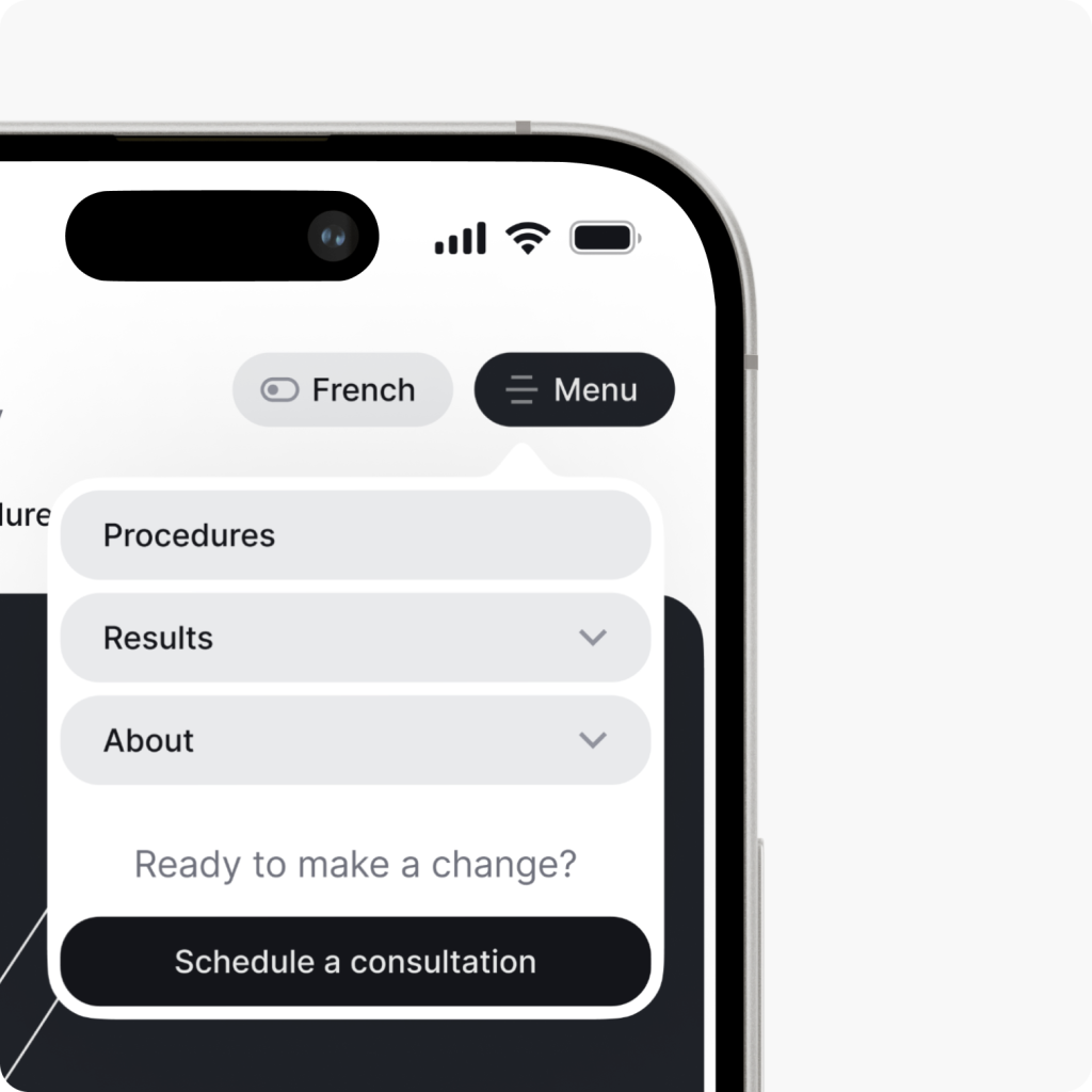
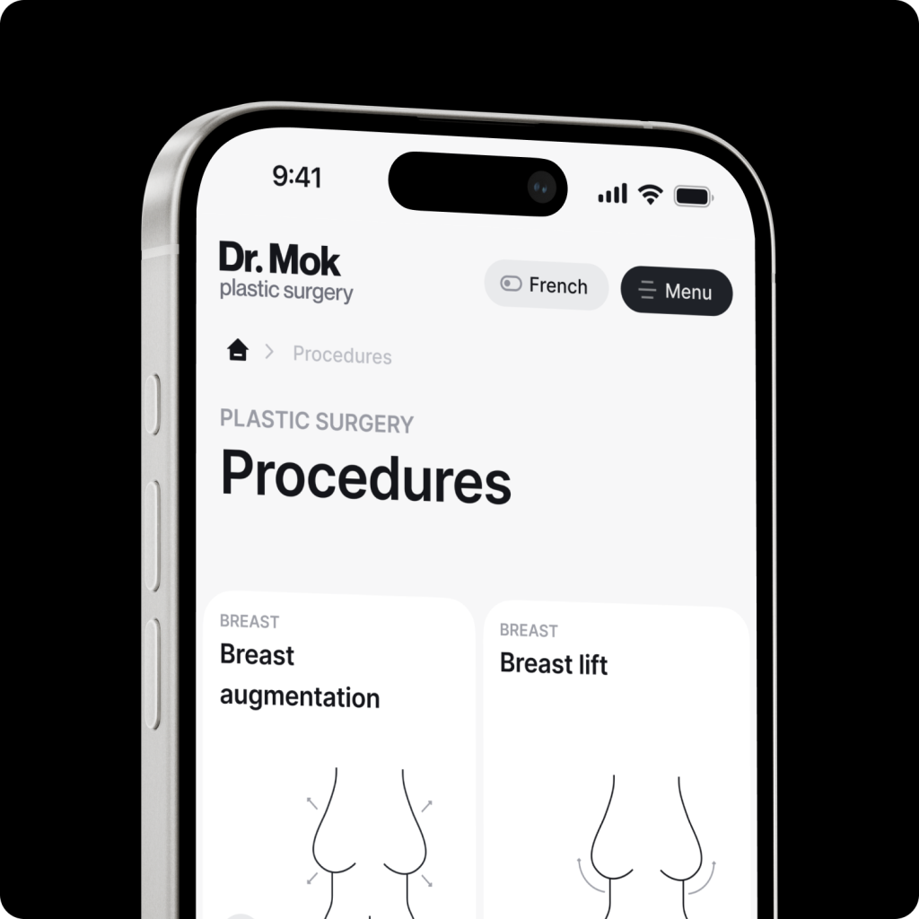
Responsive layout
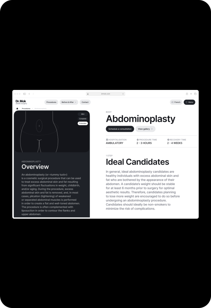
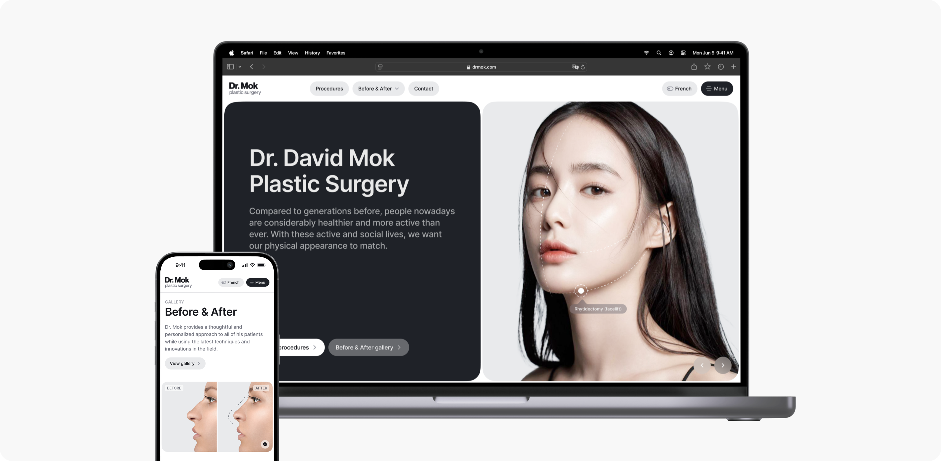
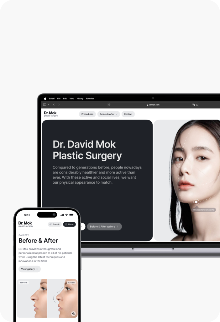
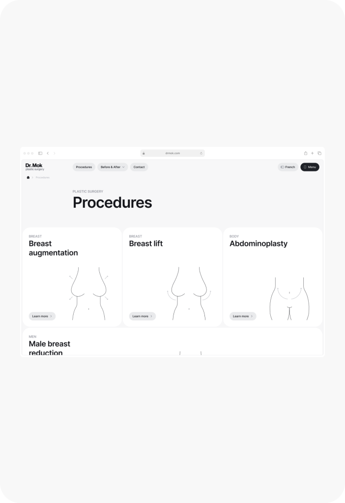
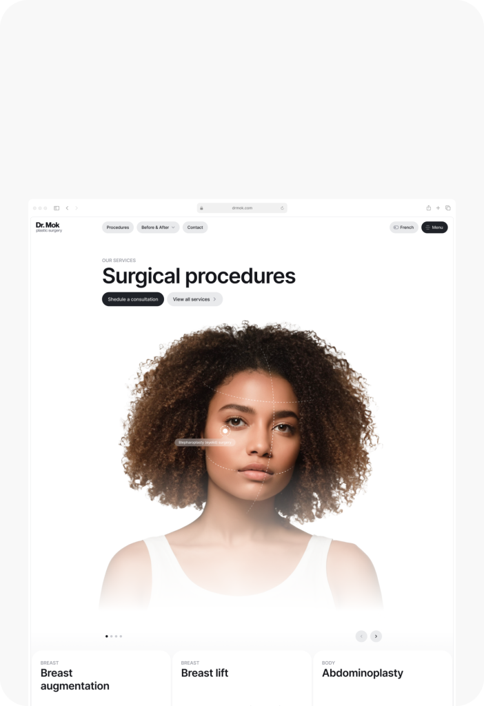
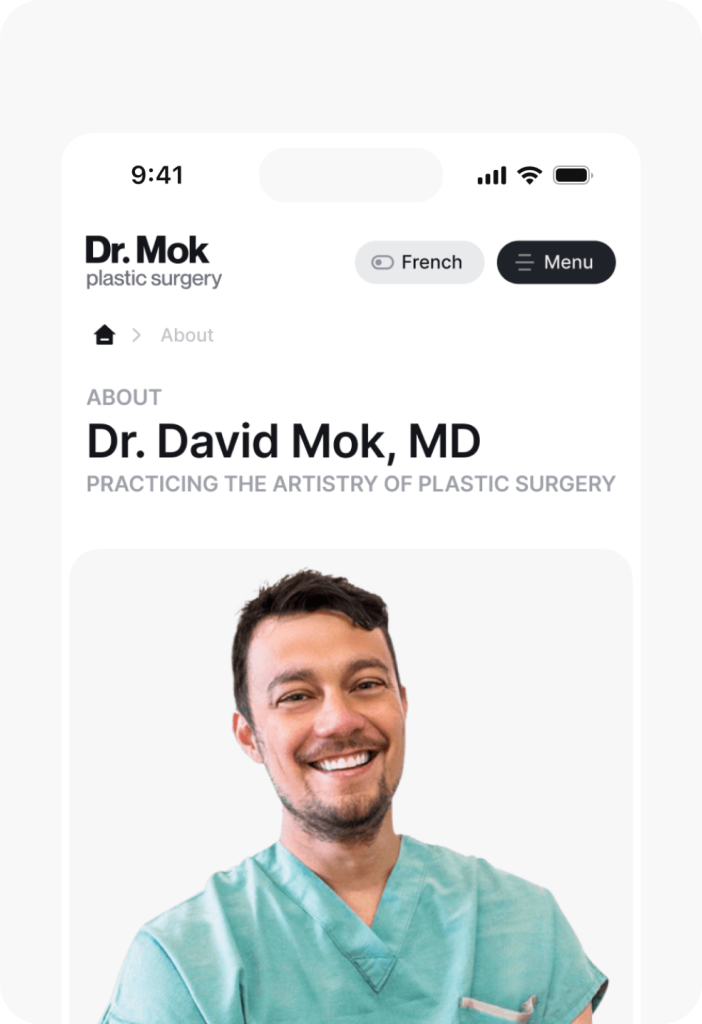
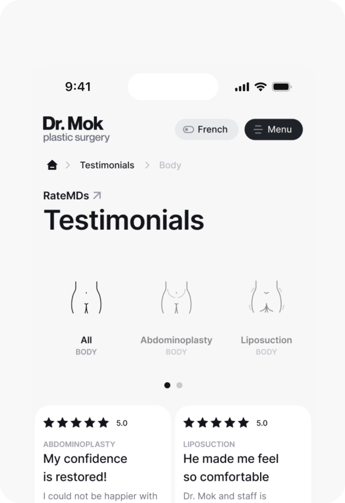
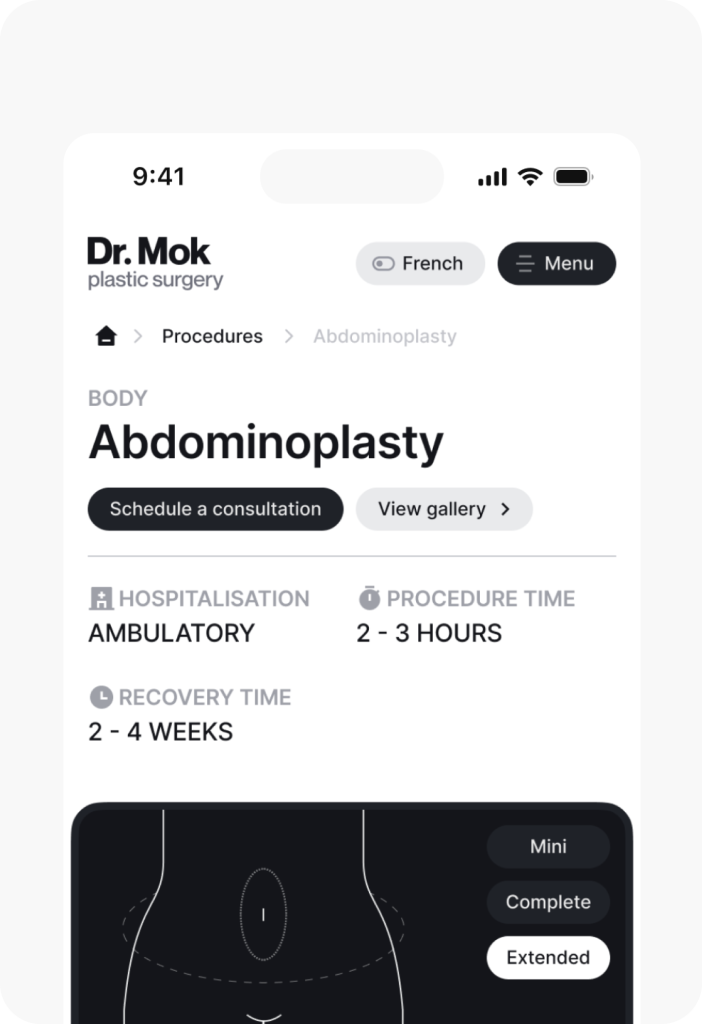
We designed layouts specifically for desktops, tablets, and smartphones to ensure consistent user experience across all devices.
Have a project in mind?
Let’s get in touch
Share your project idea with us! If our partnership isn't the right fit, we're happy to provide valuable insights that could still benefit you.
Get in touchDiscover our work
See how we transform businesses with our research-driven and innovative UX design approach.


