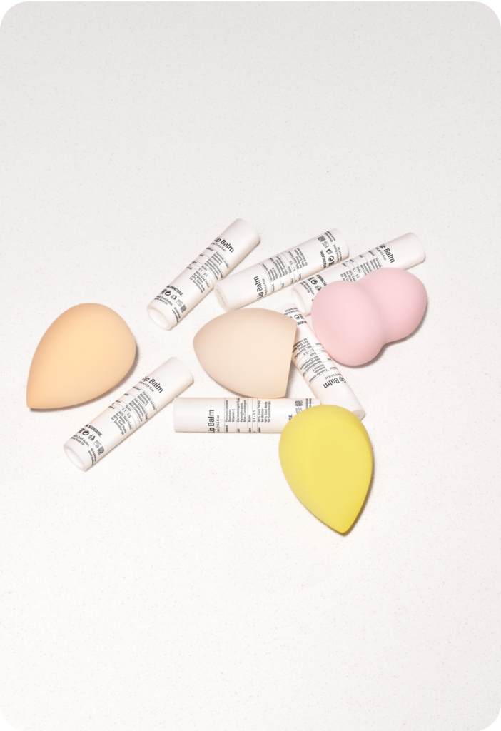
Via Skincare embodies natural beauty, care, and high standards, offering products designed to keep skin healthy, radiant, and protected.
Colors & typography
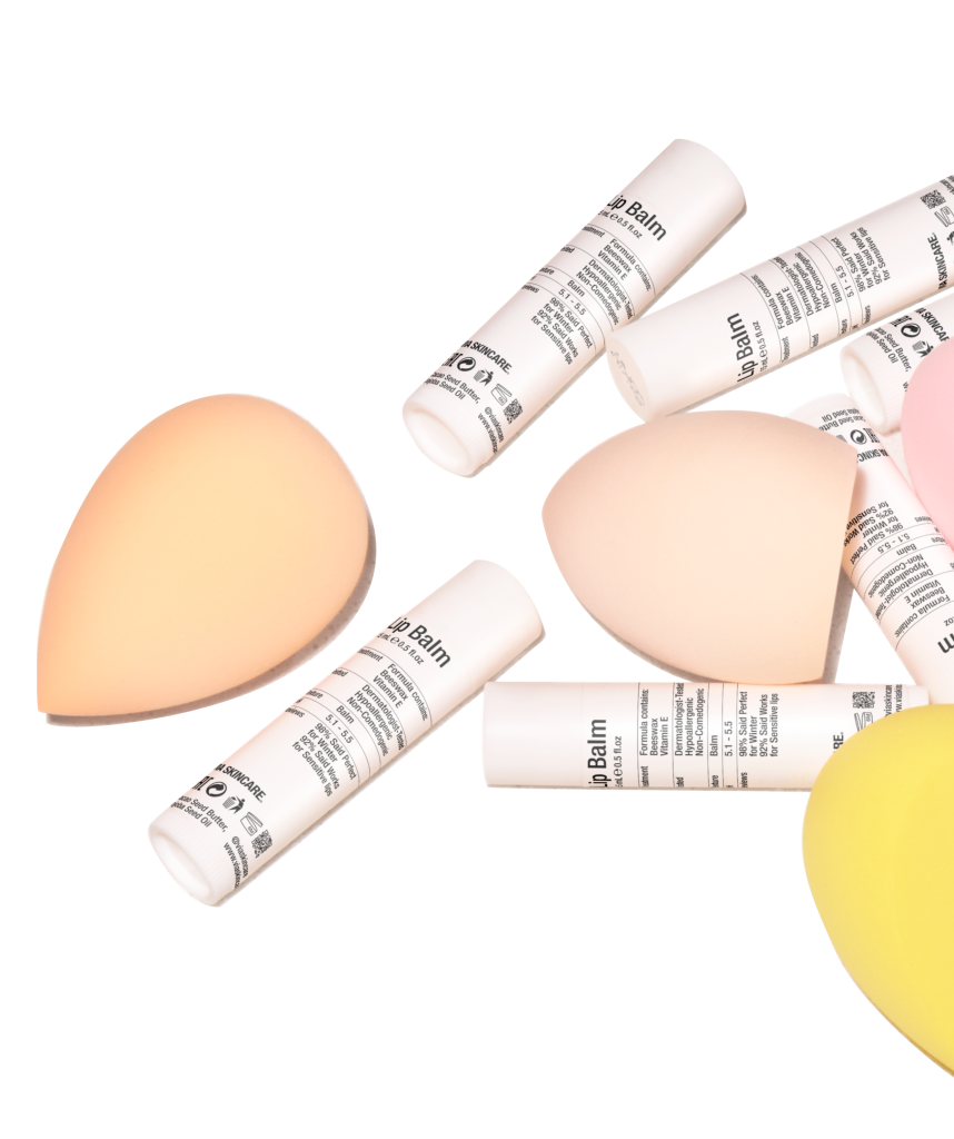
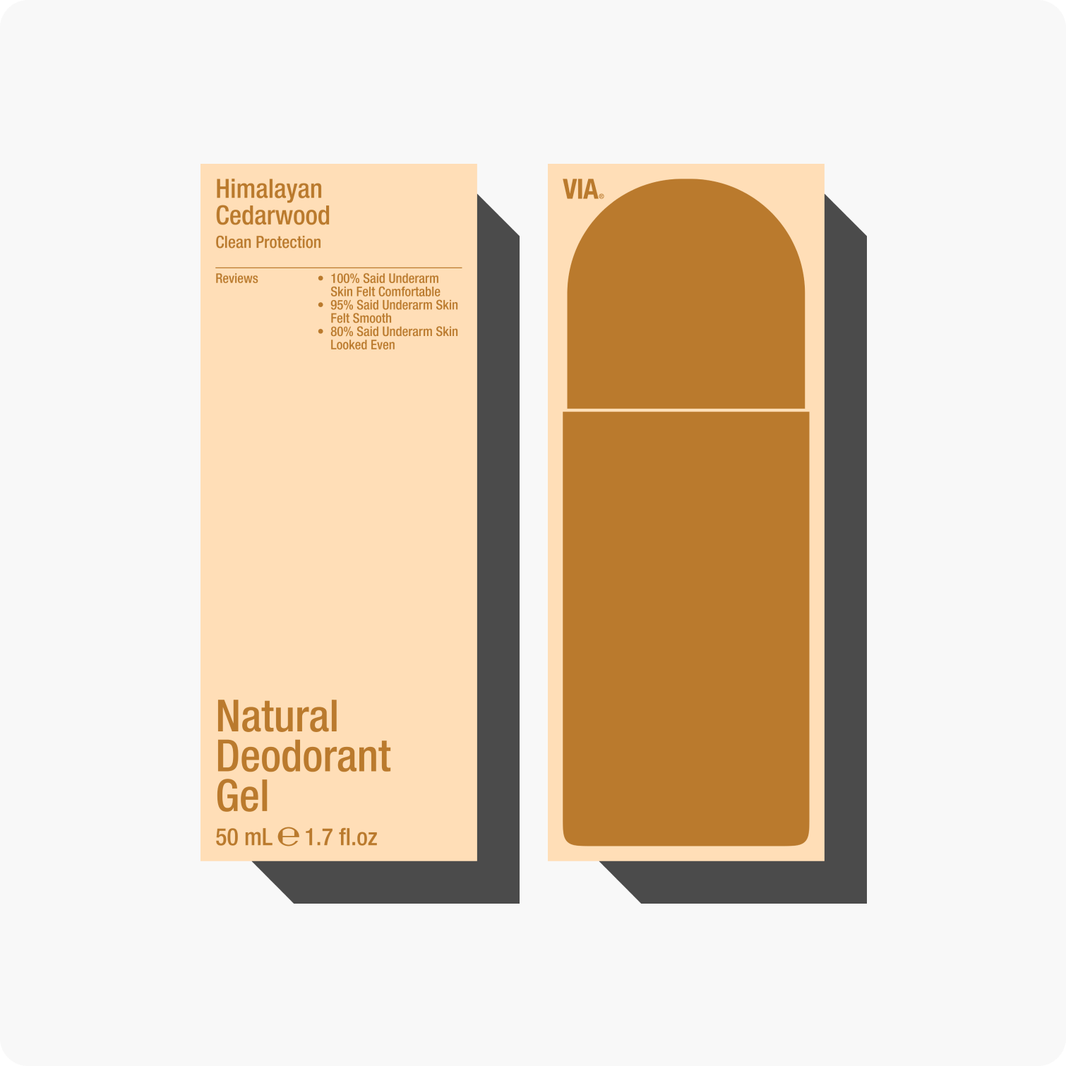
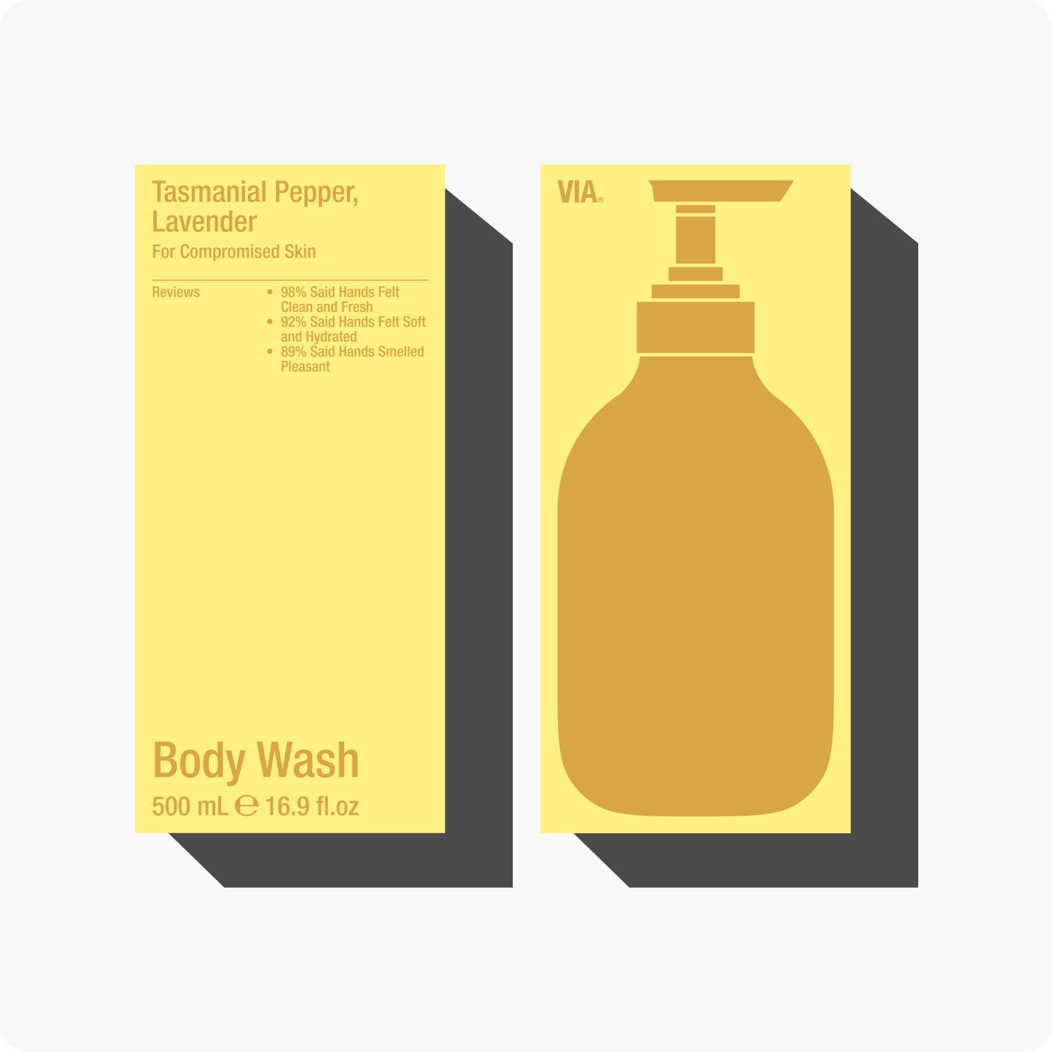
Soft pastel tones convey a sense of calm and care, making them well-suited for a skincare brand. The clean lines of Helvetica Neue Condensed complement the palette, adding contrast and visual balance.
Monochrome and color logo variations
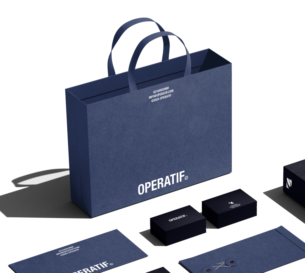
We developed monochrome and color logo variations, adapting them for the skincare product line to reflect the brand’s specialization and professional focus.
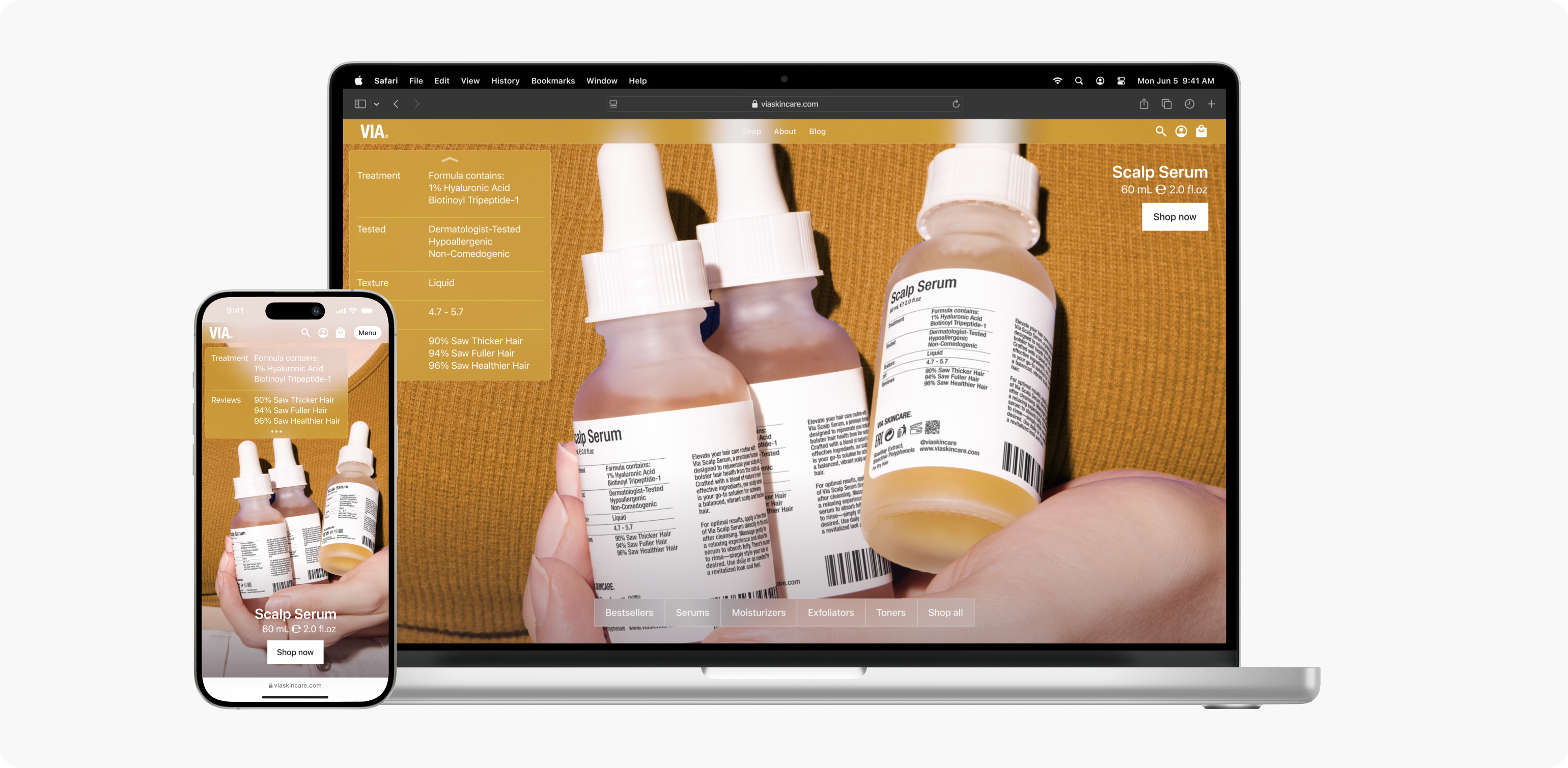
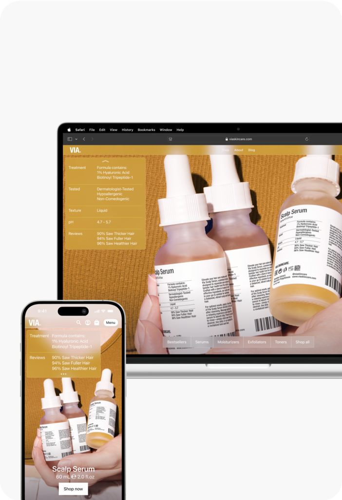
Designed the packaging, developed a website concept, and created an adaptable logo that works across various applications
Brand research & deliverables
Our team gained valuable insights into the client’s business and product, allowing us to design distinctive and impactful packaging.
Packaging design
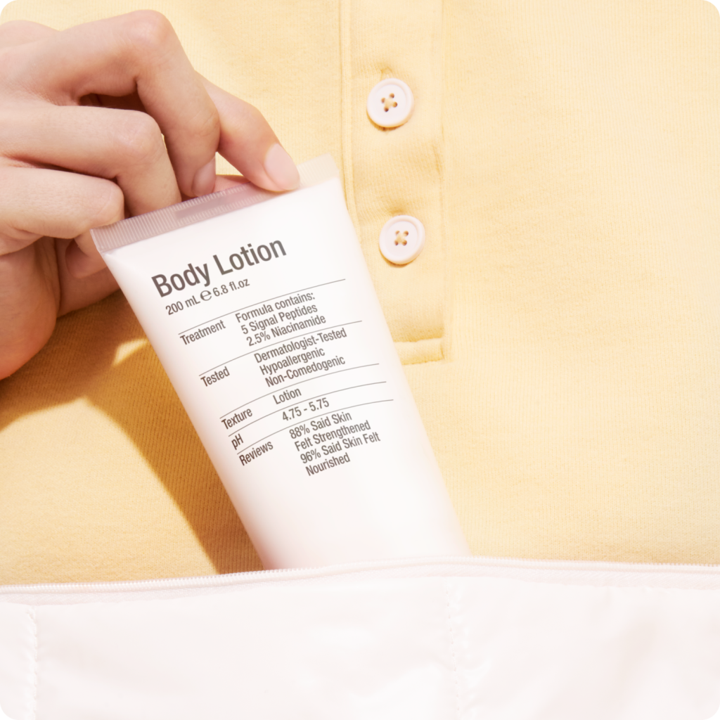
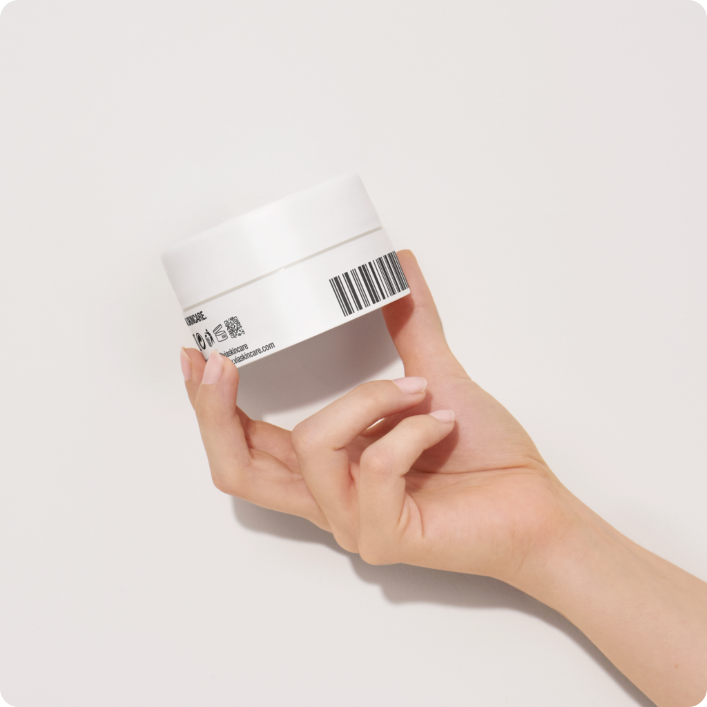
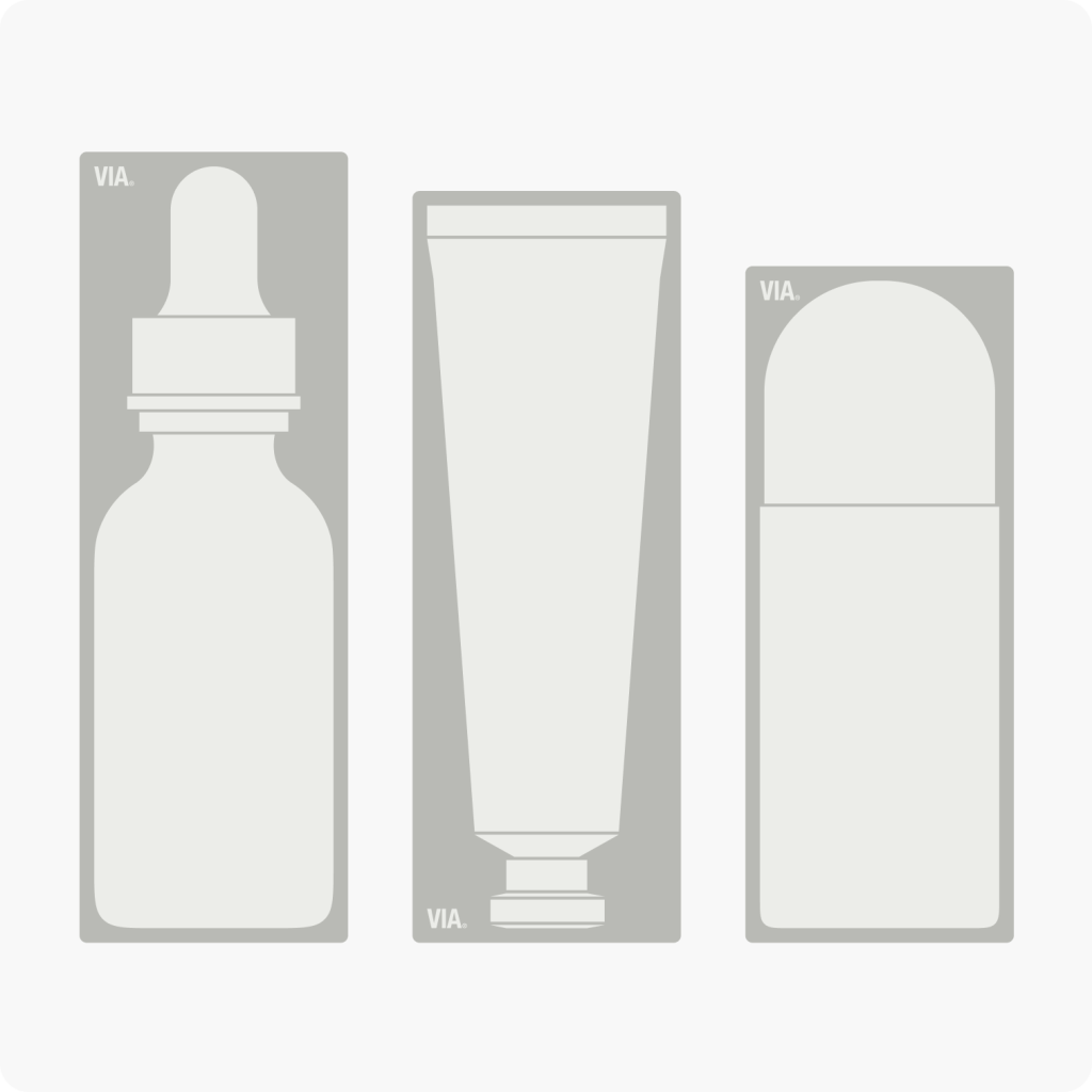
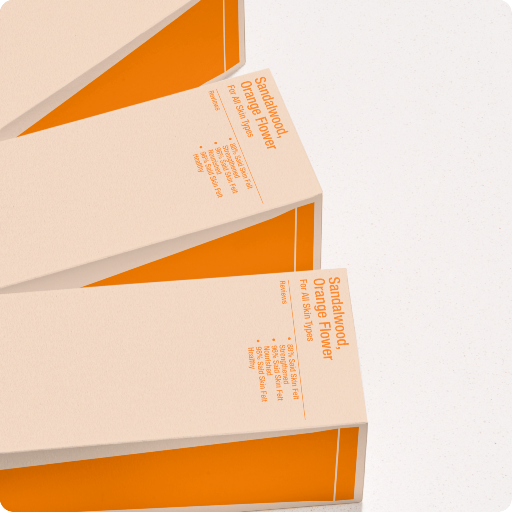
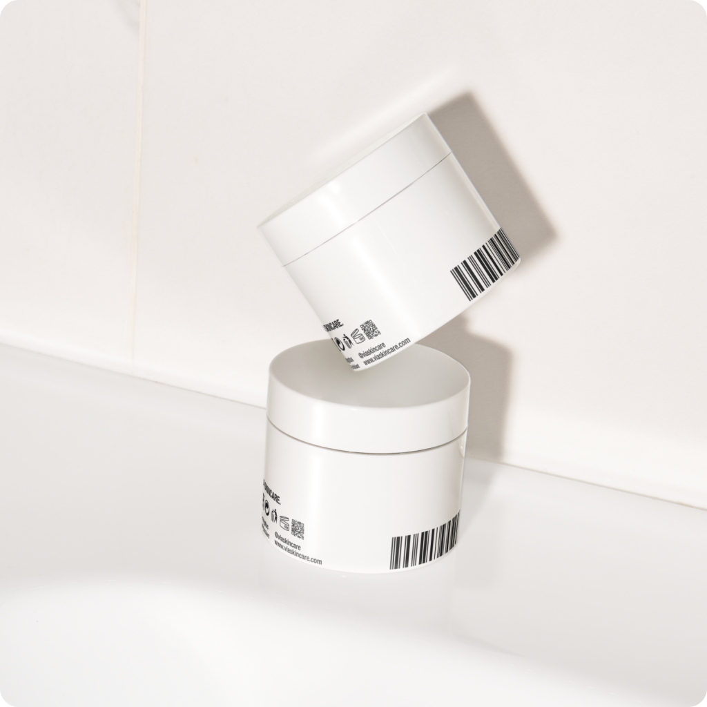
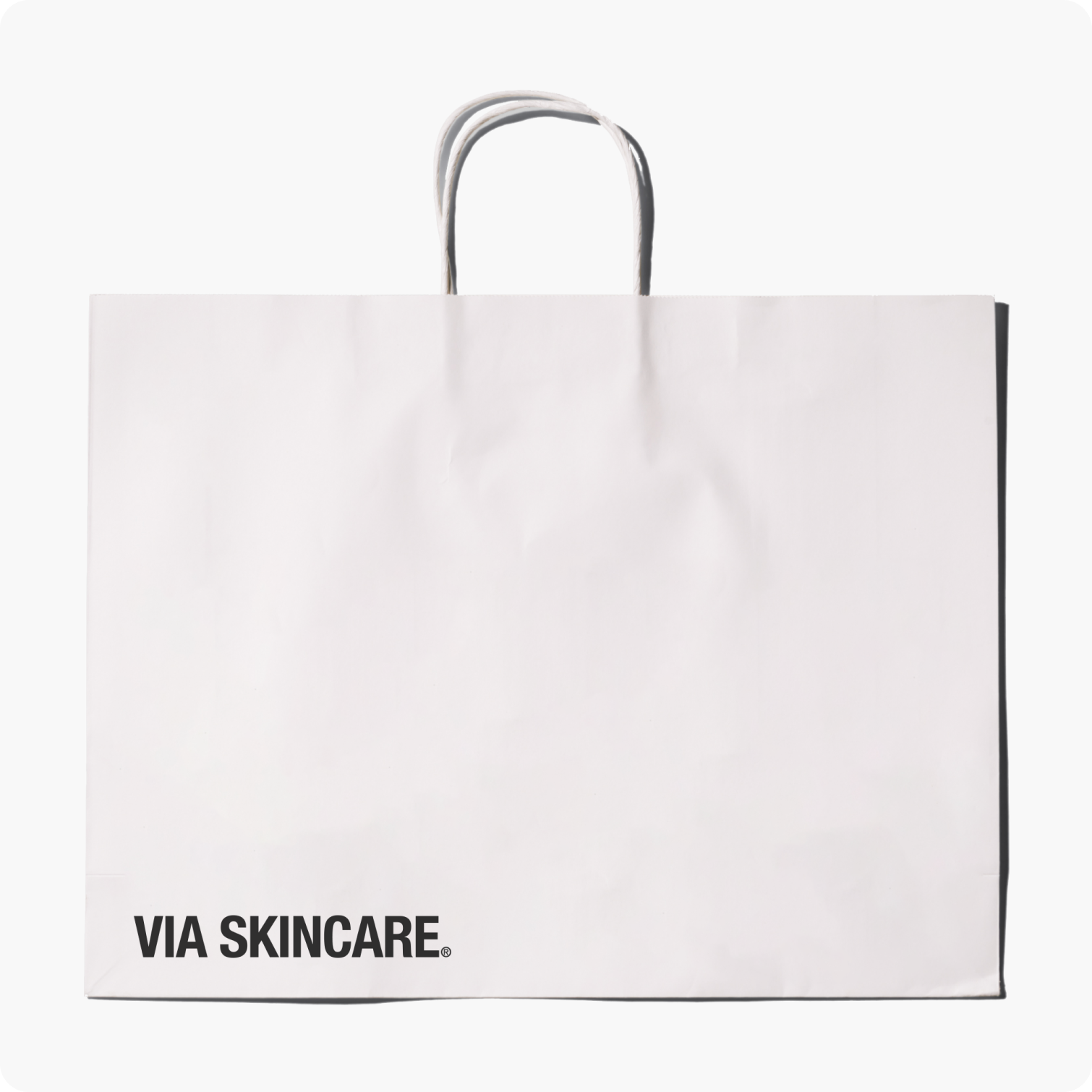
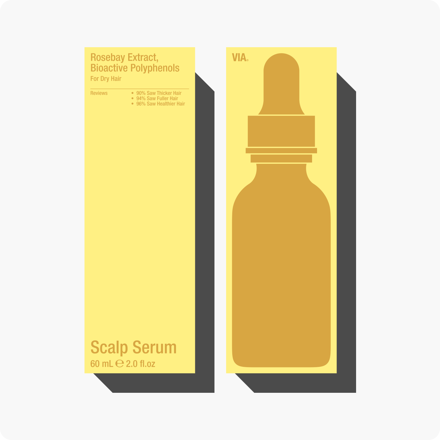
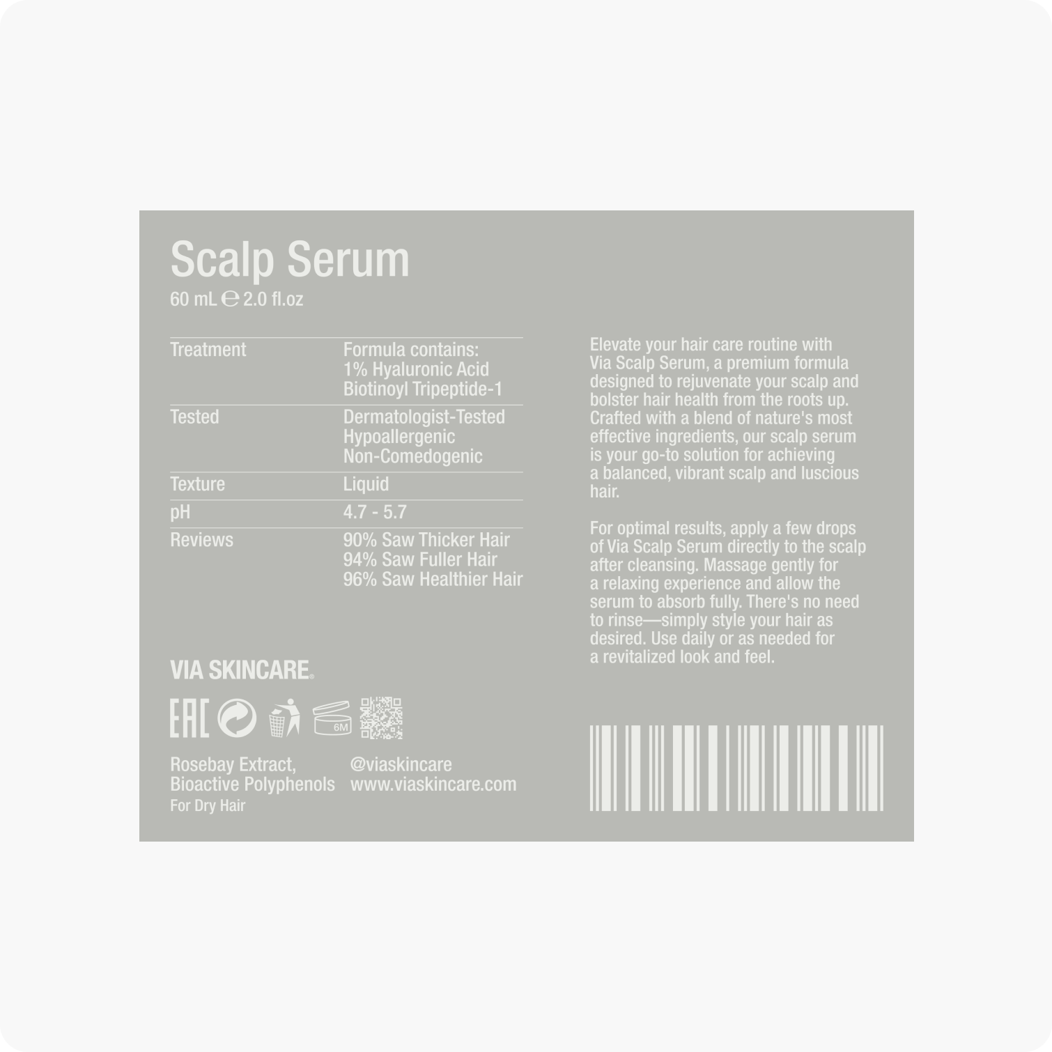
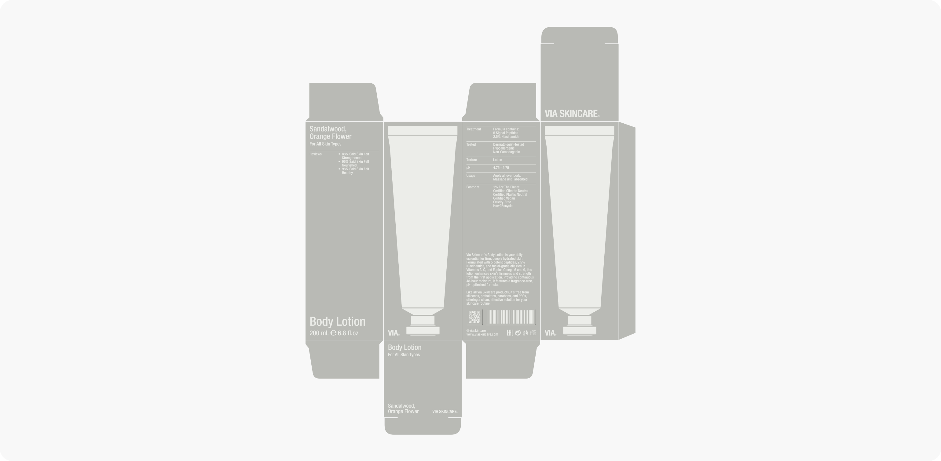
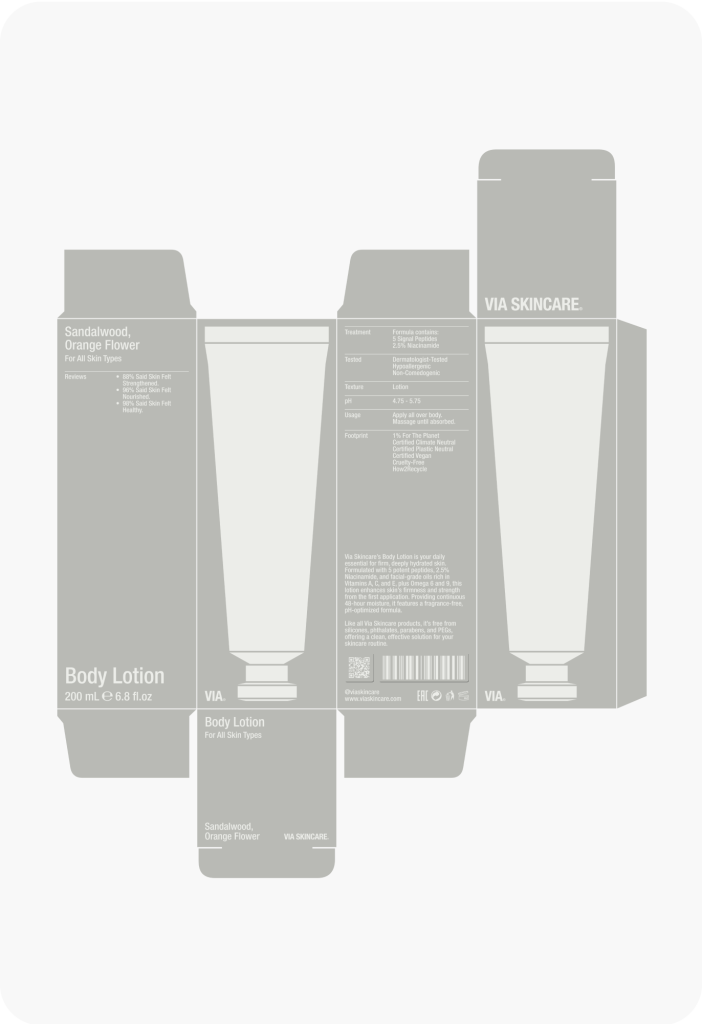
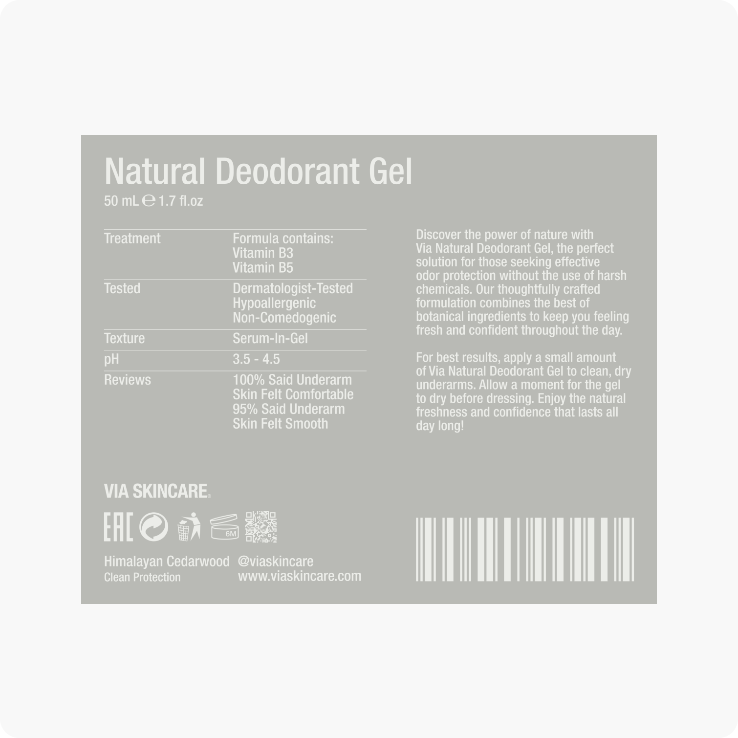
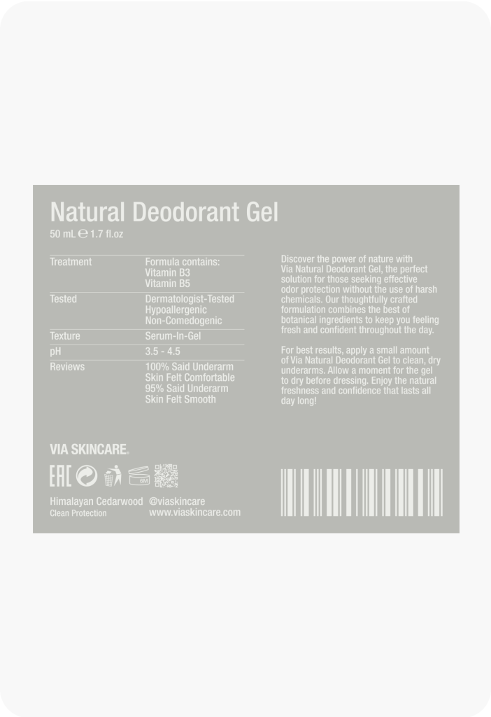
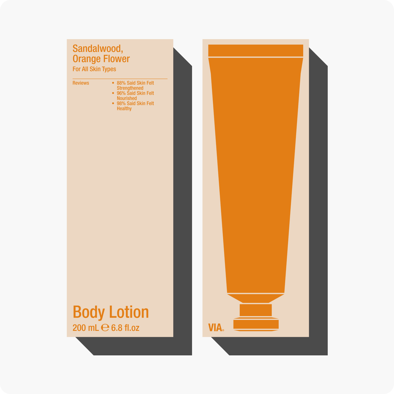
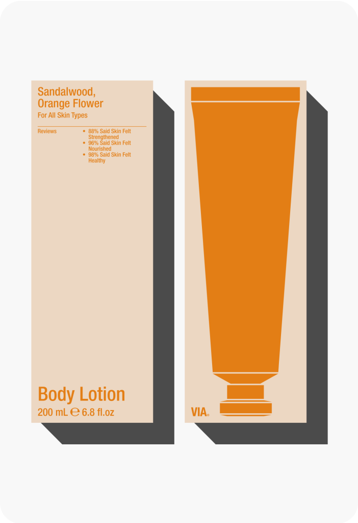
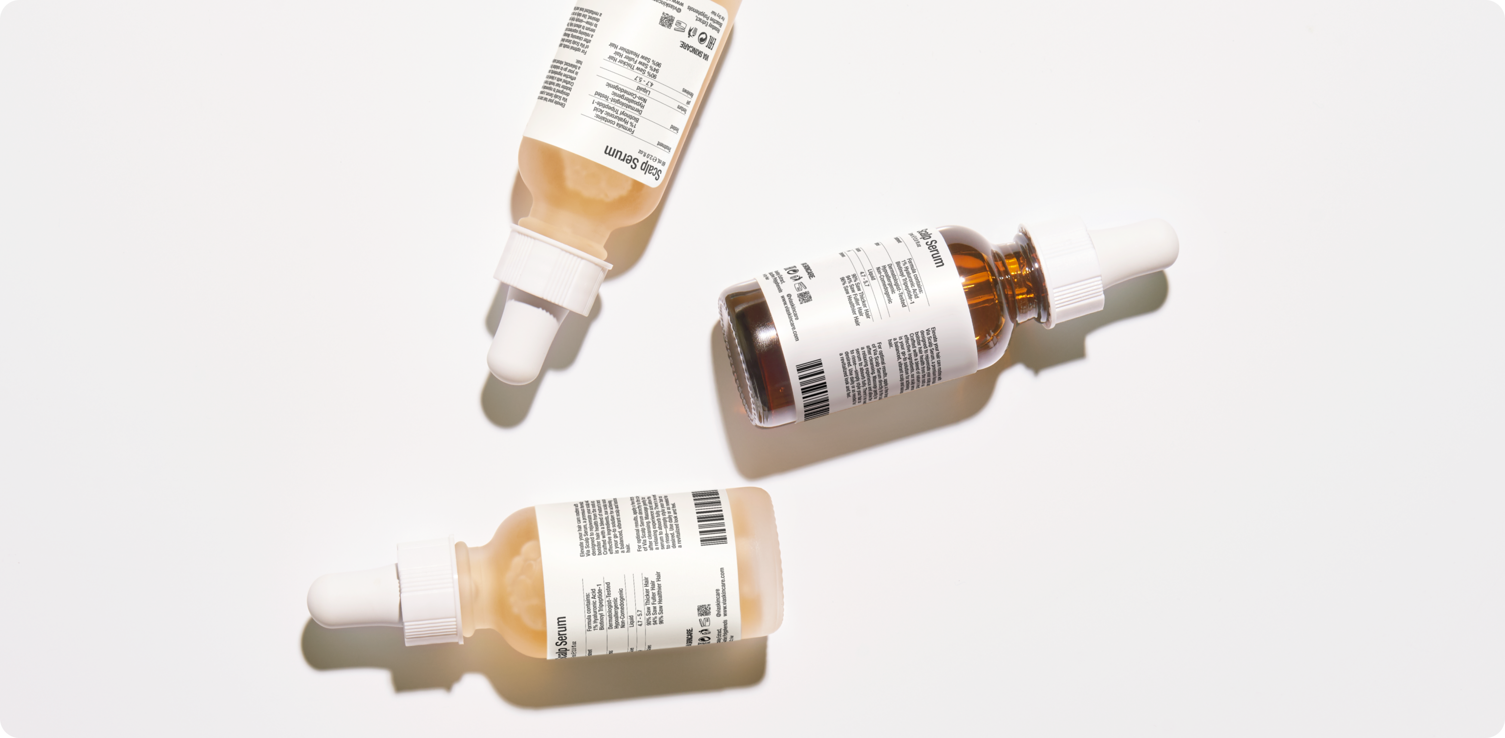
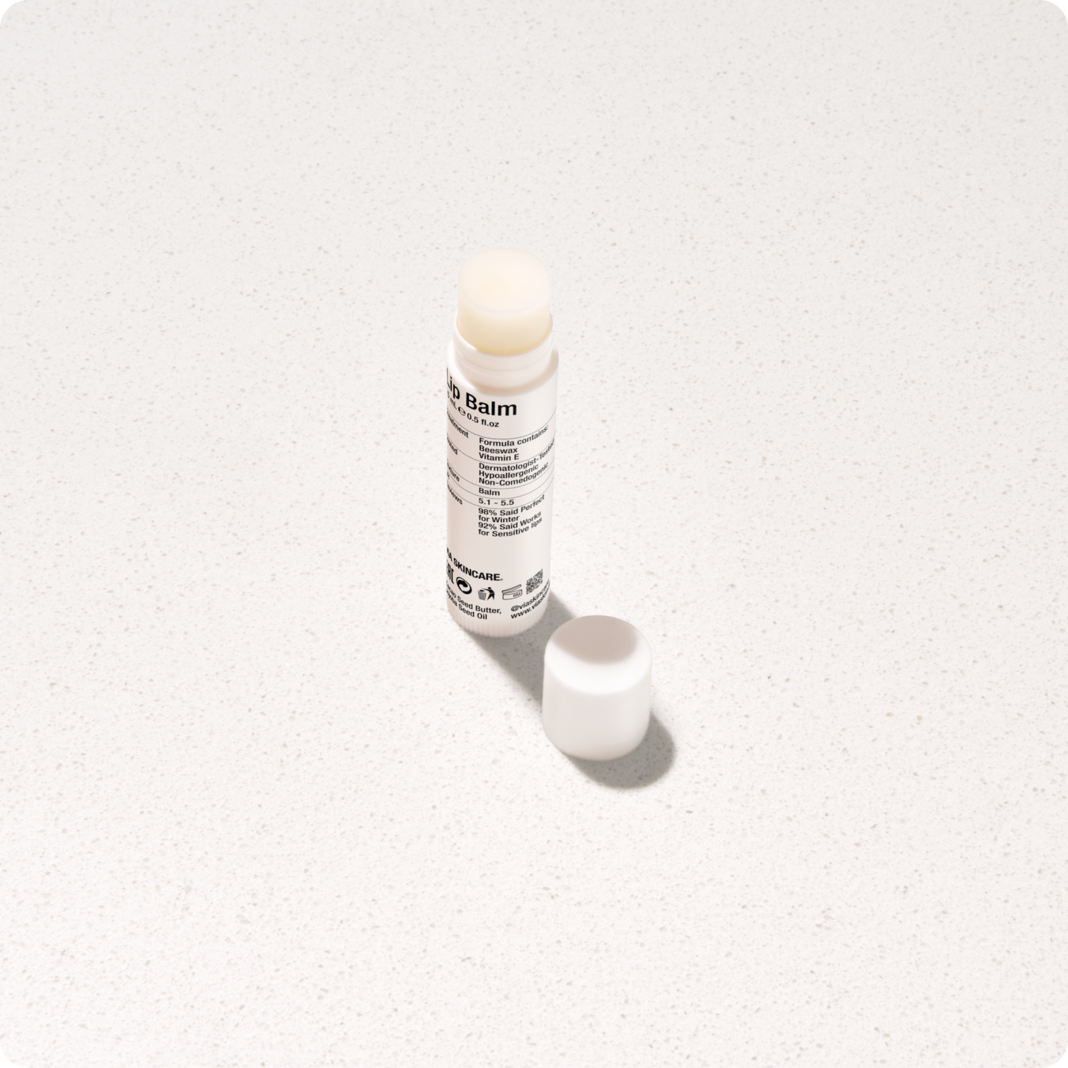
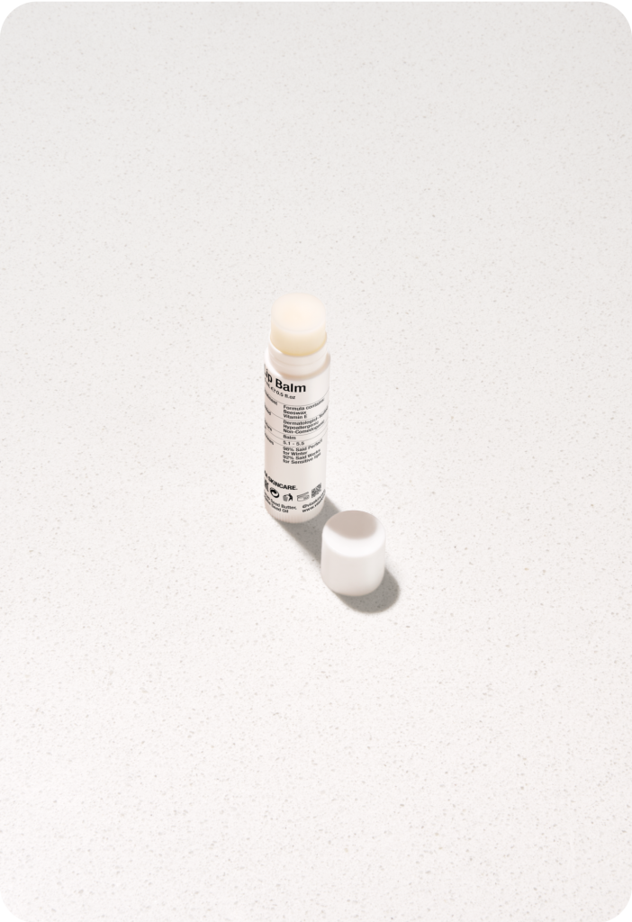
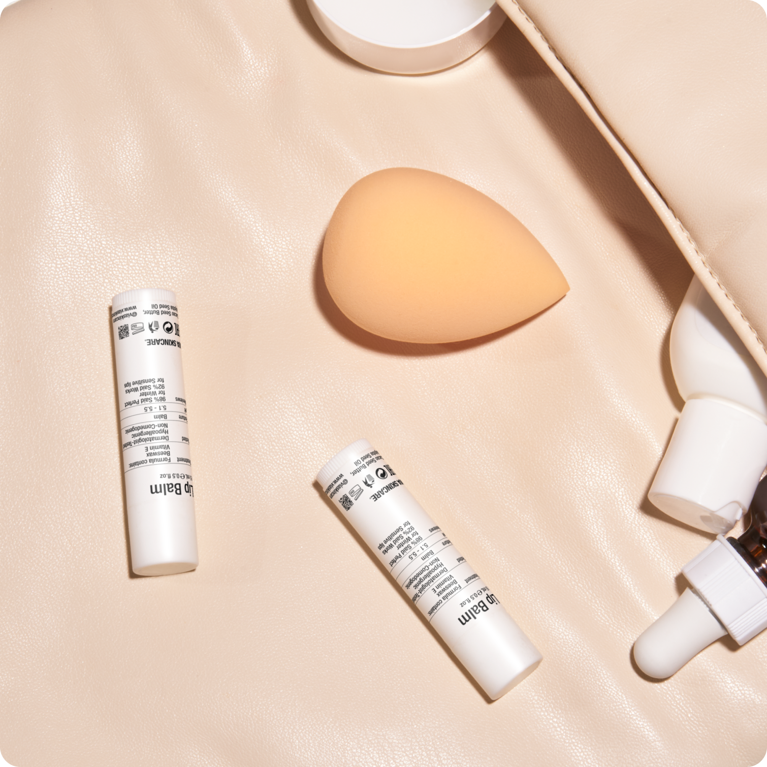
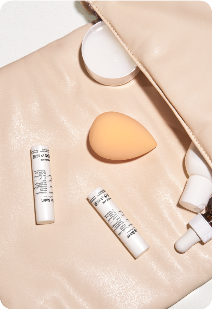
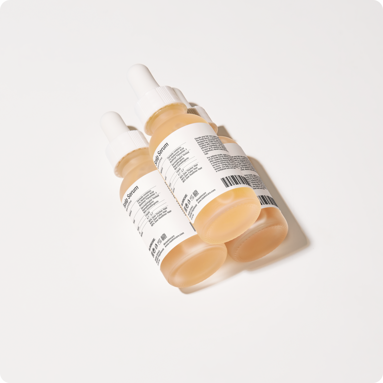
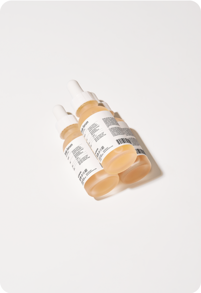
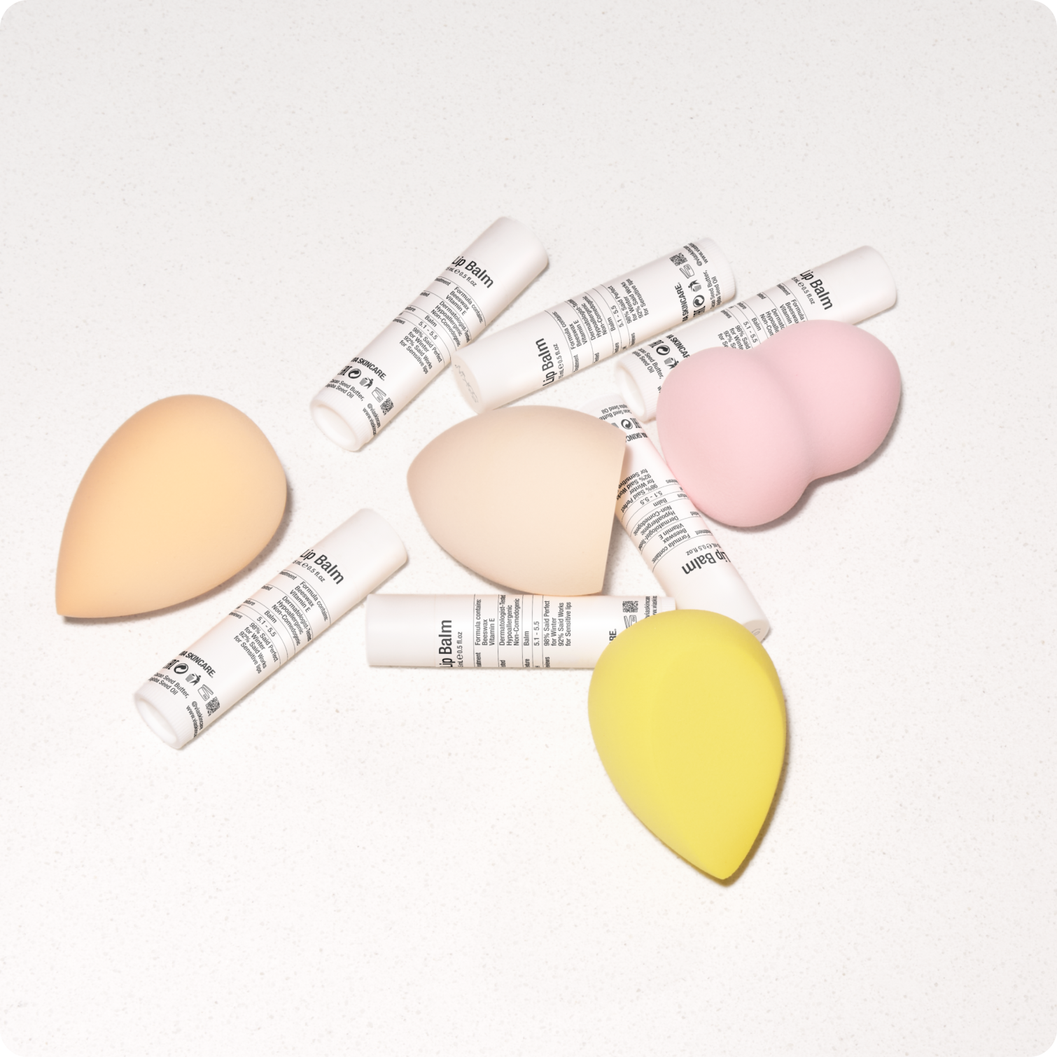
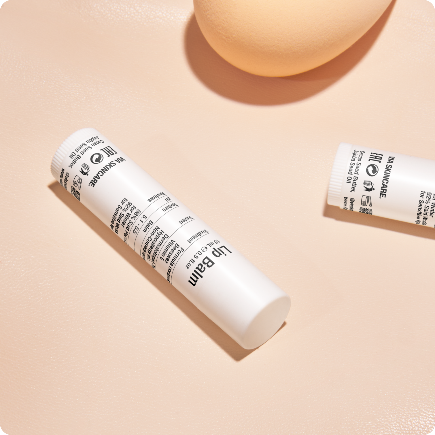
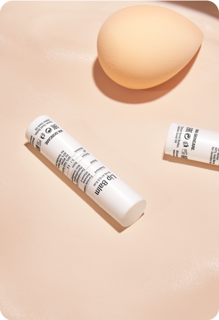
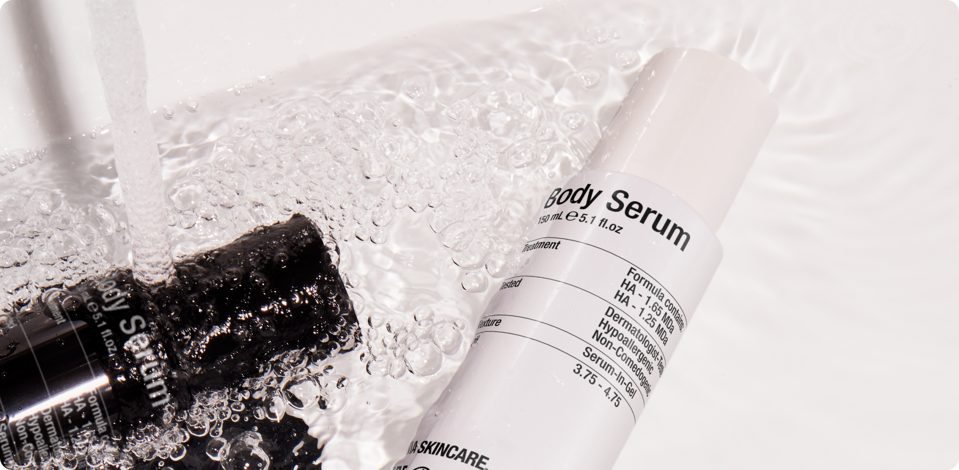
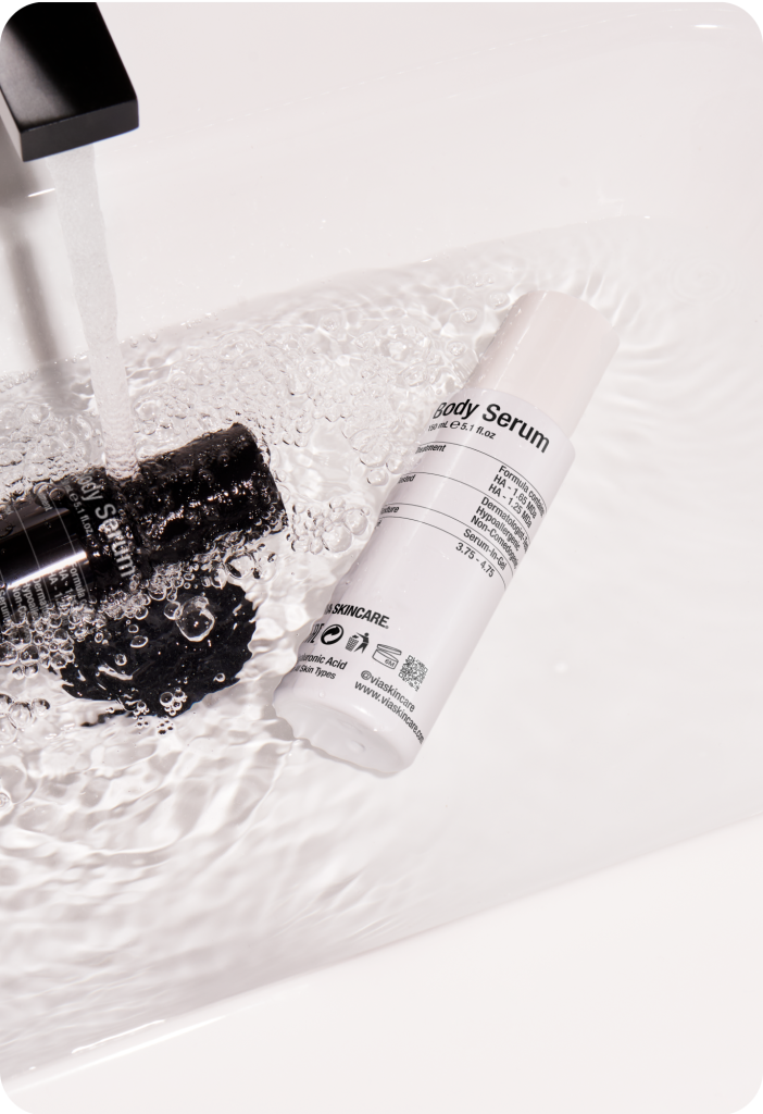
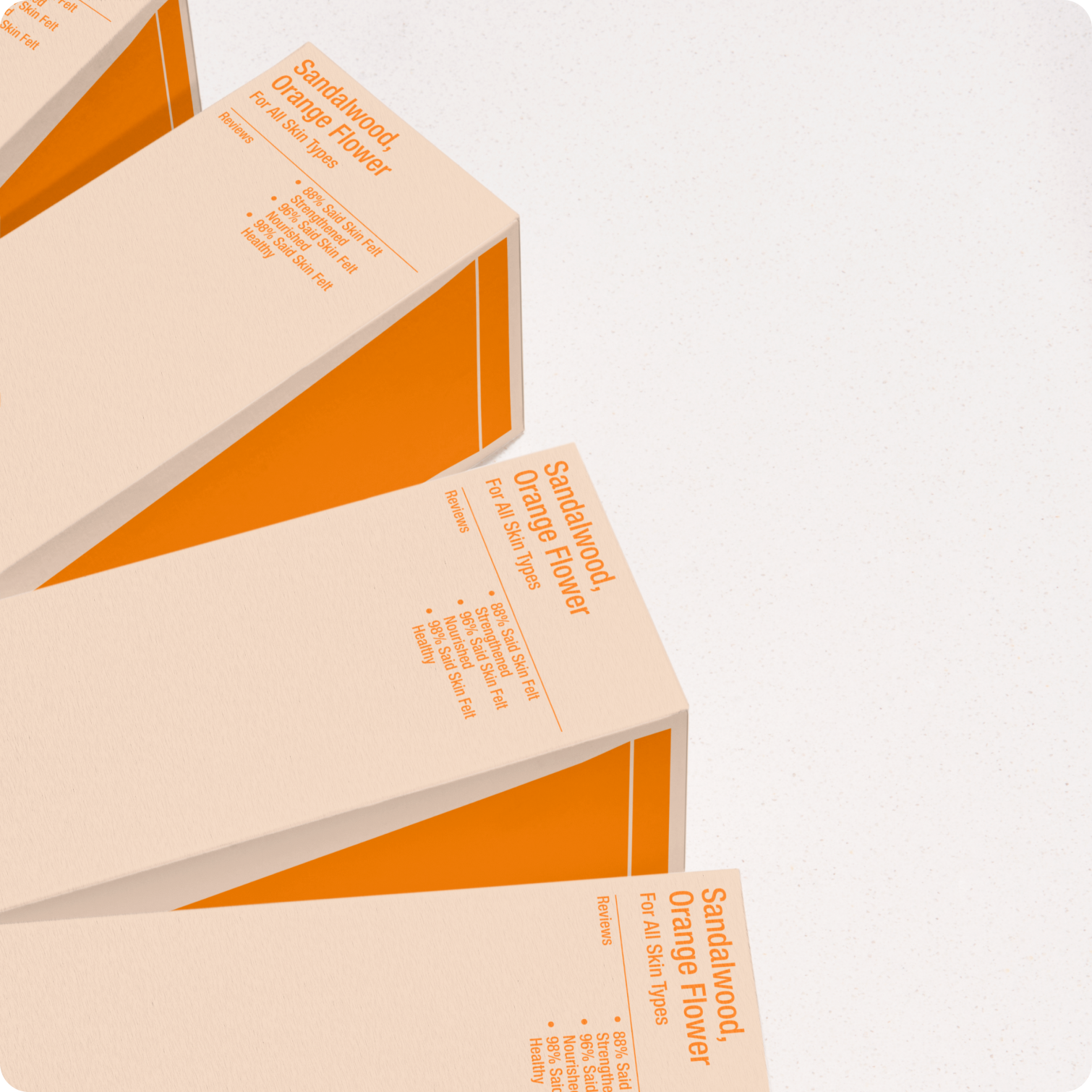
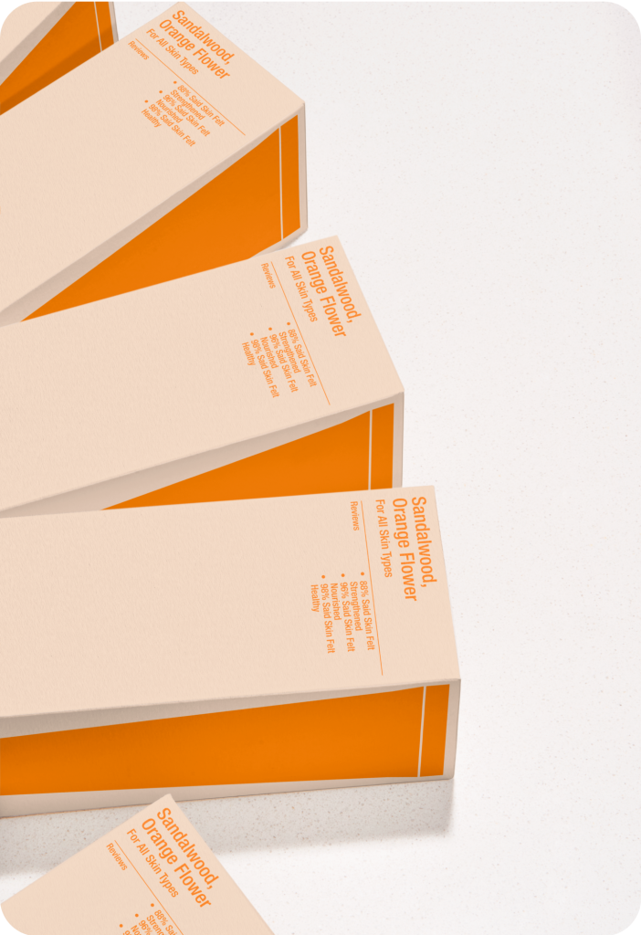
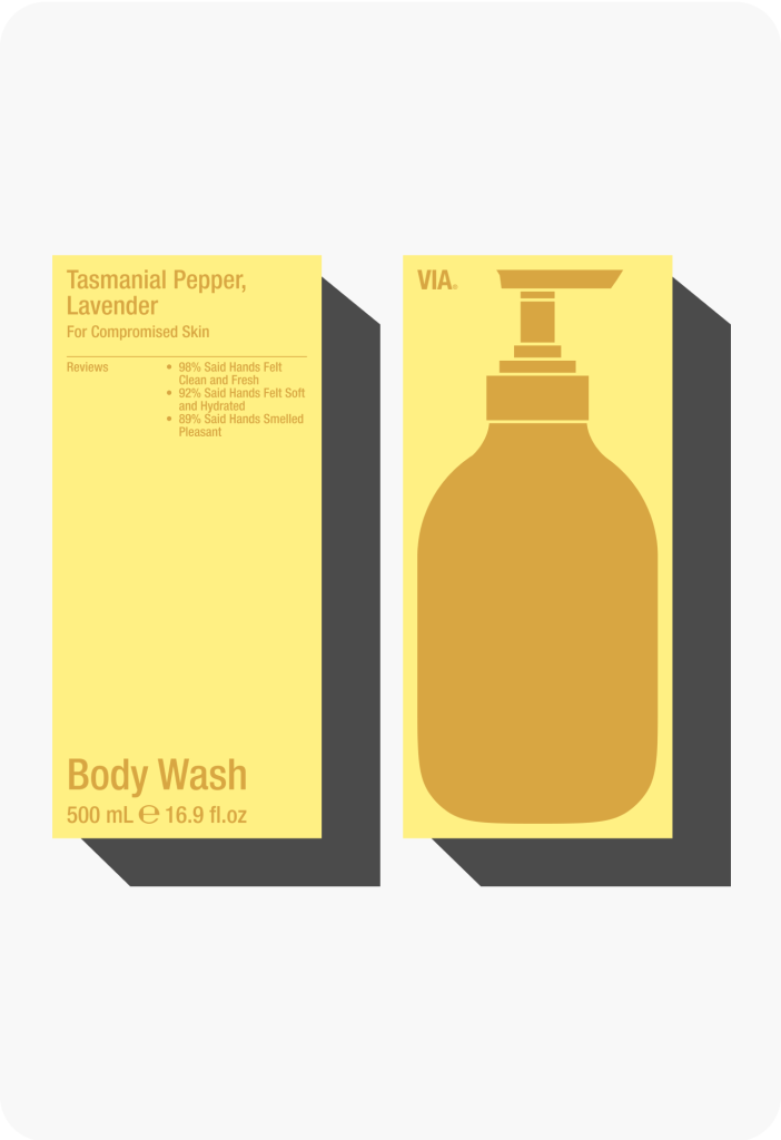
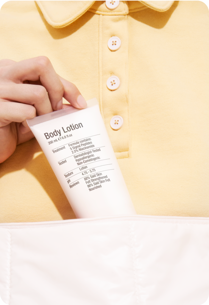
The packaging effectively reflects the brand’s core values, emphasizing accessibility through simple forms and minimalist design. Warm colors and graphics enhance visibility, while the use of recyclable materials ensures functionality and sustainability across all applications.
Modern packaging reflecting natural beauty
The new packaging combines modern design with a focus on natural beauty, highlighting brand’s dedication to high-quality skincare products.
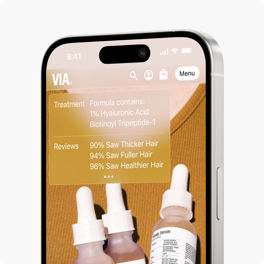
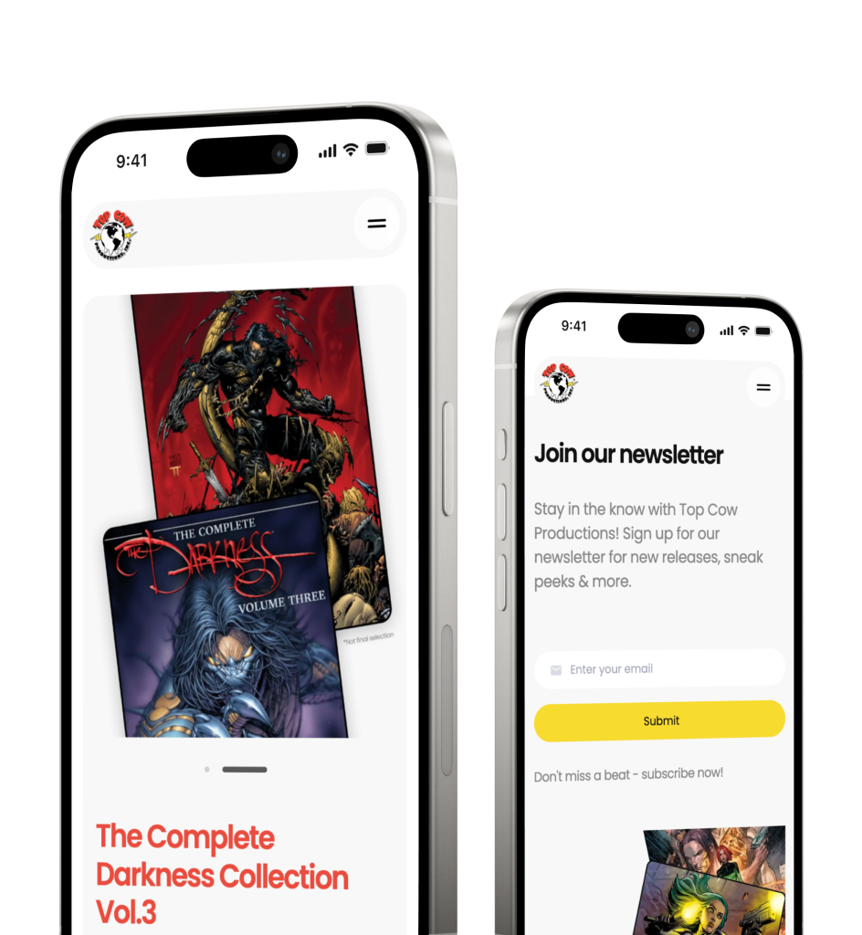
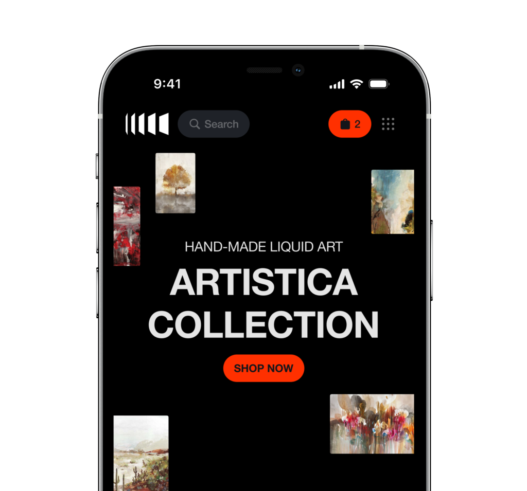
Responsive website concept
Project outcomes
The new packaging design incorporates modern design principles, focusing on creating a memorable visual identity that distinguishes the brand from competitors and fosters an emotional connection with the audience.
Have a project in mind?
Let’s get in touch
Share your project idea with us! If our partnership isn't the right fit, we're happy to provide valuable insights that could still benefit you.
Get in touchDiscover our work
See how we transform businesses with our research-driven and innovative UX design approach.


