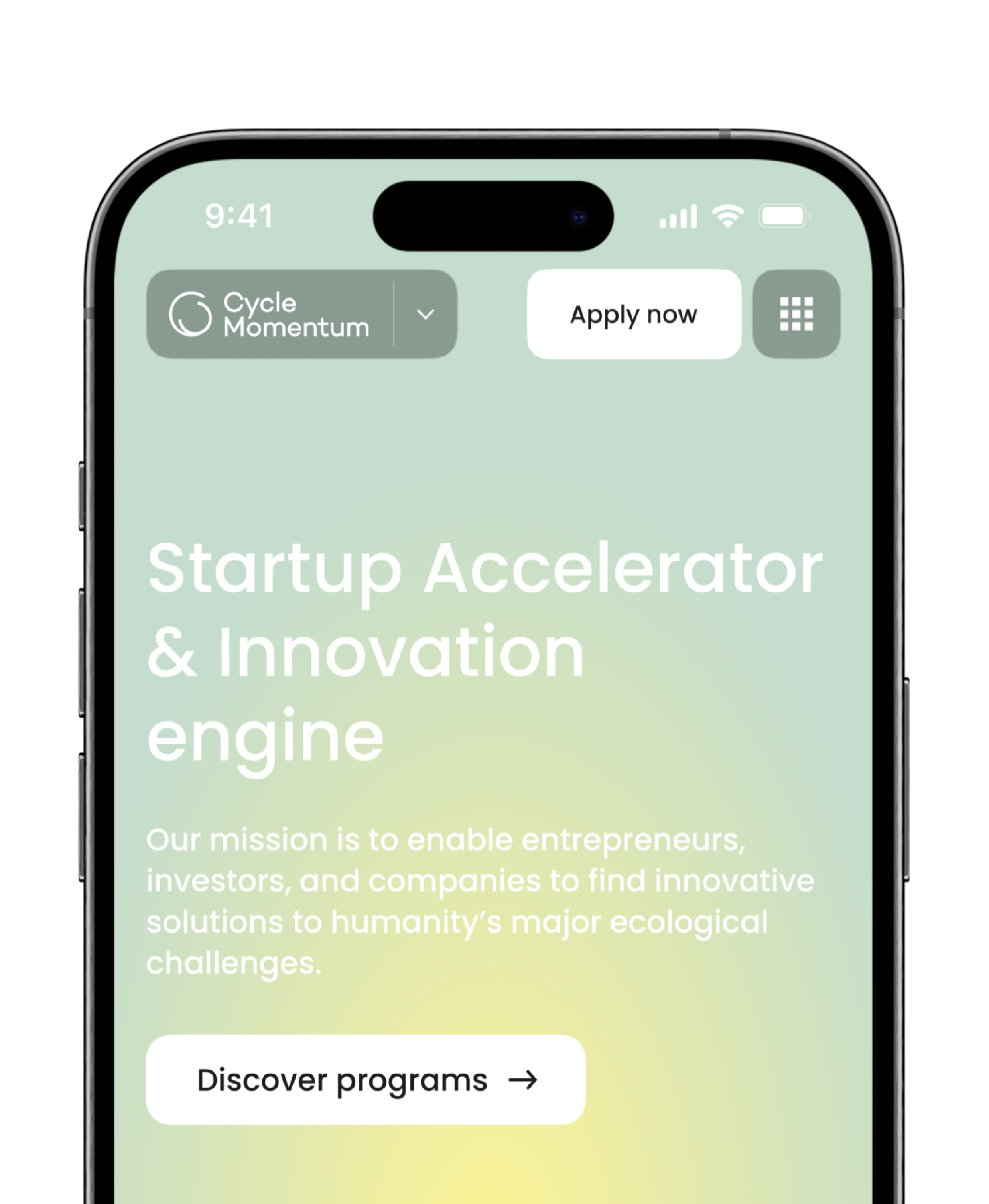
Cycle Momentum is a worldwide collaborative platform for innovators, connecting entrepreneurs, investors, and creative thinkers from all corners of the world.
Colors & typography
Our selection of colors and fonts complements the content, ensuring the focus remains on the key aspects of the organization.
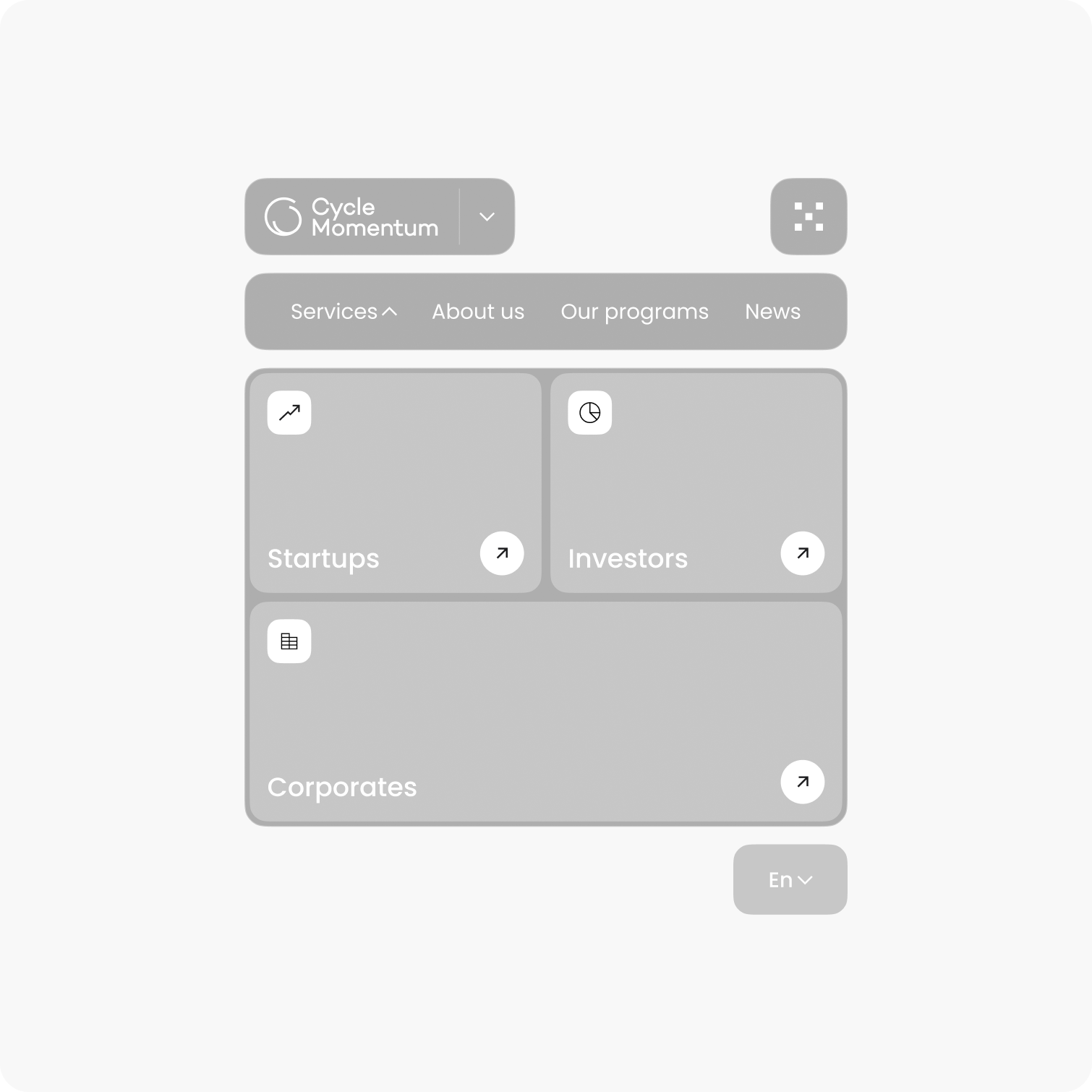
Simplified the user experience by streamlining navigation and implementing a modernized design
Identifying and addressing issues
The design concept was developed following a UX audit. We gathered details about the services, outlined a basic structure, and identified key areas that needed improvement.
Sitemap
The primary issue with the old site was its unclear navigation and overly complex structure. Our initial focus was on streamlining the site’s architecture and reducing the number of pages that lacked informational value or purpose.
UX research results
Each study considered various user interaction scenarios with the startup accelerator’s website.
Design system
Maintaining a consistent design across all services is essential for the platform, so we developed a design system that enables quick interface creation. This system provides a familiar framework for drafting and structuring new programs and services.
UI kit
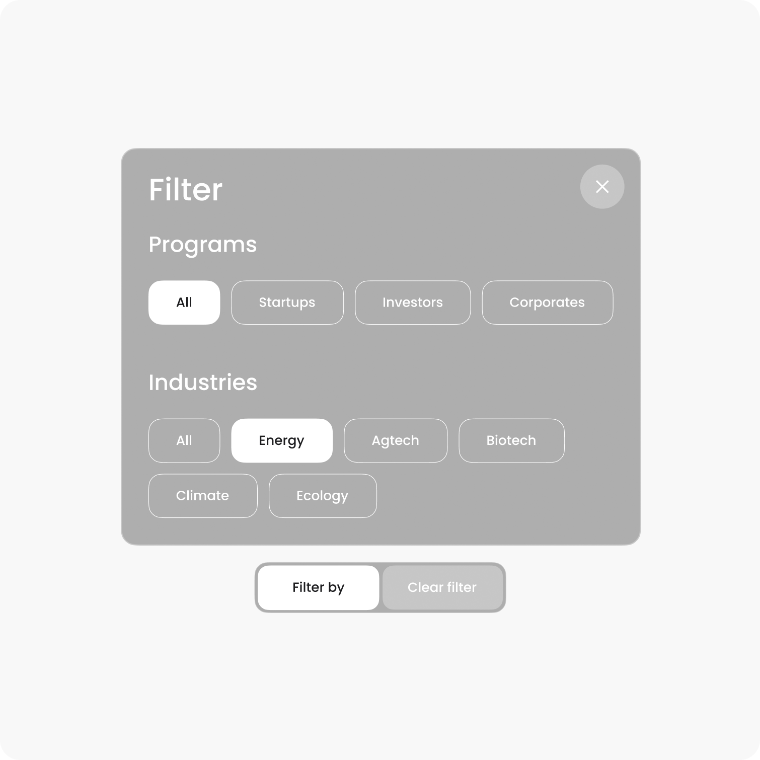
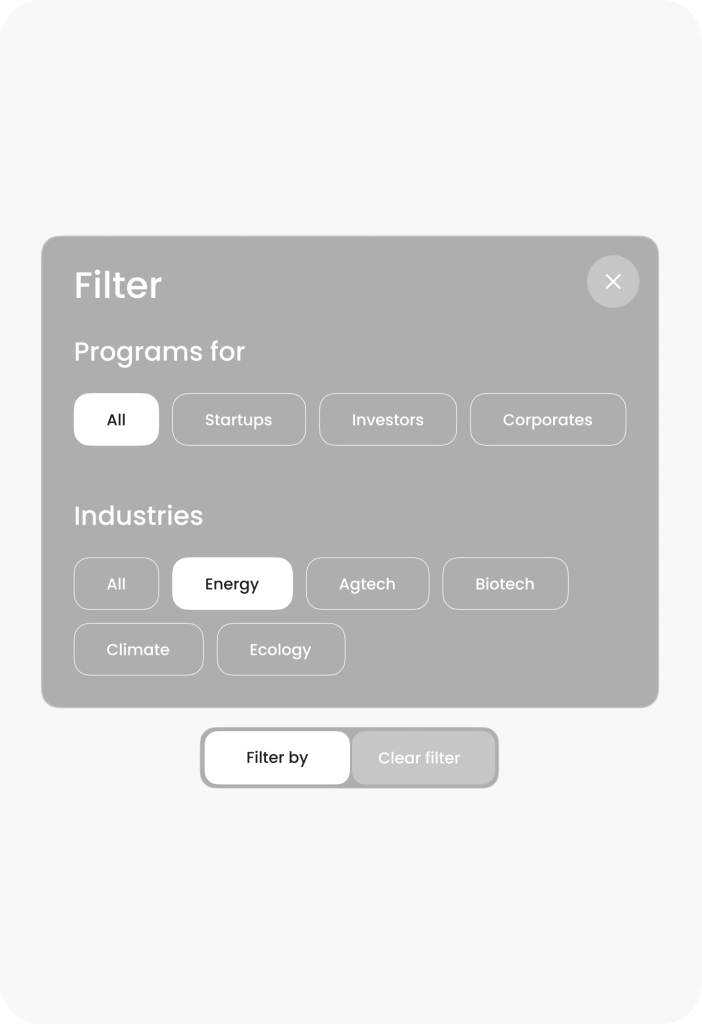
As part of the project, we prepared a UI kit for creating any necessary design elements, aligned with the company’s overall visual concept.
3D visuals
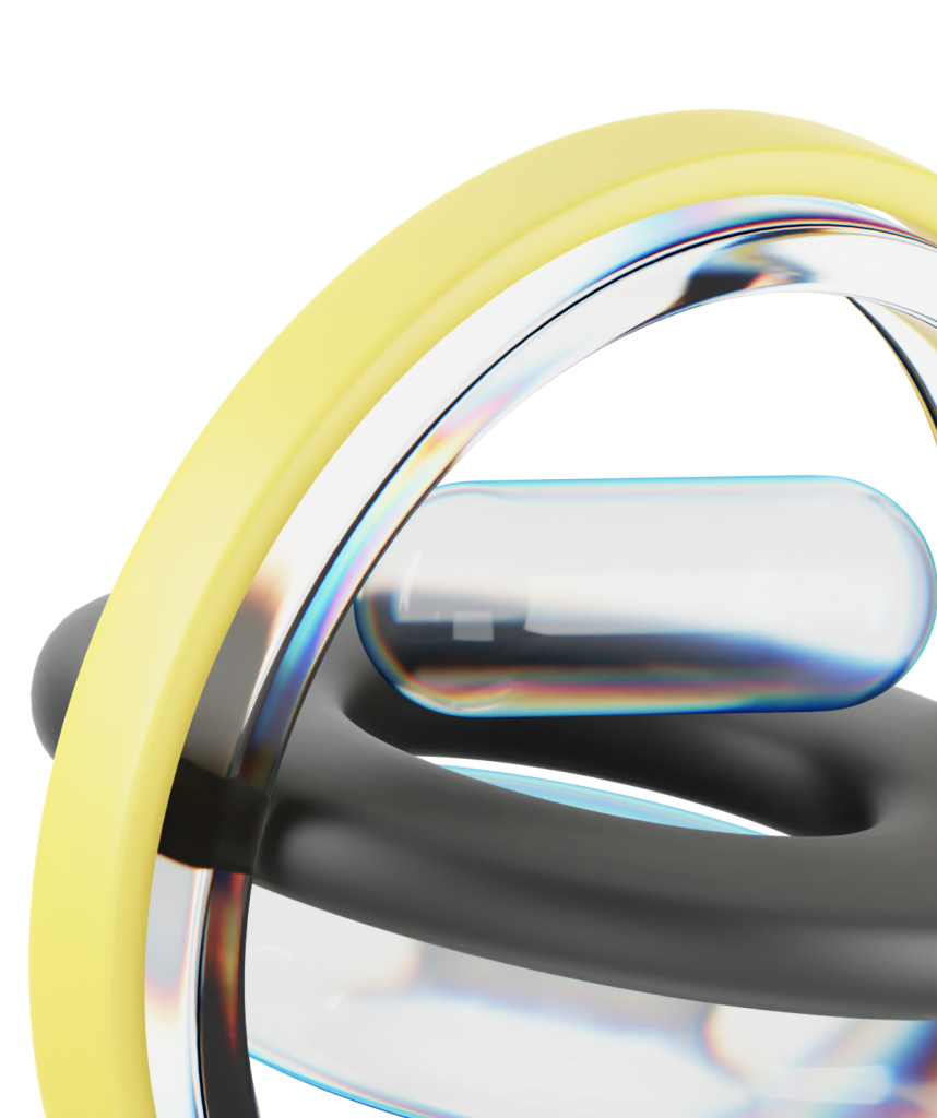
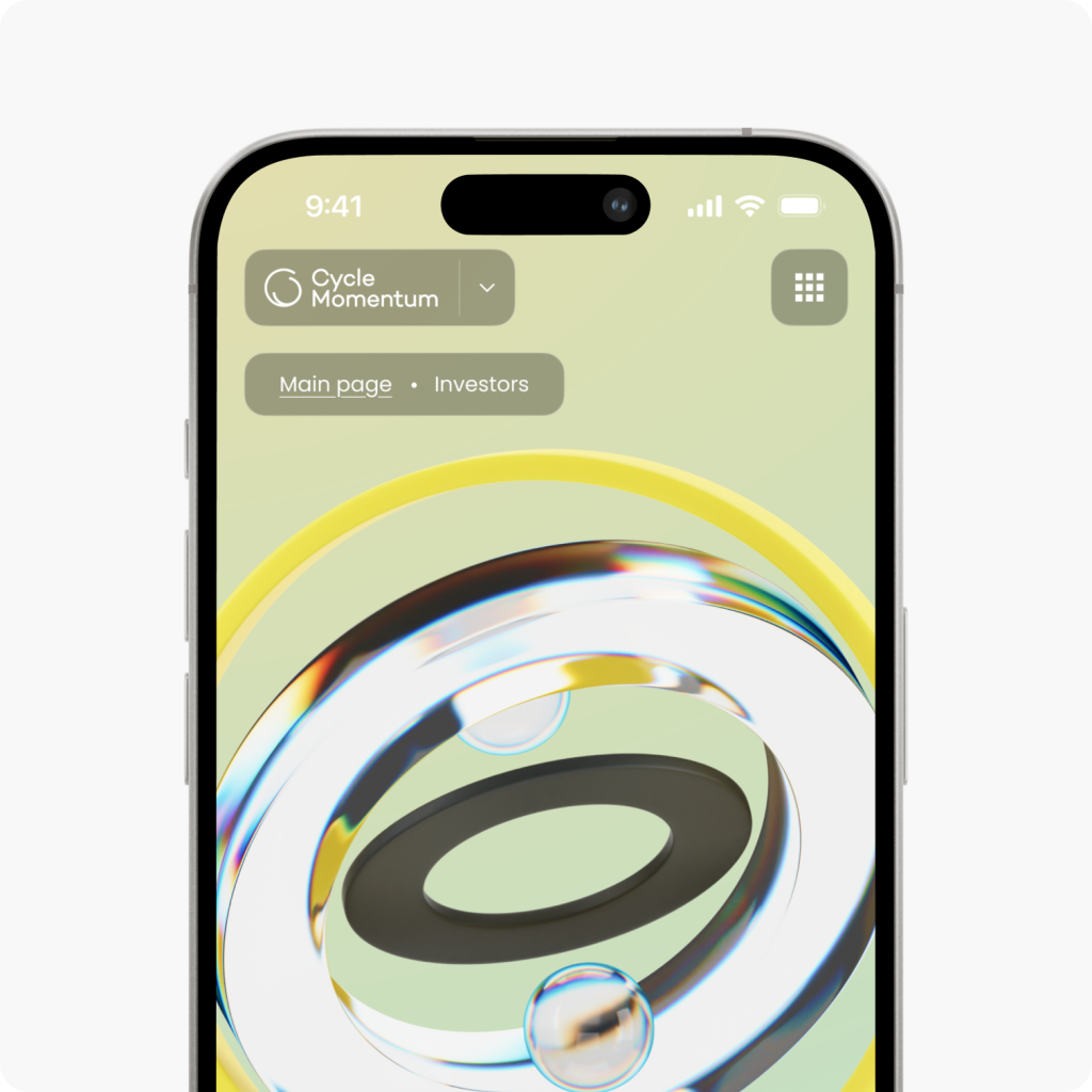
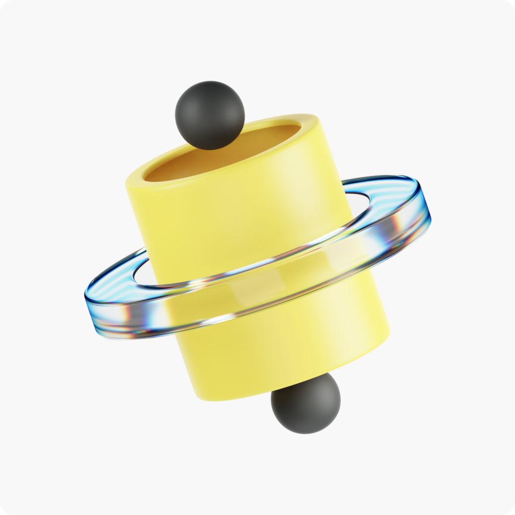
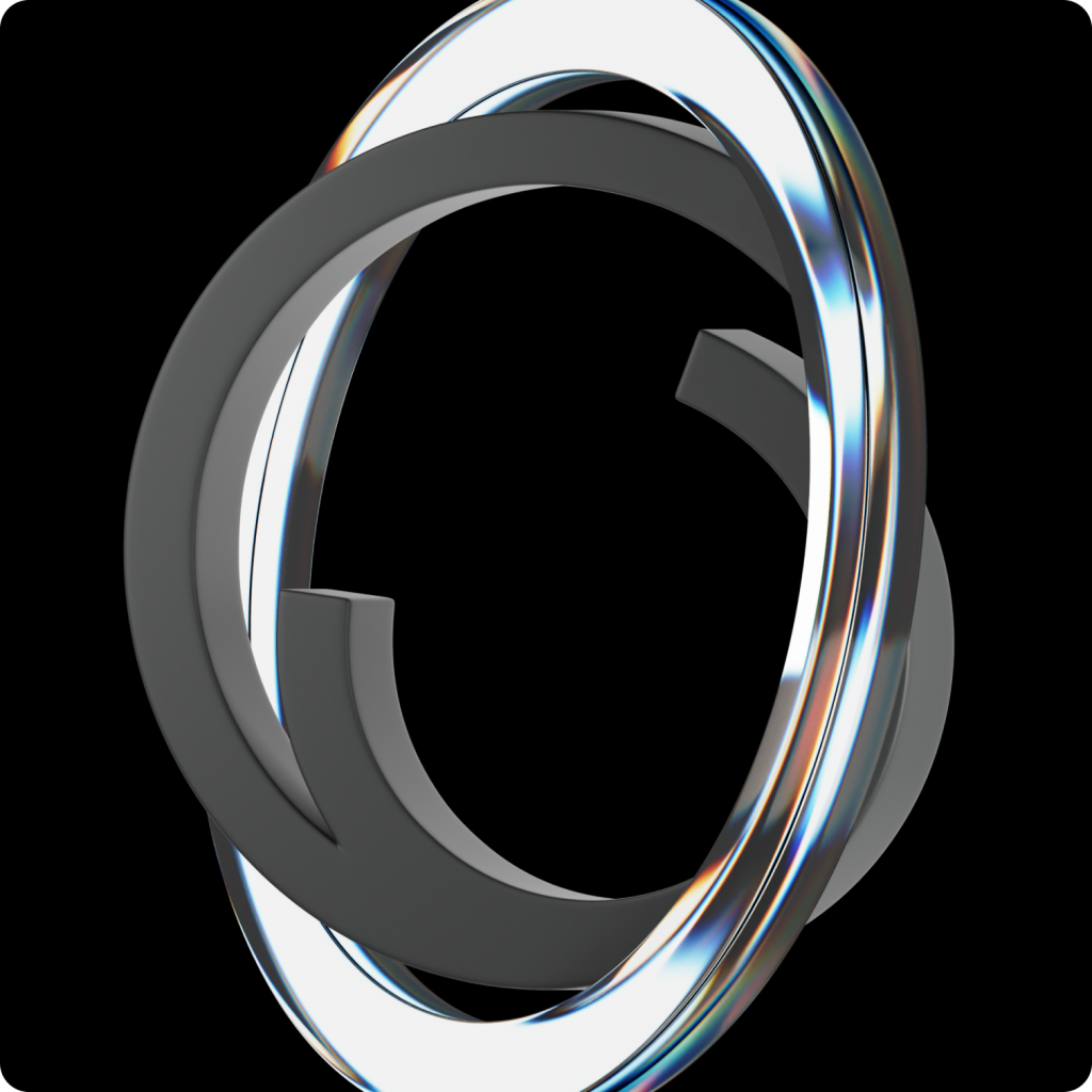
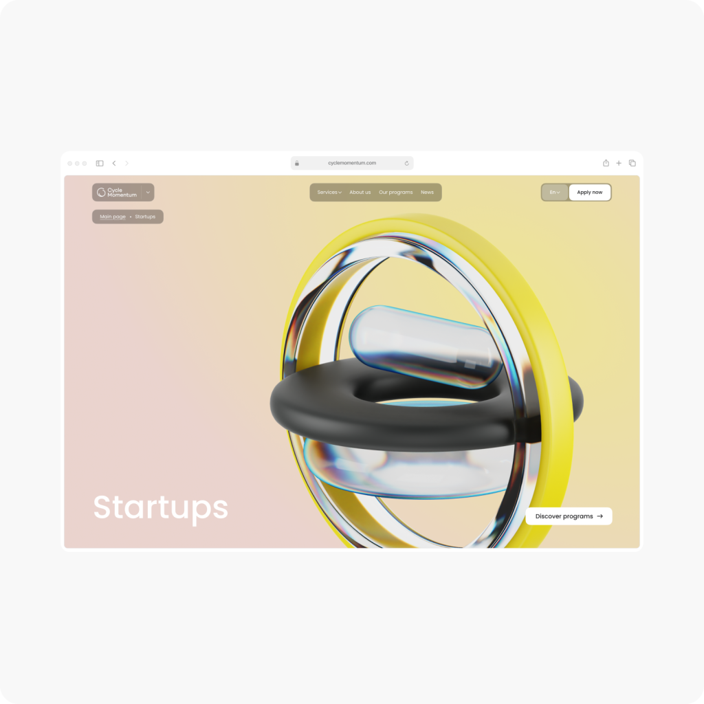
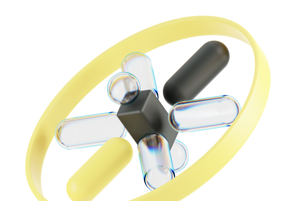
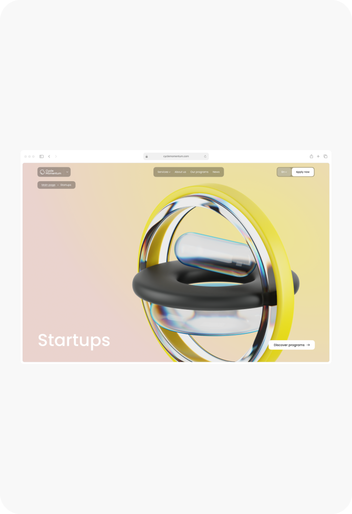
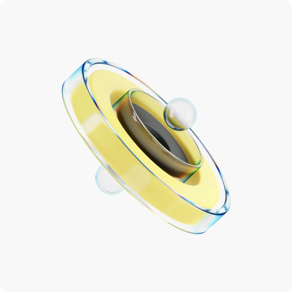
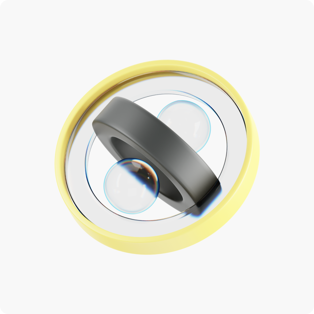
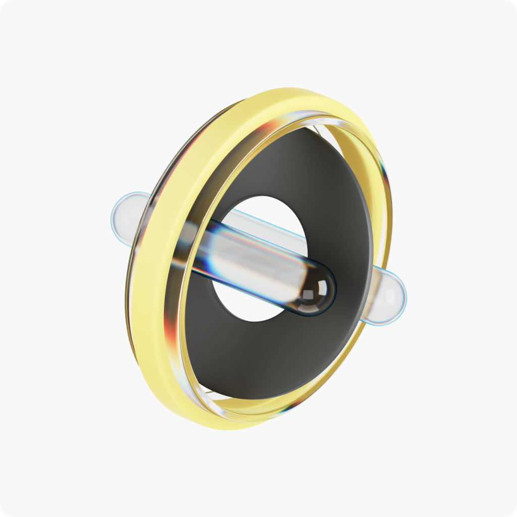
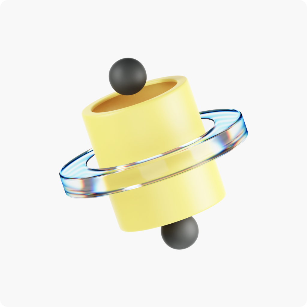
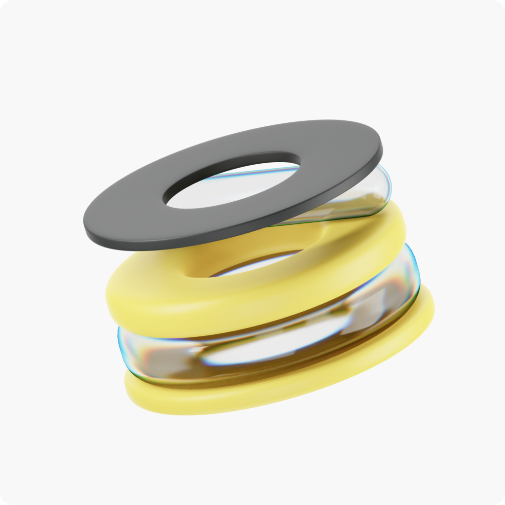
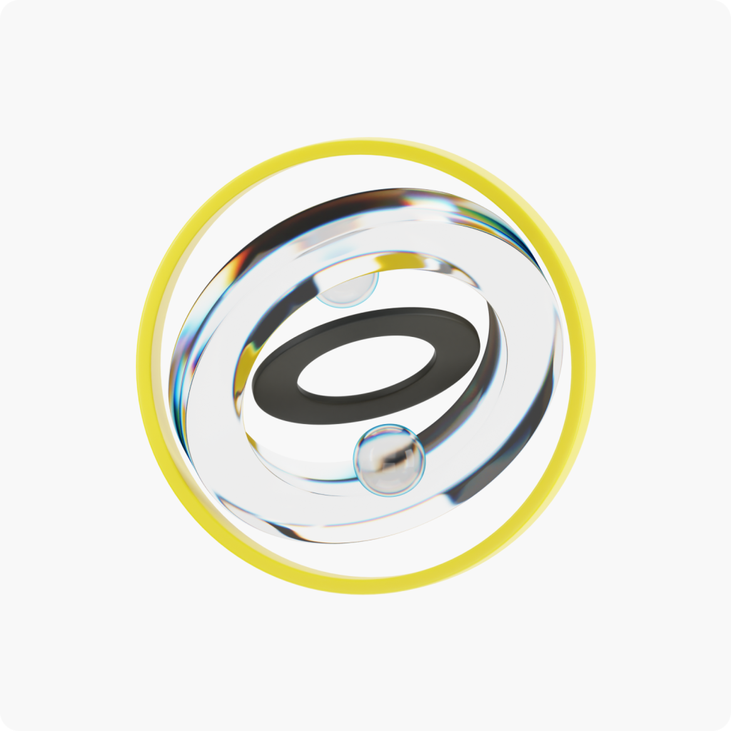
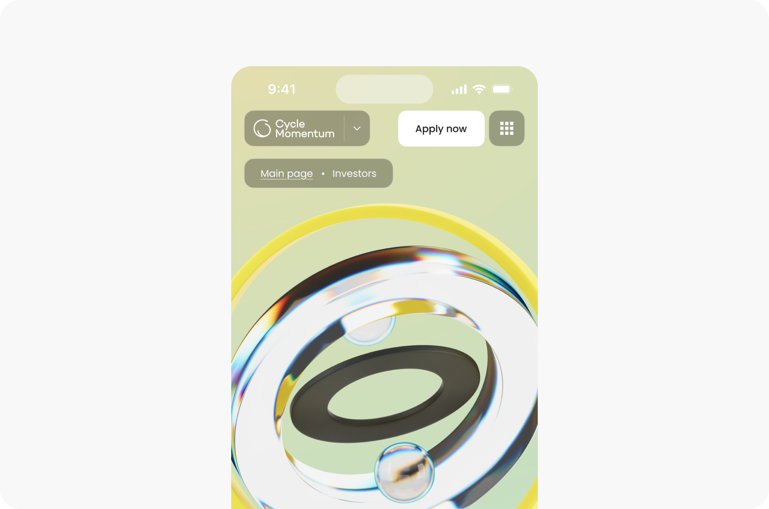
Our CG generalist developed a comprehensive set of 3D illustrations for the platform, designed to be adaptable to various scenarios.
Colors
The platform’s color palette is vibrant yet minimalist, featuring yellow as the signature accent color.
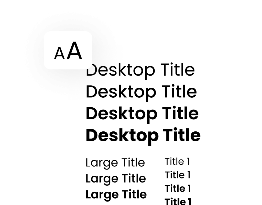
Typography
The Poppins typeface is the foundation of the platform’s typography, used for both headings and body text, following proper typography rules.
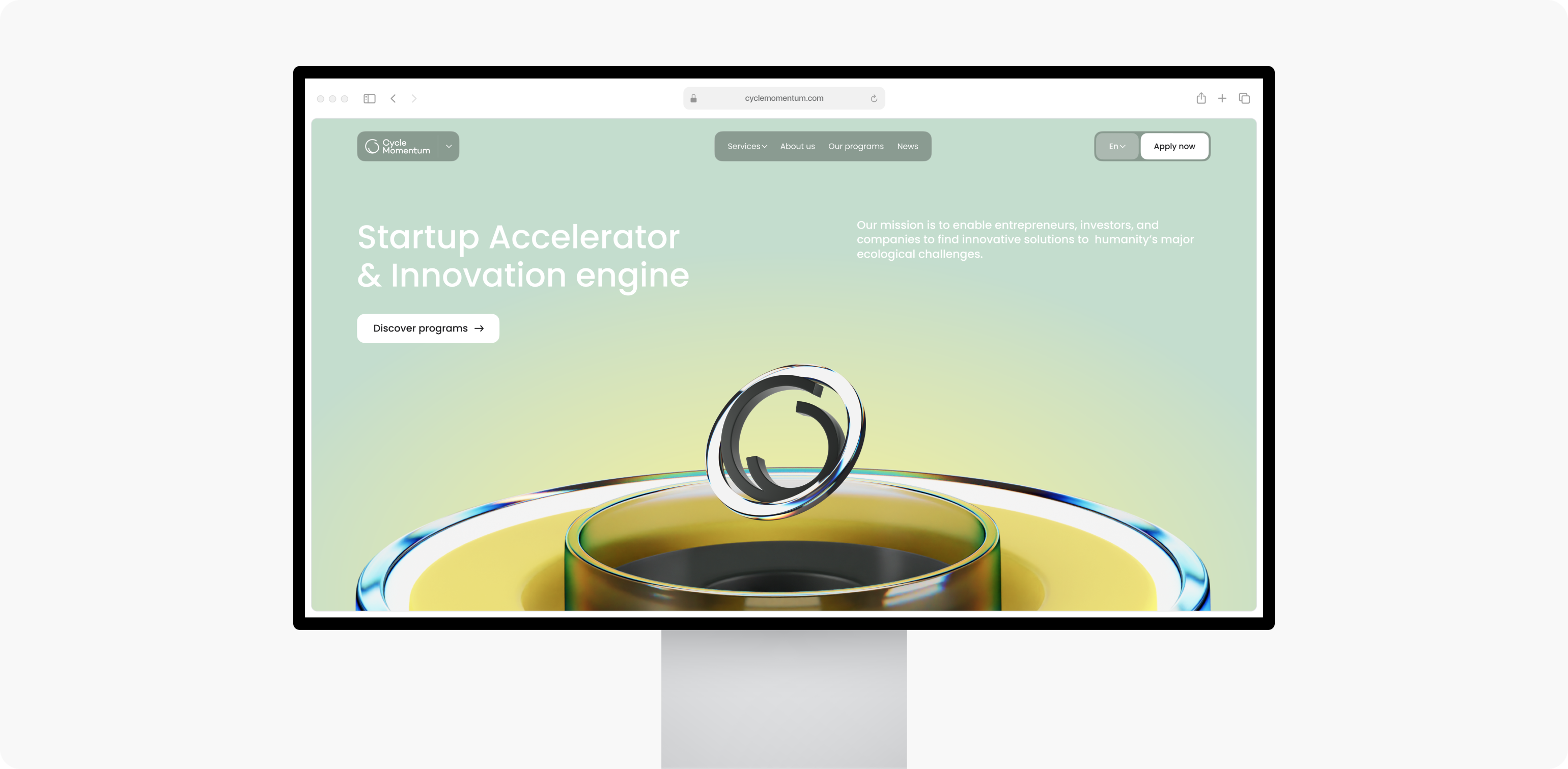
First website interaction
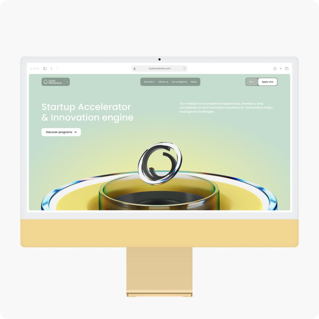
From the very beginning, we immerse the user in the company’s context by introducing its core activities.
Post-redesign traffic and interaction analysis
The new site was launched in the first quarter of 2024. Since then, session duration has increased significantly compared to previous metrics.
Monochrome logo variations

Interface design elements
Throughout the project, many design components, sections, and blocks for the platform were developed, ranging from buttons to icons.
Stylized 3D graphics
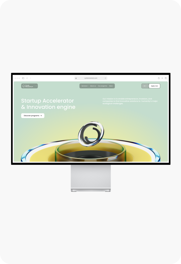
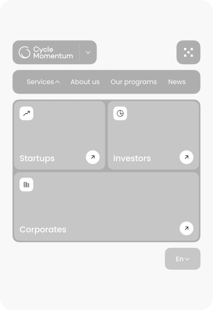
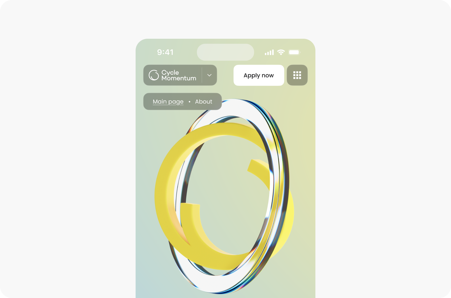
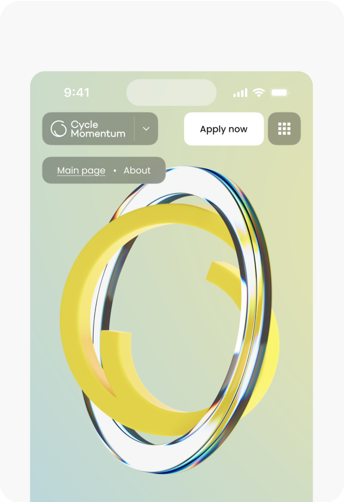
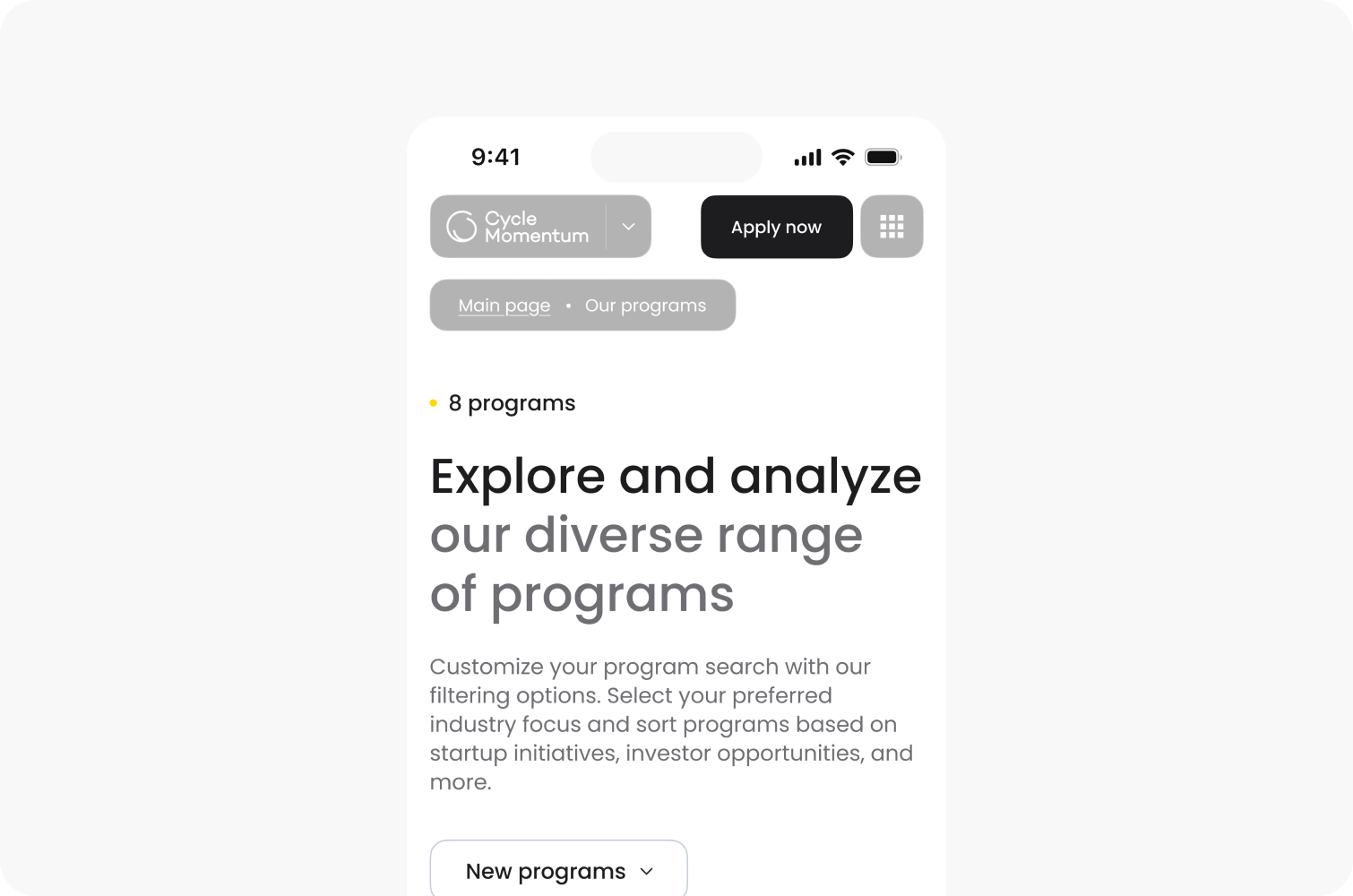
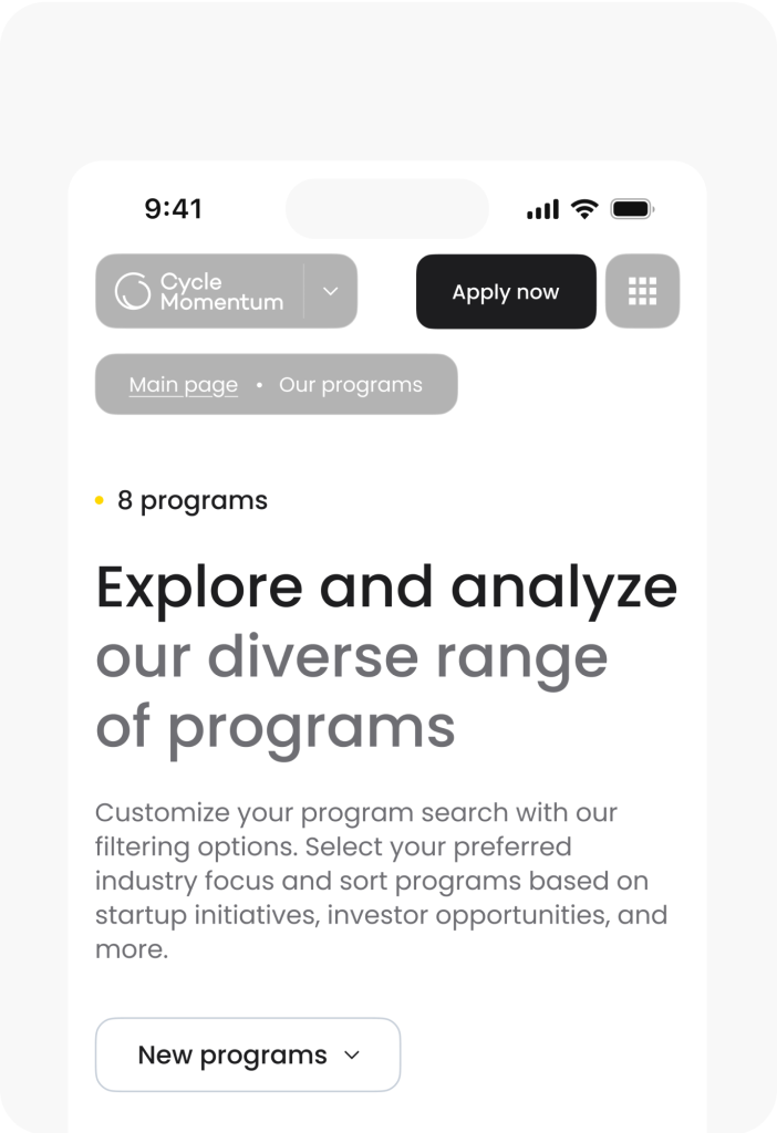
Responsive layout
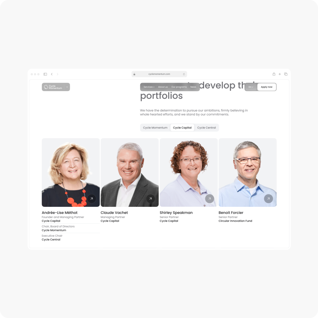
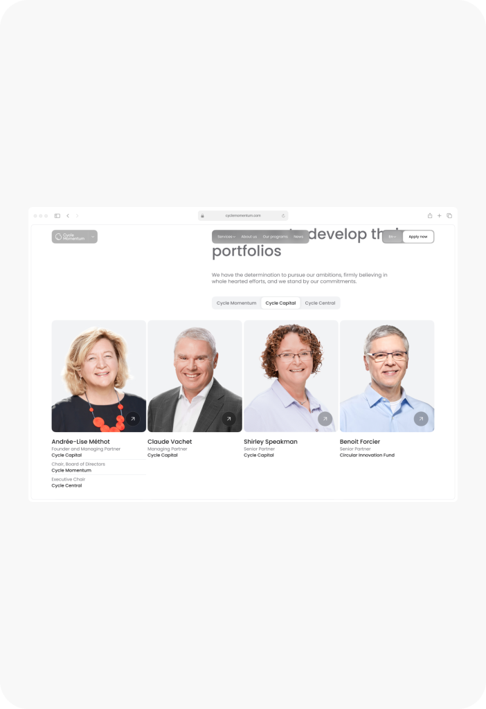
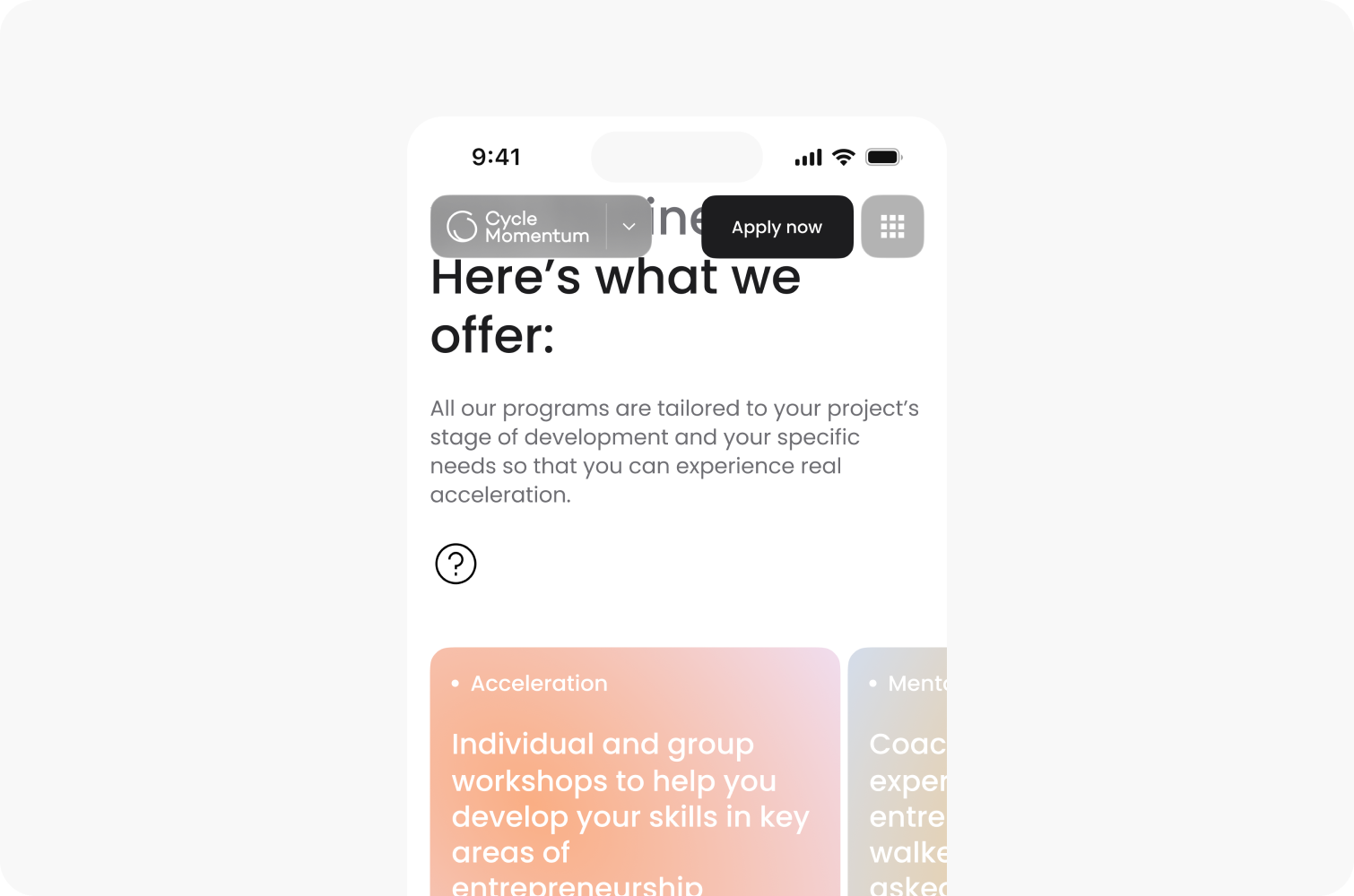
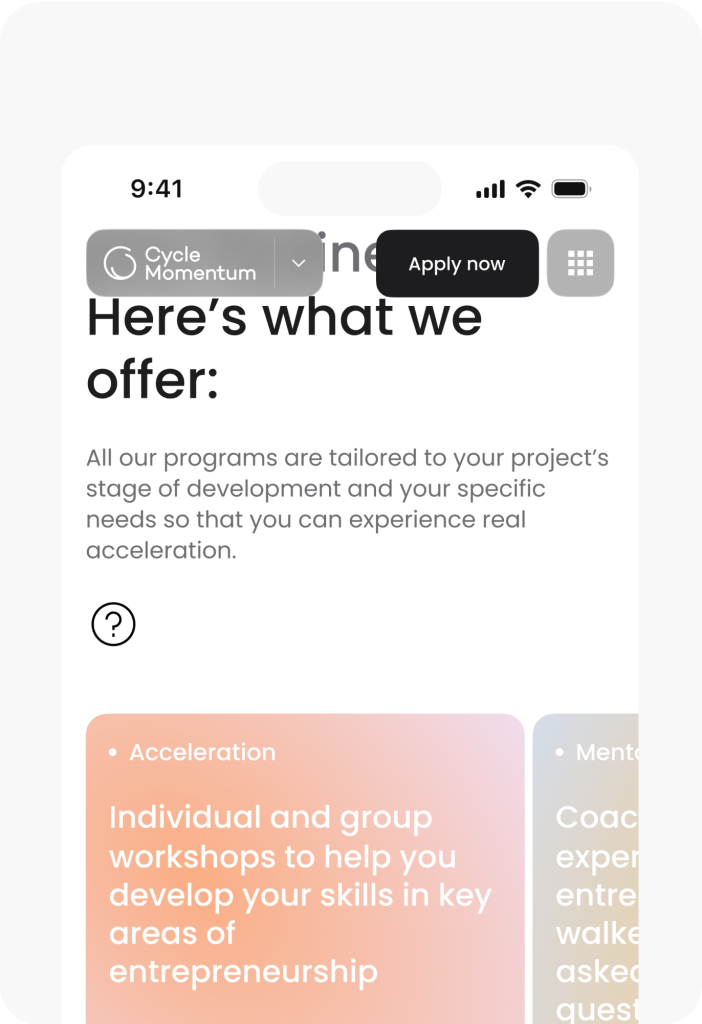
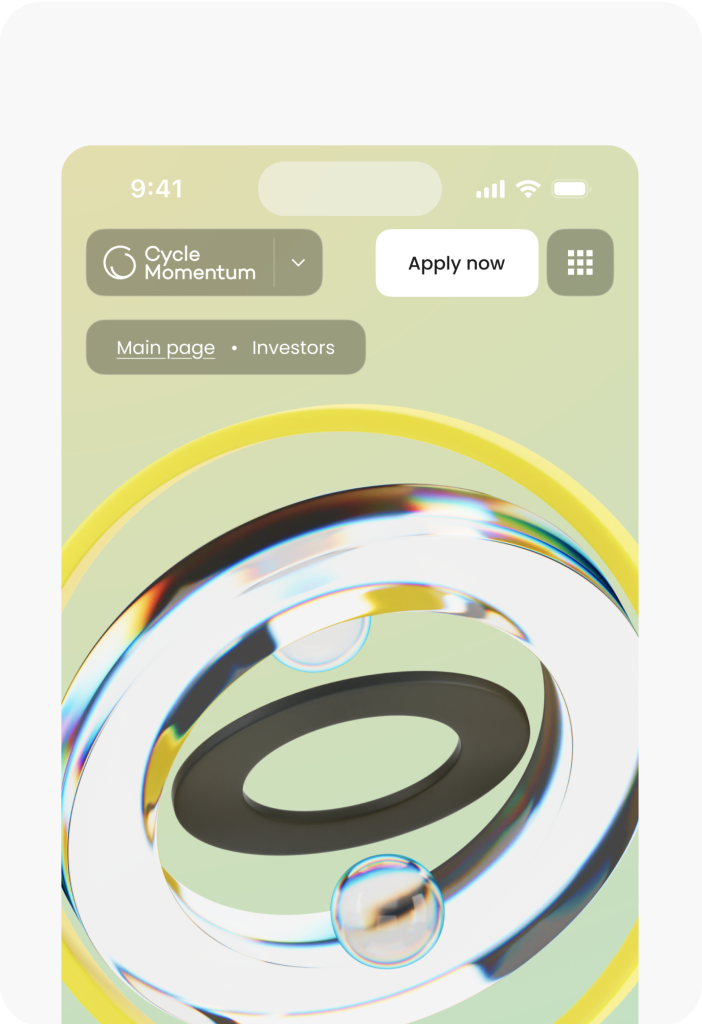
We created dedicated layouts for desktops, tablets, and smartphones, ensuring responsiveness and a smooth user experience across all devices.
Have a project in mind?
Let’s get in touch
Share your project idea with us! If our partnership isn't the right fit, we're happy to provide valuable insights that could still benefit you.
Get in touchView our projects
See how we transform businesses with our research-driven and innovative design approach.


