


Why Startup Web Design Mistakes Cost More Than You Think
Your startup website has 50 milliseconds to make a first impression. That’s faster than a blink of an eye, and for most startups, it’s a make-or-break moment that determines whether potential customers stay or click away forever.
The stakes couldn’t be higher in 2026. With more than 60% of web traffic now coming from mobile devices, and users forming judgments about your credibility within three seconds, even small web design mistakes can devastate your conversion rates and torpedo your growth plans.
Startups are particularly vulnerable to these design pitfalls. Unlike established companies with dedicated design teams and substantial budgets, startups often rely on founders with limited design experience, template-based solutions, or rushed development cycles. The pressure to launch quickly and conserve cash frequently leads to shortcuts that cost far more in the long run.
Research from Baymard Institute shows that overwhelming product pages can increase bounce rates by up to 60%. Meanwhile, studies reveal that clear, well-designed call to action buttons can raise conversion rates by up to 202% compared to poorly designed alternatives. For cash-strapped startups, these differences between success and failure often come down to avoiding fundamental web design mistakes.
This comprehensive guide examines the 15 most critical startup web design mistakes that are killing conversions in 2026. You’ll discover not only what these mistakes look like in practice, but also practical, budget-friendly solutions that any startup can implement to significantly improve conversion rates, build trust with potential customers, and create a foundation for sustainable growth.
Navigation and User Experience Disasters
Confusing or Hidden Navigation Menus
One of the biggest web design mistakes startups make is prioritizing creativity over clarity in their navigation design. While it’s tempting to stand out with innovative menu structures, confusing navigation can drive users away before they understand your value proposition.
The most common navigation mistakes include using ambiguous menu labels, hiding important sections behind dropdown menus, and creating overly complex menu hierarchies. Many startups fall into the trap of using industry jargon or clever wordplay in their navigation, assuming users will understand their terminology. This creates confusion and significantly reduces user engagement.
The 3-click rule remains a fundamental principle of good web design: users should be able to reach any important page on your website within three clicks from your homepage. Nielsen Norman Group research shows that findability can be reduced by over 40% when navigation doesn’t match user expectations or uses nonstandard patterns.
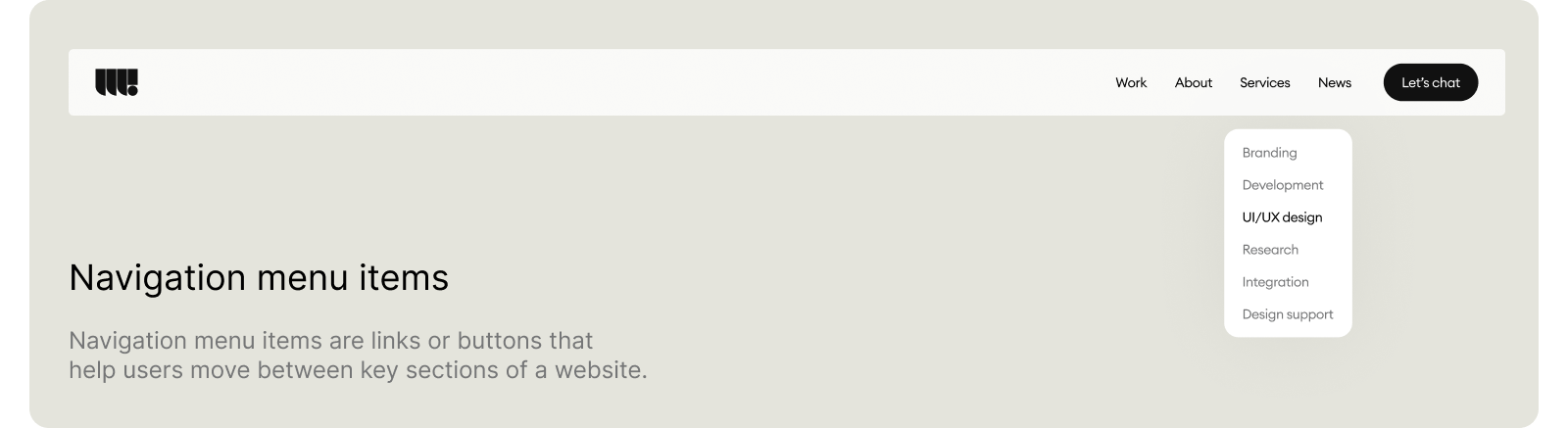
Effective startup navigation follows these principles:
- Use clear, descriptive labels that match user language
- Limit main menu items to 7 or fewer options
- Ensure critical pages like pricing and contact information are easily accessible
- Maintain consistent navigation across all pages
- Include breadcrumb navigation for deeper page hierarchies
One Y Combinator-backed productivity startup redesigned their navigation from a complex, feature-focused structure to a simple outcome-oriented menu. By changing confusing labels like “Workflow Optimization Tools” to straightforward options like “Features,” “Pricing,” and “Get Started,” they saw a 40% improvement in user engagement and a significant boost in trial signups.
Ignoring Mobile-First Design
Mobile traffic dominance is no longer a trend – it’s reality. More than 60% of startup website visits now come from mobile devices, making responsive design absolutely critical for survival. Yet many startups still treat mobile as an afterthought, leading to poor user experience and lost conversions.
Common mobile design mistakes include creating non responsive design layouts that don’t adapt to smaller screens, using text that’s too small to read comfortably, placing call to action buttons too close together for touch navigation, and failing to optimize forms for mobile input.
Google reports that 53% of mobile users abandon websites that take longer than 3 seconds to load. For startups competing for attention in crowded markets, this means that poor mobile optimization directly translates to lost customers and reduced revenue.
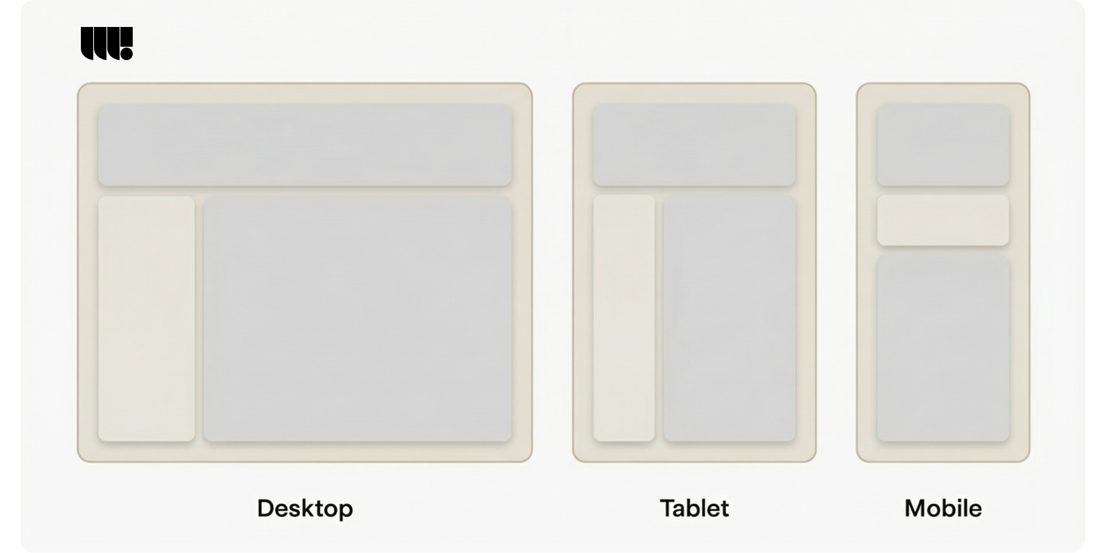
Mobile-first design principles for startups include:
- Design for the smallest screen first, then scale up
- Ensure touch targets are at least 44 pixels for easy tapping
- Use readable font sizes (minimum 16px for body text)
- Optimize images and compress files for faster loading
- Simplify forms and reduce input requirements
- Test on real mobile devices, not just browser simulations
Successful startups prioritize mobile users by creating clean, fast-loading mobile experiences that guide users toward conversion without friction. This approach not only improves user experience but also positively impacts search engine optimization, as Google now uses mobile-first indexing for all websites.
Slow Loading Times That Drive Users Away
Speed sells, and slow websites kill conversions. Page loading speed has become one of the most critical factors affecting startup success, influencing everything from user experience to search engine rankings to customer trust.
Every second of additional load time can decrease conversions by 7%, according to Akamai research. For startups where every conversion matters, this performance penalty can be devastating. Slow loading times particularly hurt mobile users, who expect instant access to information and have less patience for delays.
Common causes of slow loading in startup websites include unoptimized images, excessive third-party plugins, poor hosting choices, and bloated code. Many startups unknowingly sabotage their performance by using heavy themes, loading unnecessary scripts, or failing to implement basic optimization techniques.
Essential speed optimization strategies for startups:
- Compress and optimize all images before uploading
- Choose reliable hosting with good performance metrics
- Minimize HTTP requests by combining CSS and JavaScript files
- Enable browser caching to reduce repeat loading times
- Remove unnecessary plugins and scripts
- Use content delivery networks (CDNs) for faster global access
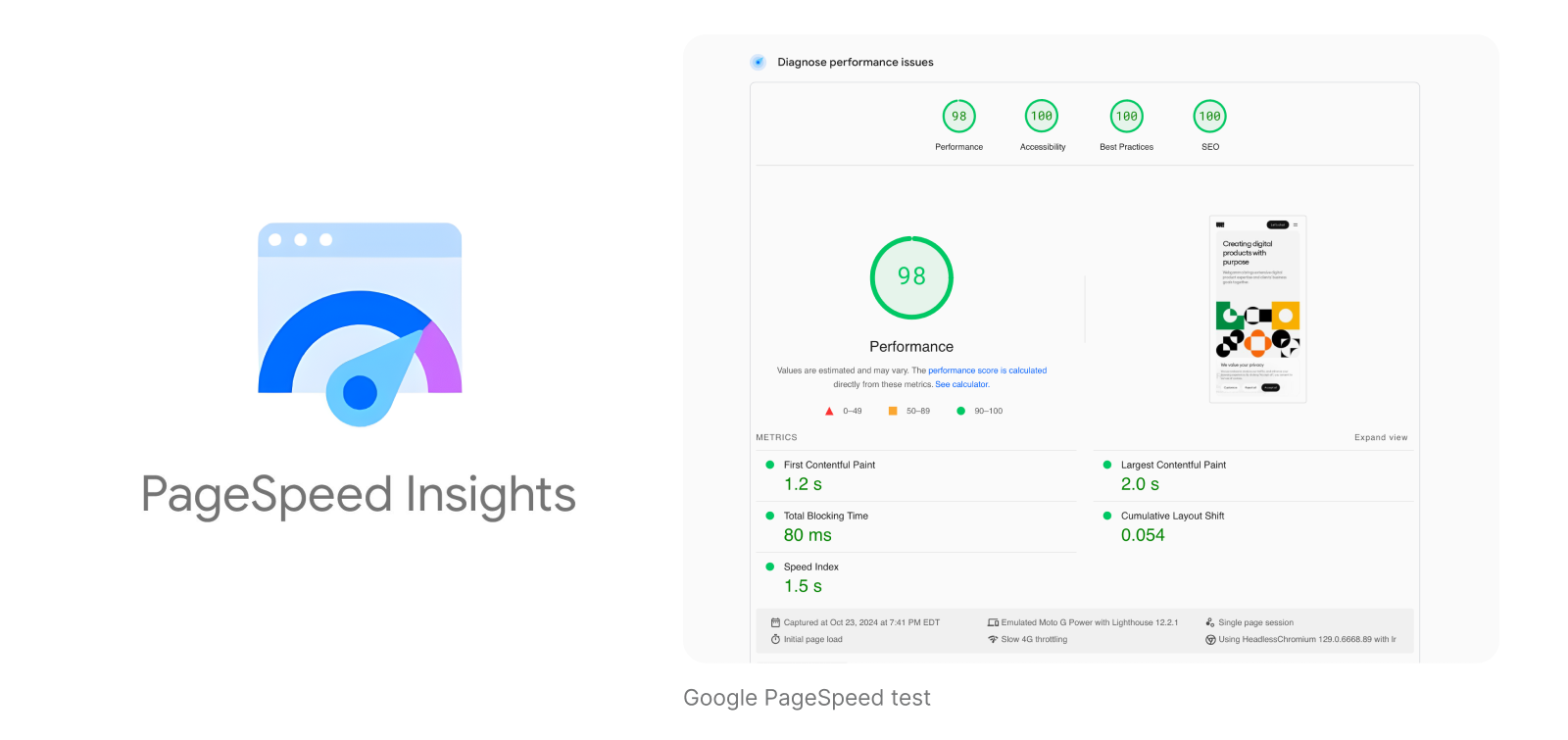
- Monitor loading speed regularly with tools like Google PageSpeed Insights
Speed optimization doesn’t require expensive tools or technical expertise. Simple changes like compressing images, choosing better hosting, and cleaning up unnecessary code can dramatically improve performance and user engagement.
Content and Messaging Failures
Unclear Value Proposition and Messaging
The 5-second rule is unforgiving: visitors should understand what your startup does and why it matters within five seconds of landing on your homepage. Yet many startups fail this critical test by using vague language, industry jargon, or overly complex explanations that confuse rather than clarify.
Common messaging mistakes include focusing on features instead of benefits, using insider terminology that potential customers don’t understand, burying the value proposition beneath multiple paragraphs of text, and trying to appeal to everyone rather than speaking directly to target audience needs.
Your value proposition should answer three fundamental questions: What do you do? Who do you do it for? Why should they care? The most effective startup websites lead with clear, outcome-oriented headlines that immediately communicate the benefit users will receive.
A framework for creating compelling value propositions:
- Identify the specific problem you solve: Be precise about the pain point your startup addresses
- Articulate the outcome or benefit: Focus on what users gain, not what your product does
- Differentiate from alternatives: Explain why your solution is better than existing options
- Use customer language: Test your messaging with real users to ensure clarity
- Lead with the most important benefit: Put the strongest value proposition front and center
Successful startups craft messaging that resonates immediately with their target audience. Instead of saying “Revolutionary workflow optimization platform,” effective messaging might say “Save 10 hours per week on project management.” This outcome-focused approach helps potential customers instantly understand the value and encourages deeper engagement with your website.
Weak or Missing Call-to-Action Buttons
Call to action buttons are the bridge between visitor interest and customer conversion. Yet many startup websites feature weak calls to action that fail to motivate users or, worse, confuse them about what step to take next.
Common CTA mistakes include using generic text like “Learn More” or “Click Here” displaying too many competing CTAs on a single page, poor button placement that requires scrolling or searching, weak visual design that doesn’t stand out, and unclear next steps after users click.
Effective CTAs combine compelling copy, strategic placement, and strong visual design. The most successful startup CTAs focus on specific outcomes and use action-oriented language that creates urgency or excitement about the next step.
Best practices for startup CTA design:
- Use specific, action-oriented copy: “Start Your Free Trial” is more effective than “Learn More”
- Create visual contrast: CTAs should stand out from surrounding elements
- Limit choices: One primary CTA per page reduces decision paralysis
- Place strategically: Position CTAs where users naturally look (above the fold, after value propositions)
- Test different variations: A/B testing can reveal significant performance differences
- Match the user’s journey: Early visitors need different CTAs than repeat visitors
Research from Unbounce shows that optimized CTAs can improve conversion rates by over 200% compared to generic alternatives. For startups, this improvement can mean the difference between struggling to acquire customers and achieving sustainable growth.
Content That Doesn’t Address User Needs
Too many startups create content from their own perspective rather than their users’ viewpoint. This inside-out approach leads to websites that talk about features, technical specifications, and company achievements while ignoring the questions and concerns that actually matter to potential customers.
User-centered content focuses on solving problems, addressing concerns, and guiding visitors toward making confident decisions. This approach requires understanding your target audience deeply enough to anticipate their questions, concerns, and decision-making process.
Creating user personas helps guide content strategy by providing concrete representations of your ideal customers. These personas should include demographic information, goals and challenges, preferred communication styles, and decision-making criteria. Well-developed personas inform everything from headline copy to feature descriptions to testimonial selection.
Effective startup content strategy includes:
- Problem-focused headlines: Start with the user’s pain point, not your solution
- Benefit-driven feature descriptions: Explain what users gain, not just what the feature does
- Social proof and testimonials: Include real customer stories that address common concerns
- Clear next steps: Guide users through their decision-making process
- Scannable formatting: Use headers, bullet points, and visual elements to improve readability
The most successful startup websites tell a story that resonates with their target audience’s experience. They acknowledge challenges, present solutions, provide evidence, and make it easy for users to take the next step. This user-focused approach builds trust and significantly improves conversion rates.
Visual Design and Branding Mistakes
Using Generic Stock Photos and Low-Quality Images
Visual elements play a crucial role in building trust and credibility, yet many startups undermine their professional image by relying on generic stock photos or using low-quality images throughout their websites. These choices signal inattention to detail and can make even innovative startups appear untrustworthy or unprofessional.
Generic stock photos create several problems for startup websites. They fail to differentiate your brand from competitors, often look staged or inauthentic, may appear on multiple websites, and miss opportunities to showcase your actual product, team, or customers.
Low-quality images compound these problems by suggesting that your startup doesn’t pay attention to important details. Pixelated logos, stretched images, and poor lighting in team photos all contribute to an unprofessional appearance that drives away potential customers and investors.

Affordable alternatives to expensive custom photography include:
- Product screenshots and mockups: Show your actual software or service in action
- Authentic team photos: Use natural lighting and real workplace settings
- Customer-generated content: Feature real users with your product
- High-quality free resources: Platforms like Unsplash offer professional photos
- Simple graphics and illustrations: Clean, custom graphics often work better than stock photos
- User interface elements: Screenshots of your actual product provide authenticity
Image optimization remains crucial for website performance. Large, uncompressed images slow loading times and hurt both user experience and search engine optimization. Startups should compress all images, use appropriate file formats (WebP for modern browsers, JPEG for photos, PNG for graphics), and implement responsive images that scale appropriately for different screen sizes.
Inconsistent Visual Identity and Branding
Visual consistency builds trust and recognition, yet many startup websites suffer from inconsistent branding that confuses users and weakens brand identity. This problem often develops gradually as different team members make updates or as startups evolve without maintaining design standards.
Common consistency issues include using multiple fonts across pages, inconsistent color usage and brand elements, varying logo treatments and sizes, mixed design styles and button appearances, and inconsistent spacing and layout patterns.
Research from Lucidpress shows that maintaining brand consistency across all digital assets can increase revenue by up to 23%. For startups building brand recognition and customer trust, this consistency becomes even more critical.
Essential brand elements that require consistency:
- Color palette: Define primary, secondary, and accent colors with specific hex codes
- Typography: Choose 2-3 fonts maximum and specify usage for headers, body text, and captions
- Logo usage: Create guidelines for size, spacing, and color variations
- Button styles: Maintain consistent appearance for primary and secondary actions
- Spacing and layout: Use consistent margins, padding, and grid systems
Creating a simple brand style guide helps maintain visual consistency across your website and marketing materials. This guide doesn’t need to be elaborate – a single page documenting colors, fonts, logo usage, and basic design principles can prevent many consistency problems.
Small startups can use design tools like Figma, or Adobe XD to create templates that ensure consistent branding. These tools often include brand kit features that automatically apply your colors, fonts, and logos to new designs.
Poor Typography and Color Choices
Typography and color choices significantly impact readability, accessibility, and user perception, yet many startups make poor decisions that hurt their website’s effectiveness. These design elements communicate professionalism and attention to detail while affecting how easily users can consume your content.
Common typography mistakes include using too many different fonts, choosing decorative fonts for body text, insufficient contrast between text and background, inconsistent font sizing and spacing, and poor readability on mobile devices.
Color-related problems often include insufficient contrast for accessibility, using colors that don’t align with brand personality, overwhelming users with too many bright colors, and poor color combinations that strain the eyes or reduce readability.
Best practices for startup typography and color:
- Limit font choices: Use no more than 2-3 font families across your entire website
- Ensure readability: Body text should be at least 16px on mobile devices
- Test contrast ratios: Use tools like WebAIM’s contrast checker to ensure accessibility
- Choose appropriate fonts: Sans-serif fonts often work better for digital reading
- Consider loading performance: Web fonts can slow loading times if not optimized
- Test on real devices: Typography that looks good on desktop may be unreadable on mobile
Color psychology plays an important role in user perception and brand communication. Blue often conveys trust and reliability, making it popular for B2B startups. Green suggests growth and stability, while orange and red create urgency and excitement. However, cultural considerations and accessibility requirements should always take precedence over color psychology.
Free tools for choosing effective color palettes include Coolors.co, Adobe Color, and Paletton. These resources help startups create harmonious color schemes that work well together and maintain sufficient contrast for accessibility.
Trust and Credibility Issues
Missing or Hard-to-Find Contact Information
Contact information serves as a fundamental trust signal, yet many startup websites make the critical mistake of hiding or minimizing this essential element. When potential customers can’t easily find ways to reach your company, they may question your legitimacy or worry about post-purchase support.
Missing contact information particularly hurts B2B startups, where buyers often want to speak with someone before making significant purchasing decisions. Even B2C startups benefit from clear contact options, as they signal transparency and customer service commitment.
Common contact information mistakes include relegating contact details to hard-to-find footer links, providing only email addresses without phone numbers, using generic contact forms without response time expectations, failing to include physical addresses when relevant, and not providing multiple contact options for different needs.
Essential contact elements for startup websites:
- Multiple contact methods: Email, phone, and live chat options when possible
- Clear response time expectations: Let users know when they can expect replies
- Physical address: Include location information for local businesses
- Team member information: Consider showing key contacts with photos and roles
- Social media links: Provide additional ways for users to connect
- Hours of operation: Set clear expectations for availability
Well-designed contact pages also improve search engine optimization by providing local SEO signals and helping search engines understand your business location and legitimacy. Google and other search engines favor websites with clear, consistent contact information.
Startups should make contact information easily accessible from every page, typically through header navigation or prominent footer placement. The contact page itself should be comprehensive while remaining easy to scan and use.
Lack of Social Proof and Trust Signals
Social proof and trust signals help overcome the natural skepticism potential customers feel toward unfamiliar companies. Startups, lacking established reputation and brand recognition, must work harder to demonstrate credibility and build confidence in their offerings.
Many startups underutilize available social proof opportunities or fail to display trust signals prominently. This oversight can significantly impact conversion rates, as users often look for validation from others before making purchasing decisions or sharing personal information. Incorporating social proof effectively is also a vital component of the web design process, ensuring your site’s credibility and boosting user confidence.
Types of social proof:
- Customer testimonials: Real quotes from satisfied users with names and companies
- Case studies: Detailed success stories showing specific results
- User reviews and ratings: Authentic feedback from actual customers
- Client logos: Display recognizable companies that use your product
- Usage statistics: Number of users, companies served, or transactions processed
- Media mentions: Press coverage, awards, or industry recognition
- Expert endorsements: Recommendations from industry leaders or influencers
Trust signals that enhance credibility include security badges for e-commerce functionality, professional certifications and memberships, privacy policy and terms of service links, SSL certificates and secure payment processing, money-back guarantees or free trial offers, and team photos with brief professional backgrounds.
Creating authentic social proof when starting out requires creativity and persistence.
Early-stage startups can:
- Offer free trials or pilot programs in exchange for testimonials
- Partner with other startups for mutual endorsements
- Seek coverage in relevant industry publications
- Participate in startup competitions and accelerator programs
- Build relationships with industry experts and thought leaders
The key is displaying social proof prominently where users are making decisions – near call to action buttons, on pricing pages, and throughout the conversion funnel.
Technical and Performance Problems
Poor Accessibility and Inclusive Design
Accessible design isn’t just morally important – it’s legally required in many jurisdictions and affects up to 25% of your potential audience. The CDC estimates that 1 in 4 U.S. adults has a disability, making accessibility both an ethical imperative and a business opportunity that many startups overlook.
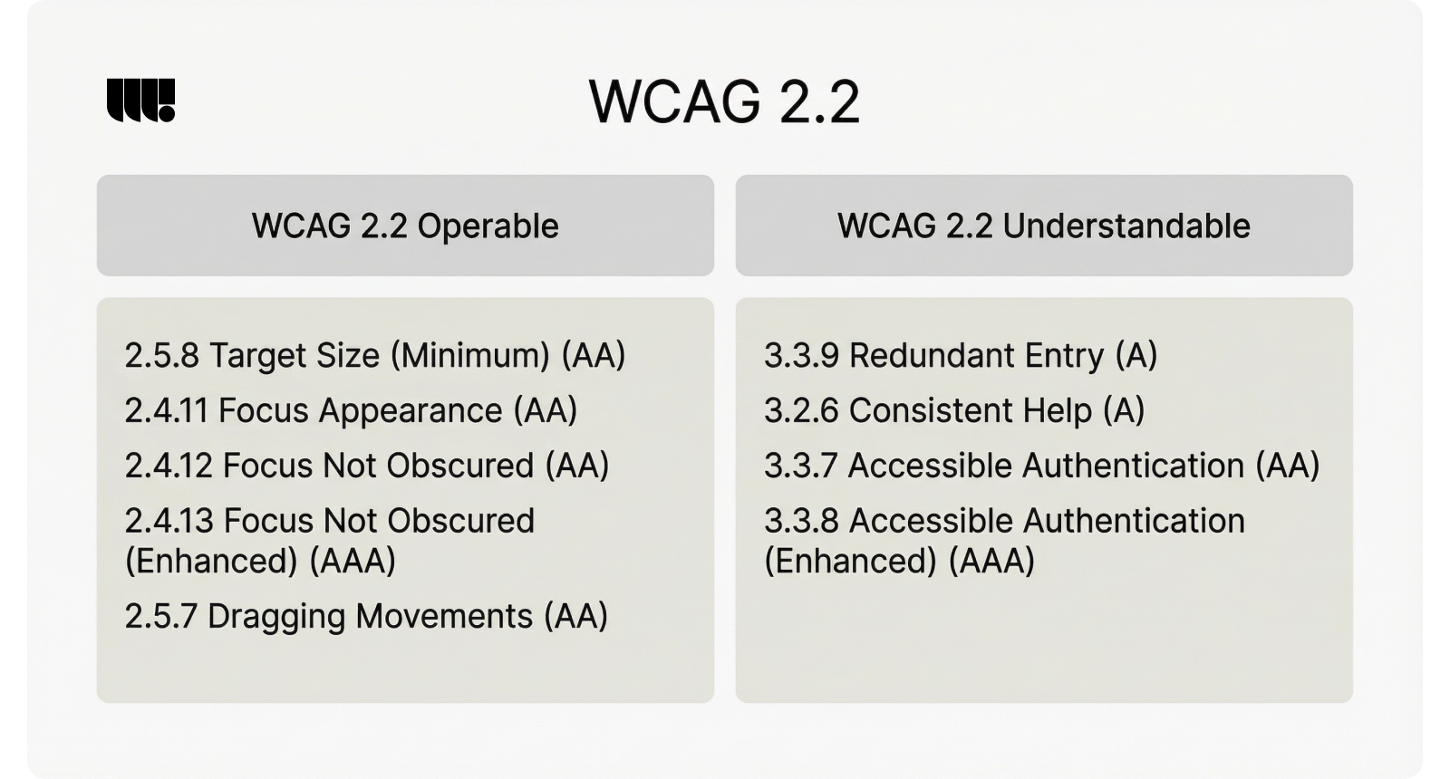
Poor accessibility can lead to legal liability under regulations like the Americans with Disabilities Act (ADA) and Web Content Accessibility Guidelines (WCAG 2.1). Beyond legal requirements, accessible design often improves usability for all users, not just those with disabilities.
Common accessibility mistakes in startup websites include insufficient color contrast for text and backgrounds, missing alt text for images and graphics, non-navigable interfaces for keyboard users, lack of proper heading structure and ARIA labels, inaccessible forms without clear labels and error messages, and videos without captions or transcripts.
Simple accessibility improvements any startup can implement:
- Use sufficient color contrast: Aim for at least 4.5:1 ratio for normal text
- Add descriptive alt text: Describe the content and function of all images
- Create logical heading structure: Use H1, H2, H3 tags in proper hierarchy
- Enable keyboard navigation: Ensure all interactive elements work without a mouse
- Label form inputs clearly: Use proper labels and provide helpful error messages
- Test with assistive technologies: Use screen readers and other accessibility tools
Free accessibility testing tools include WAVE (Web Accessibility Evaluation Tool), axe DevTools, and Lighthouse accessibility audits. These tools help identify common issues and provide specific recommendations for improvements.
Many accessibility improvements also enhance search engine optimization, as search engines rely on many of the same structural elements that assistive technologies use to understand web content.
Broken Forms and Poor User Feedback
Forms serve as critical conversion points on startup websites, yet broken or poorly designed forms can destroy user trust and eliminate potential customers. Form-related issues are particularly damaging because they occur at the moment users have decided to engage with your company.
Common form problems include validation errors that don’t clearly explain the problem, required fields that aren’t marked appropriately, forms that lose data when submission errors occur, unclear progress indicators for multi-step processes, excessive information requests that create friction, and mobile-unfriendly input fields and layouts.
User feedback extends beyond forms to include error messages, loading indicators, and confirmation messages. Poor feedback leaves users confused about whether their actions succeeded and what they should do next.
Best practices for startup form design:
- Request only essential information: Every additional field reduces conversion rates
- Provide clear validation messages: Explain exactly what needs to be fixed
- Use appropriate input types: Email, phone, and date fields should use proper HTML5 types
- Show progress for multi-step forms: Help users understand how much remains
- Save data during the process: Don’t make users re-enter information after errors
- Optimize for mobile input: Consider touch keyboards and screen size limitations
- Test thoroughly: Submit forms with various inputs to identify problems
Well-designed forms can significantly improve conversion rates. Simple changes like reducing form fields, improving error messages, or adding progress indicators often yield dramatic improvements in completion rates.
Form analytics help identify where users abandon the process and which fields cause the most problems. Tools like Hotjar, Google Analytics Enhanced Ecommerce, or specialized form analytics platforms provide insights into form performance and optimization opportunities.
Neglecting SEO Basics
Search engine optimization matters from day one for startup visibility, yet many founders treat SEO as an afterthought or advanced marketing tactic. Basic SEO implementation costs little but can significantly impact your startup’s discoverability and organic growth potential.
Common SEO mistakes that hurt startup websites include missing or poorly written title tags and meta descriptions, lack of proper heading structure and keyword optimization, slow loading times that hurt search rankings, missing schema markup and local SEO elements, duplicate content across pages, and broken internal and external links.
On-page SEO for startup websites:
- Optimize title tags: Include primary keywords and compelling descriptions under 60 characters
- Write meta descriptions: Create unique, compelling summaries for each page under 160 characters
- Use heading hierarchy: Structure content with proper H1, H2, H3 tags
- Optimize for relevant key phrases: Include important terms naturally in content
- Create descriptive URLs: Use clean, keyword-rich URLs for all pages
- Add schema markup: Help search engines understand your content and business information
- Build internal links: Connect related pages to improve navigation and SEO
- Optimize images: Use descriptive filenames and alt text for all visuals
Free SEO tools for startups include Google Search Console, Google Analytics, Google My Business for local SEO, Yoast SEO plugin for WordPress, and various keyword research tools like Google Keyword Planner.
SEO implementation should align with user needs rather than attempting to manipulate search results. The best SEO strategies focus on creating valuable, well-structured content that serves your target audience while following technical best practices.
How to Avoid These Mistakes: Action Plan for Startups
Identifying and fixing web design mistakes requires a systematic approach that balances available resources with potential impact. This action plan helps startups prioritize improvements and implement changes efficiently.
Step 1: Audit Your Current Website
Create a checklist covering all major areas:
- Technical performance: Test loading speed, mobile responsiveness, and basic functionality
- Navigation and usability: Review menu structure, search functionality, and user flow
- Content and messaging: Evaluate clarity, relevance, and alignment with user needs
- Visual design: Check consistency, image quality, and brand alignment
- Trust signals: Verify contact information, social proof, and security elements
- Accessibility: Test with accessibility tools and keyboard navigation
- SEO basics: Review title tags, meta descriptions, and technical SEO elements
Step 2: Prioritize Fixes Based on Impact and Resources
Not all mistakes require immediate attention. Prioritize based on:
- High impact, low effort: Quick wins that significantly improve user experience
- Critical functionality: Broken forms, slow loading, or mobile issues
- Trust and credibility: Missing contact information or poor visual quality
- Conversion-focused: CTA improvements, messaging clarity, or navigation fixes
Step 3: Budget-Friendly Tools and Resources
Many improvements require tools rather than expensive custom web development:
- Low-code design tools (Website builders): Framer, or Webflow for web design updates
- Image optimization: TinyPNG, Squoosh, or built-in compression tools
- Speed testing: Google PageSpeed Insights, GTmetrix, or Pingdom
- Accessibility: WAVE, axe DevTools, or Lighthouse audits
- SEO: Google Search Console
- Analytics: Google Analytics, Hotjar for user behavior insights
Step 4: DIY vs. Professional Help Decision Framework
Determine when to handle improvements internally versus hiring help:
DIY appropriate for:
- Content updates and messaging improvements
- Basic SEO optimization and meta tag updates
- Image compression and optimization
- Form field reduction and simplification
- Contact information and trust signal additions
Professional help recommended for:
- Complex technical issues or custom web development
- Complete visual rebranding or major UI/UX design overhauls
- Advanced performance optimization or server-side improvements
- Custom accessibility implementations
- Comprehensive UX research and user testing methods
Step 5: Implementation Timeline
Create a realistic timeline that doesn’t disrupt business operations:
- Week 1: Address critical functionality issues (broken forms, slow loading)
- Week 2-3: Implement quick wins (CTA improvements, contact information)
- Month 2: Tackle visual consistency and content improvements
- Month 3: Focus on advanced optimization and testing programs
- Ongoing: Regular monitoring, testing, and iterative improvements
This systematic approach ensures steady progress without overwhelming limited startup resources or disrupting core business activities.
Testing and Optimization for Continuous Improvement
Continuous improvement requires ongoing testing and optimization rather than one-time fixes. Successful startups build testing into their regular workflow to identify new opportunities and validate UI/UX design decisions.
User Testing on Limited Budgets
User testing doesn’t require expensive research firms or elaborate testing facilities.
Startups can gather valuable insights through:
- Guerrilla testing: Quick, informal testing with friends, family, or coffee shop patrons
- Remote testing tools: Platforms like UserTesting or Loom
- Survey tools: Post-visit surveys or exit-intent surveys to gather feedback
- Social media outreach: Ask followers to test specific features or pages
- Customer interviews: Include website feedback in regular customer conversations
Effective user testing focuses on specific questions rather than general feedback. Test particular user flows, specific page elements, or new features to gather actionable insights.
Simple A/B Testing Methods
A/B testing helps validate design changes and optimize conversion rates.
Startups can implement simple tests using:
- Free tools from Google: Free A/B testing platform integrated with Google Analytics
- WordPress plugins: Simple testing tools for WordPress-based websites
- Social media ads: Test different headlines, images, or calls to action
- Email campaigns: Test subject lines, button text, or layout variations
- Landing page builders: Many platforms include built-in testing capabilities
Start with high-impact, easy-to-test elements like headlines, CTA button text, form fields, or pricing page layouts. Focus on one element at a time to clearly identify what drives improvements.
Analytics and Monitoring Tools
Regular monitoring helps identify problems and opportunities:
- Google Analytics: Track user behavior, conversion rates, and traffic sources
- Google Search Console: Monitor search performance and technical issues
- Heat mapping tools: Understand how users interact with your pages
- Speed monitoring: Regular performance testing and alerts for slow pages
- Uptime monitoring: Ensure your website remains accessible to users
Creating a Culture of Continuous Improvement
Sustainable optimization requires systematic approaches:
- Regular review schedules: Weekly or monthly website performance reviews
- Customer feedback integration: Include website feedback in customer success processes
- Team training: Ensure team members understand basic UX and conversion principles
- Documentation: Track what works and what doesn’t for future reference
- Experimentation mindset: Encourage testing new ideas and learning from failures
The most successful startups treat their websites as living documents that evolve based on real user feedback and performance data. This approach leads to steady improvements in user experience, conversion rates, and business results.
Small, consistent improvements compound over time to create significant competitive advantages. By avoiding the major startup web design mistakes outlined in this guide and implementing regular testing and optimization practices, startups can build websites that effectively support their growth objectives and create positive experiences for potential customers.
The key is starting with the basics – clear navigation, fast loading times, mobile optimization, and compelling calls to action – then gradually optimizing based on real user behavior and feedback. This practical approach helps startups maximize their limited resources while building websites that convert visitors into loyal customers and support long-term business success.
Remember that effective web design serves your users first and your business goals second. When you focus on creating genuinely helpful, accessible, and engaging experiences for website visitors, conversions and business growth naturally follow. If you feel stuck or don’t have the in-house expertise, you can also reach out to a professional web design agency that understands startup realities and can help you avoid costly missteps. Avoid these common web design mistakes, implement regular testing and optimization, and watch your startup website become a powerful engine for customer acquisition and business growth.


