Mastering UI/UX Design for 2025
This guide, serves as a comprehensive resource for both seasoned designers and newcomers. It covers everything from user research and prototyping to the latest tools and methodologies.
Whether you’re refining your skills or just starting, this guide will equip you with the knowledge to craft exceptional digital experiences that leave a lasting impact.
In 2025, the focus on user engagement and accessibility will be more critical than ever. As users expect more personalized and seamless digital experiences, working with a leading user experience design agency and focusing on strong UI/UX design is key to creating digital products that truly meet their needs.
With this guide, you’ll gain insights into creating designs that not only look good but also function intuitively and inclusively.
What Is UI/UX Design?
UI/UX design is at the core of creating meaningful and effective digital experiences. While the terms UI (User Interface) and UX (User Experience) are often used interchangeably, they refer to different yet complementary aspects of the design process. Understanding the nuances of each is essential for any designer aiming to create products that truly connect with users.
Understanding UX Design
“Design is how it works.” – Steve Jobs
UX design is a user-centered approach focused on the overall experience a user has when interacting with a product or service. It goes beyond aesthetics, considering how the product works, how easy it is to use, and how it makes the user feel. Good UX design requires a deep understanding of user needs, motivations, and behaviors.
In today’s digital environment, where users form impressions in milliseconds, the importance of UX design cannot be overstated. Effective UX/UI design ensures that a product is not only functional but also enjoyable to use, which is key to fostering user loyalty and satisfaction.
UX design encompasses several disciplines, including user research, information architecture, experience strategy, and interaction design. Each discipline plays a critical role in shaping the overall user experience, from how information is structured to the emotional journey users experience when interacting with a product.
Exploring UI Design
“A good user interface is invisible.” – Jeff Raskin
UI design is about the look and feel of a digital product. It focuses on creating intuitive interfaces that allow users to interact with a product effortlessly. This involves designing visual elements such as buttons, menus, and icons, as well as defining the overall layout and aesthetic of the product.
While UX design is about the overall experience, UI design is concerned with the specifics of the interface that the user interacts with. A well-designed UI ensures that the interface is visually appealing and easy to navigate, enhancing the overall user experience.
UI design also considers accessibility, ensuring the product is usable by everyone, regardless of their abilities. This includes considerations such as color contrast for readability, text size, and interactive elements that are easy to use.
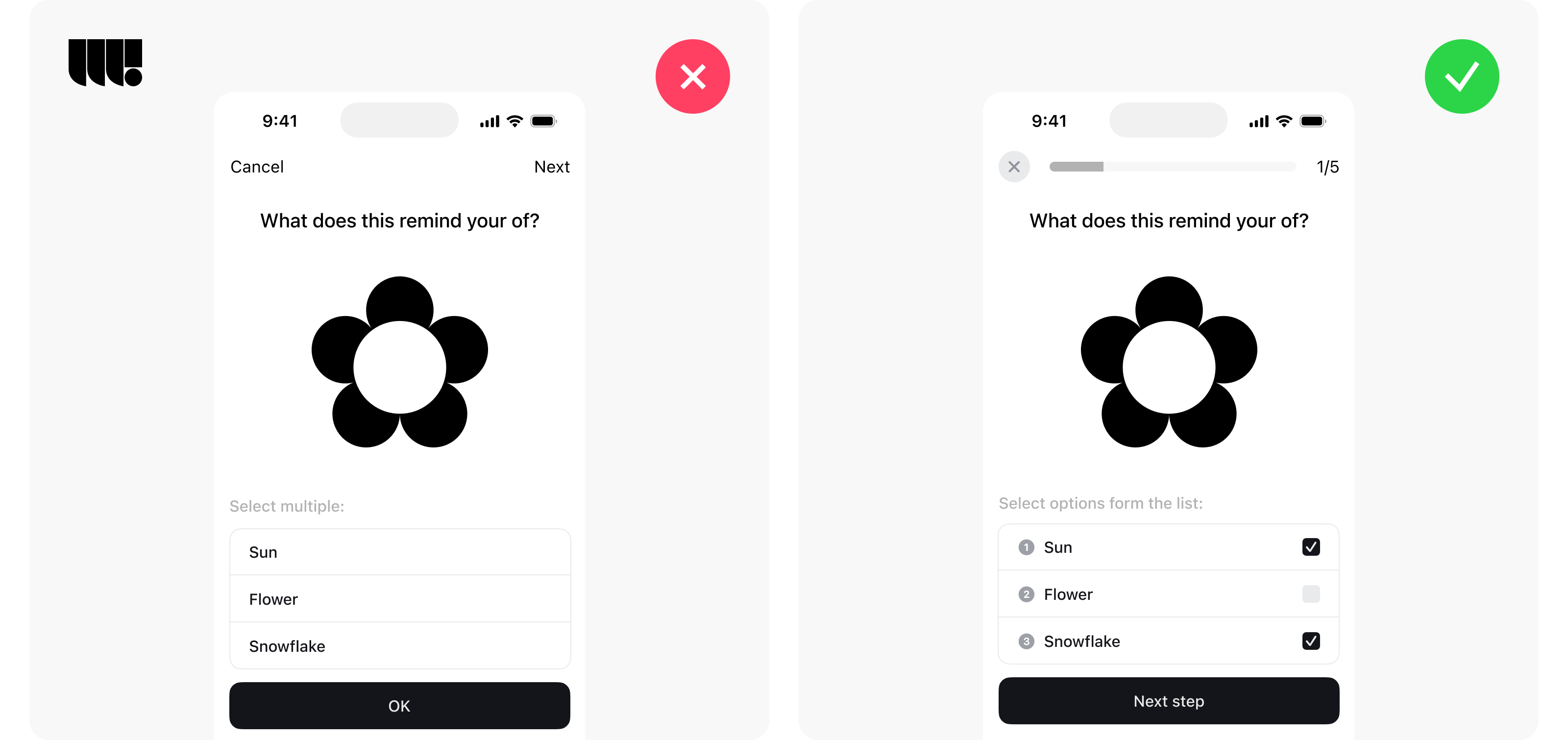
UX vs. UI: Understanding the Differences and Their Roles in Product Design
While UX (User Experience) and UI (User Interface) design are often grouped together, they serve distinct purposes within the design process. Both are crucial to creating a successful product, but they address different aspects of user interaction.
The Role of UX Design in Shaping Experiences
“Good design is as little design as possible.” – Dieter Rams
UX design focuses on the user’s journey through a product, aiming to make it as smooth, intuitive, and enjoyable as possible. This involves understanding user needs through research, creating user personas, mapping out user flows, and continuously testing and refining the experience. UX designers are responsible for ensuring the product solves the user’s problem efficiently and satisfyingly.
A successful UX design anticipates user needs and eliminates potential frustrations, ensuring that the interaction is both seamless and effective. By prioritizing usability and accessibility, UX design helps build products that users find valuable and are more likely to return to.
The Importance of UI Design in Enhancing Usability
“Design adds value faster than it adds costs.” — Joel Spolsky
UI design is the counterpart to UX, focusing on the visual and interactive elements of a product. Where UX design maps out the structure and logic behind the user experience, UI design brings it to life through color schemes, typography, button styles, and overall visual aesthetics.
UI designers ensure that every visual element of the interface not only looks appealing but also enhances usability. This includes creating consistent visual languages, ensuring that interactive elements are intuitive, and making sure the product is accessible to all users. The UI design directly influences the user’s first impression and ongoing interaction with the product, making it a critical component of the overall design strategy.
The Synergy Between UX and UI
Though UX and UI design serve different functions, they are deeply interconnected. A well-designed user experience is incomplete without a well-executed user interface, and vice versa. Together, they create a cohesive product that not only functions well but also delights users visually and interactively.
Effective collaboration between UX and UI designers is essential to ensure that the product not only meets user needs but also provides a visually engaging experience. When UX and UI are aligned, the result is a product that is both functional and aesthetically pleasing, leading to higher user satisfaction and increased engagement.
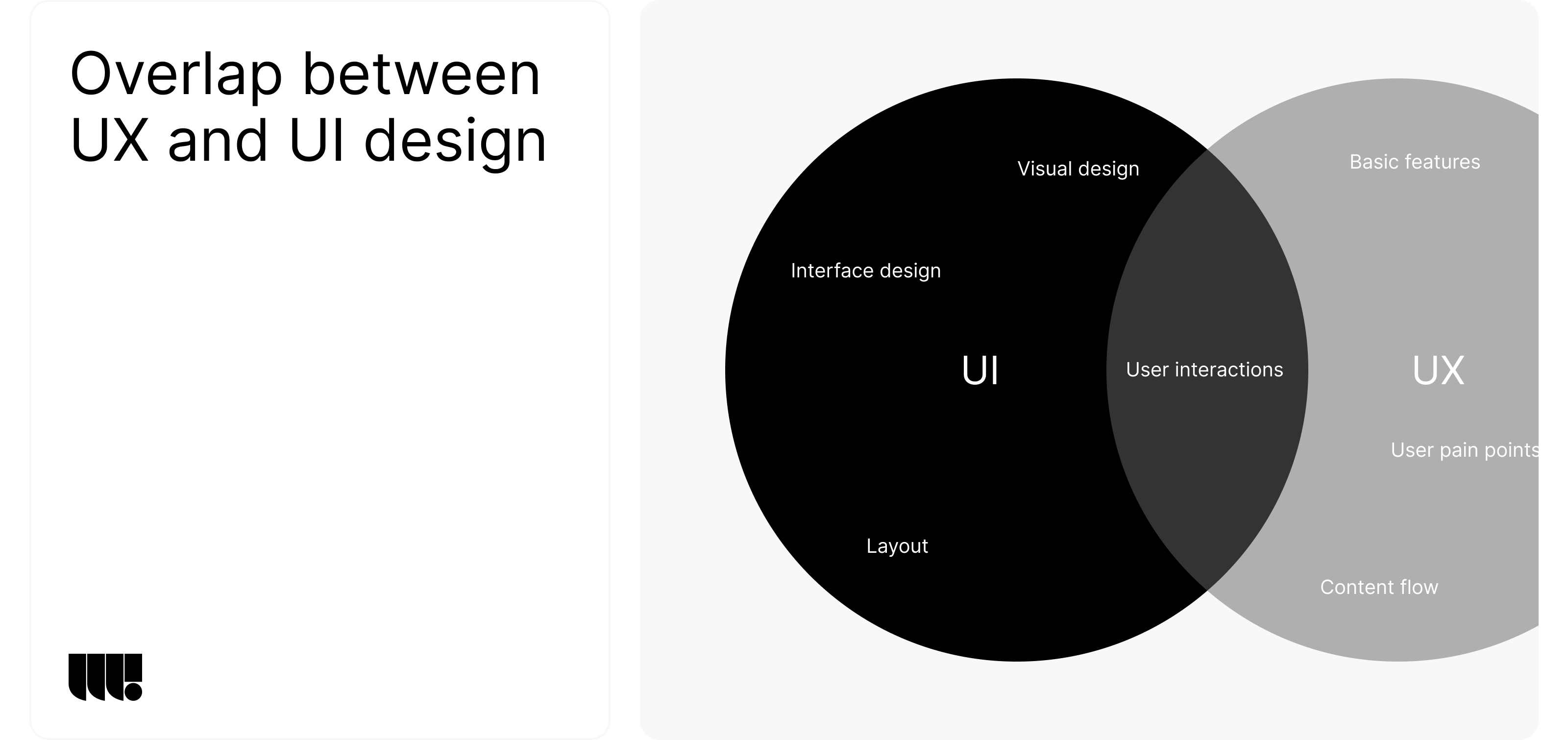
The Role of UI/UX Designers in Product Development
UI/UX designers play a critical role in developing digital products, bridging the gap between user needs and the technical execution of the product. Their work is essential in creating products that are not only functional but also intuitive and enjoyable to use.
What Do UI/UX Designers Do?
UI/UX designers are responsible for understanding the user, defining the product’s functionality, and shaping its aesthetics. Their responsibilities typically include conducting user research, creating wireframes and prototypes, designing the user interface, and collaborating closely with developers to bring the design to life.
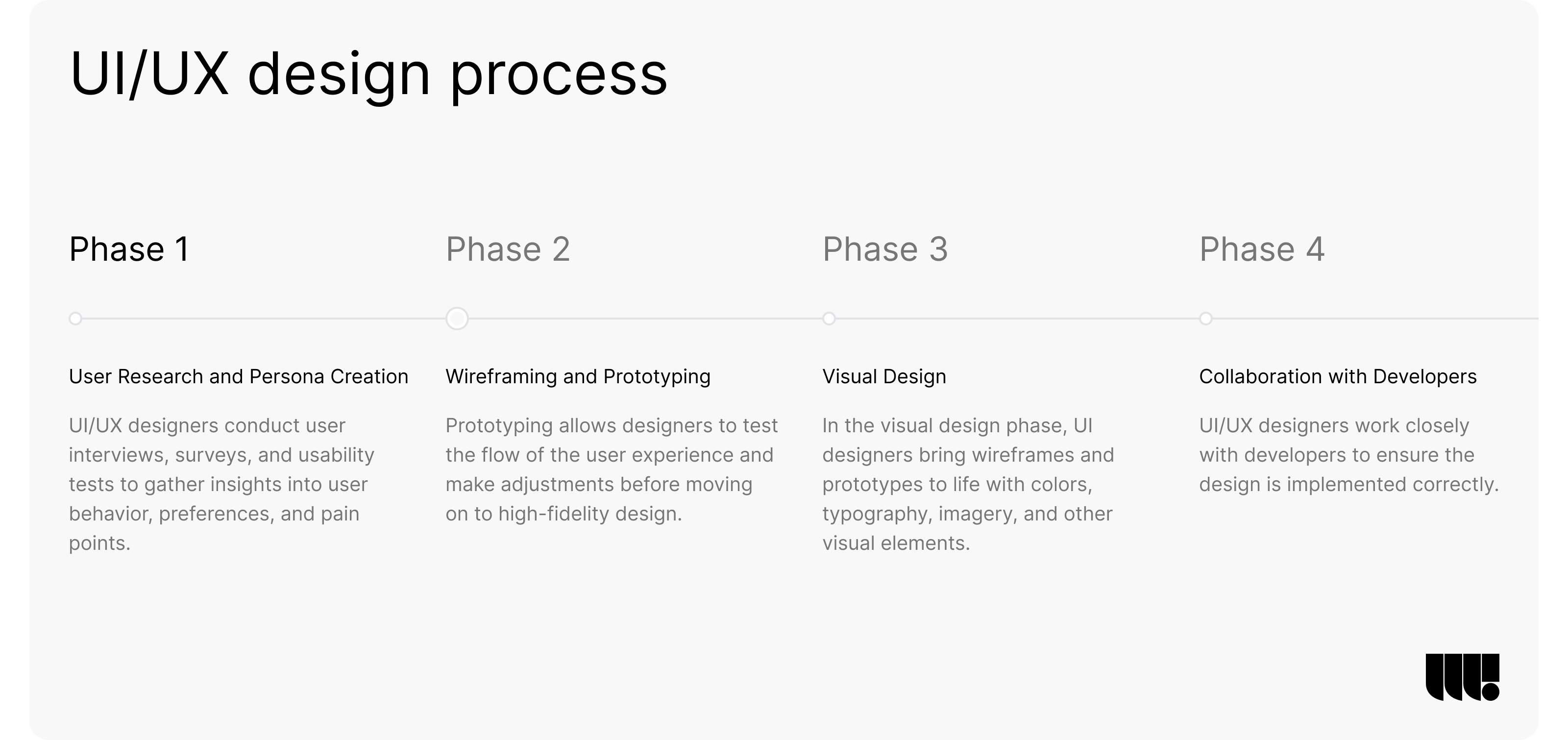
- User Research and Persona Creation: The design process begins with understanding the target audience. UI/UX designers conduct user interviews, surveys, and usability tests to gather insights into user behavior, preferences, and pain points. This data is used to create user personas—fictional characters that represent different user types. These personas guide design decisions, ensuring the product is tailored to meet the specific needs of its users.
- Wireframing and Prototyping: Once user personas and user journey maps are established, designers create wireframes, which are basic blueprints of the product’s layout, focusing on structure and functionality rather than detailed design. Prototypes are the next step, offering a more interactive model of the final product. Prototyping allows designers to test the flow of the user experience and make adjustments before moving on to high-fidelity design.
- Visual Design: In the visual design phase, UI designers bring wireframes and prototypes to life with colors, typography, imagery, and other visual elements. This stage focuses on creating an interface that is not only aesthetically pleasing but also aligns with the brand’s identity and is accessible to all users.
- Collaboration with Developers: UI/UX designers work closely with developers to ensure the design is implemented correctly. This collaboration is crucial for maintaining the integrity of the design throughout the development process, ensuring that the final product matches the designer’s vision.
The Impact of UI/UX Design on Product Success
The influence of UI/UX design on the success of a digital product is significant. A well-designed product can differentiate a brand in a competitive market, improve user satisfaction, and drive business growth. Conversely, poor design can lead to user frustration, high churn rates, and ultimately, product failure.
- User Satisfaction and Loyalty: When users find a product easy to use and enjoyable, they are more likely to return, recommend it to others, and remain loyal to the brand. UI/UX design plays a key role in creating these positive user experiences. By ensuring the product meets user needs and is intuitive to navigate, designers can significantly enhance user satisfaction and build brand loyalty.
- Conversion Rates and ROI: Good UI/UX design has a direct impact on a product’s conversion rates. Whether the goal is to get users to sign up, make a purchase, or engage with content, a well-designed user interface can guide users toward these actions more effectively. Higher conversion rates lead to better ROI, making UI/UX design an essential investment for any digital product.
The Importance of a Strong UX Design Strategy
A well-defined UX design strategy is the foundation for creating products that resonate with users. It aligns the product development process with user needs, business goals, and technological capabilities, ensuring that every aspect of the product is designed with purpose and clarity.
What is a UX Design Strategy?
A UX design strategy is a comprehensive plan that guides the design process, ensuring that all design decisions are intentional and aligned with the overall objectives of the project. It involves understanding the users, defining the user experience goals, and outlining the methods and tools that will be used to achieve these goals.
- Understanding the Users: The first step in developing a UX design strategy is to thoroughly understand the target users. This involves conducting in-depth user research to gather insights into user behaviors, needs, and pain points. Techniques such as user interviews, surveys, and usability testing are commonly used to collect this data.
- Defining Experience Goals: Once the user research is completed, the next step is to define the experience goals. These goals should be specific, measurable, and aligned with both user needs and business objectives. For example, if the target users are primarily concerned with ease of use, the experience goal might be to minimize the number of steps required to complete a task.
- Choosing the Right Tools and Methods: With a clear understanding of user needs and experience goals, the next step is to select the appropriate tools and methods to achieve these goals. This could include wireframing tools, prototyping software, usability testing platforms, and collaboration tools for cross-functional teams. The choice of tools and methods should support an iterative design process, allowing for continuous testing and refinement of the product.
The Role of UX Strategy in Product Development
A robust UX strategy not only guides the design process but also ensures that the product development stays on track to meet user needs and business goals. It acts as a blueprint that aligns the efforts of all team members, from designers and developers to product managers and marketers.
- Aligning Stakeholder Expectations: One of the key benefits of having a well-defined UX strategy is that it helps align the expectations of all stakeholders. By clearly articulating the user experience goals and how they will be achieved, the strategy ensures that everyone involved in the project is working towards the same objectives. This alignment is crucial for maintaining a cohesive and focused approach to product development.
- Driving Innovation: A UX strategy encourages innovation by challenging teams to think creatively about how to meet user needs. By focusing on the user experience, teams are more likely to explore new ideas and approaches that can lead to breakthrough innovations. This can result in products that not only meet user needs but also set new standards in the industry.
- Reducing Risks: A well-executed UX strategy reduces the risks associated with product development. By continuously testing and iterating on the design, potential issues can be identified and addressed early in the process. This not only saves time and resources but also increases the likelihood of delivering a product that meets user expectations and achieves business success.
Product Definition: Crafting a Clear Vision
The product definition stage is a critical step in the UX design process, where the vision for the product is clearly outlined. This stage involves defining the product’s purpose, features, functionality, and target audience. A well-crafted product definition ensures that the design and development teams are aligned and focused on creating a product that meets user needs and business objectives.
The Importance of a Clear Product Definition
A clear product definition serves as a guiding framework for the entire product development process. It helps ensure that all decisions made during design and development are aligned with the overall vision for the product.
- Defining the Product’s Purpose: The first step in product definition is to clearly articulate the purpose of the product. What problem does it solve for the users? How does it fit into the market? This clarity is essential for creating a product that is not only functional but also valuable to its users. A well-defined purpose helps focus the team’s efforts on delivering a product that truly meets user needs.
- Identifying Key Features and Functionality: Once the purpose is defined, the next step is to identify the key features and functionality that will be included in the product. This involves prioritizing features based on their importance to the user experience and their alignment with business goals. It’s important to strike a balance between offering enough functionality to meet user needs while avoiding feature bloat that can complicate the user experience.
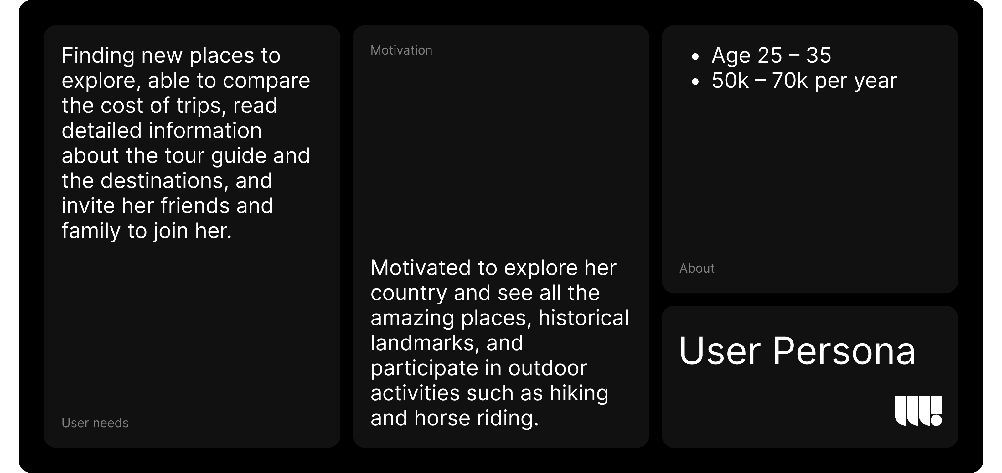
- Understanding the Target Audience: A deep understanding of the target audience is crucial for defining a product that resonates with users. This involves creating detailed user personas that represent different segments of the target audience. These personas should include demographic information, user needs, pain points, and behavior patterns. By understanding who the users are, what they need, and how they interact with similar products, the design team can make informed decisions that lead to a more successful product.
Aligning the Product Definition with Business Goals
A successful product is one that not only meets user needs but also aligns with the broader business goals of the organization. The product definition stage is the ideal time to ensure that the product’s vision is in sync with the company’s strategic objectives.
- Balancing User Needs with Business Objectives: One of the challenges in product definition is balancing user needs with business objectives. While it’s important to create a product that delights users, it’s equally important to ensure that the product contributes to the company’s bottom line. This may involve making trade-offs between different features and functionalities to find the right balance.
- Setting Measurable Goals: To ensure that the product definition is aligned with business goals, it’s important to set measurable goals for the product. These could include metrics such as user adoption rates, customer satisfaction scores, or revenue targets. By setting clear, measurable goals, the team can track progress and make adjustments as needed to stay on course.
- Collaborating with Stakeholders: Collaboration with stakeholders from different departments, including marketing, sales, and customer support, is essential during the product definition stage. These stakeholders can provide valuable insights into the market, customer needs, and business priorities. By involving them early in the process, the team can ensure that the product definition is comprehensive and aligned with the company’s overall strategy.
Analysis: Turning Data into Actionable Insights
The analysis stage in the UX design process is where data collected from user research and other sources is examined to uncover actionable insights. These insights inform design decisions, ensuring that the product is not only functional but also user-centric.
Gathering and Analyzing User Data
The first step in the analysis process involves gathering all the relevant data collected during the research phase. This data includes user interviews, surveys, usability tests, and any other qualitative or quantitative research conducted.
- Organizing the Data: Once the data is gathered, it needs to be organized in a way that makes it easy to analyze. This often involves categorizing data into themes or patterns that emerge from user feedback. For example, if multiple users mention difficulty in navigating a specific feature, this feedback can be grouped together to identify a potential usability issue.
- Identifying Patterns and Trends: After organizing the data, the next step is to identify patterns and trends. These patterns might reveal common pain points, unmet needs, or opportunities for improvement. For instance, if a significant number of users express frustration with the onboarding process, this might indicate a need for simplification or additional guidance.
- Prioritizing Issues: Not all issues identified during analysis will be of equal importance. The team needs to prioritize issues based on factors such as the severity of the problem, the number of users affected, and the potential impact on the overall user experience. High-priority issues should be addressed first, while lower-priority issues can be scheduled for future iterations.
Turning Insights into Design Decisions
The ultimate goal of the analysis stage is to translate the insights gained from data into actionable design decisions. This ensures that the product not only meets user needs but also offers a seamless and satisfying user experience.
- Developing User Stories: One effective way to turn insights into design decisions is by developing user stories. User stories are short, simple descriptions of a feature from the perspective of the end user. They help the design team stay focused on what the user needs to accomplish and why it matters. For example, a user story might be: “As a new user, I want to easily navigate through the onboarding process so that I can start using the product quickly.”
- Creating Journey Maps: Another valuable tool in the analysis stage is the creation of user journey maps. Journey maps visually represent the steps a user takes to achieve a specific goal with the product. They highlight pain points and opportunities for improvement at each step of the user journey. By mapping out the user’s journey, designers can identify areas where the experience can be enhanced.
- Defining Design Requirements: Based on the insights and tools mentioned above, the team can then define specific design requirements. These requirements serve as a guide for the design and development teams, ensuring that the product is built to meet user needs and expectations. For example, if the analysis reveals that users struggle with finding help resources, a design requirement might be to make the help section more accessible and intuitive.
UX Research & Methods: Deep Diving into User Needs
Understanding user needs is the cornerstone of successful UX design. The research and methods employed in UX design are crucial for gaining insights into user behavior, preferences, and pain points. This stage involves a combination of qualitative and quantitative methods to gather comprehensive data that informs design decisions.
Qualitative Research Methods
Qualitative research methods are essential for understanding the underlying reasons behind user behaviors and attitudes. These methods provide rich, detailed data that helps designers empathize with users and create products that truly meet their needs.
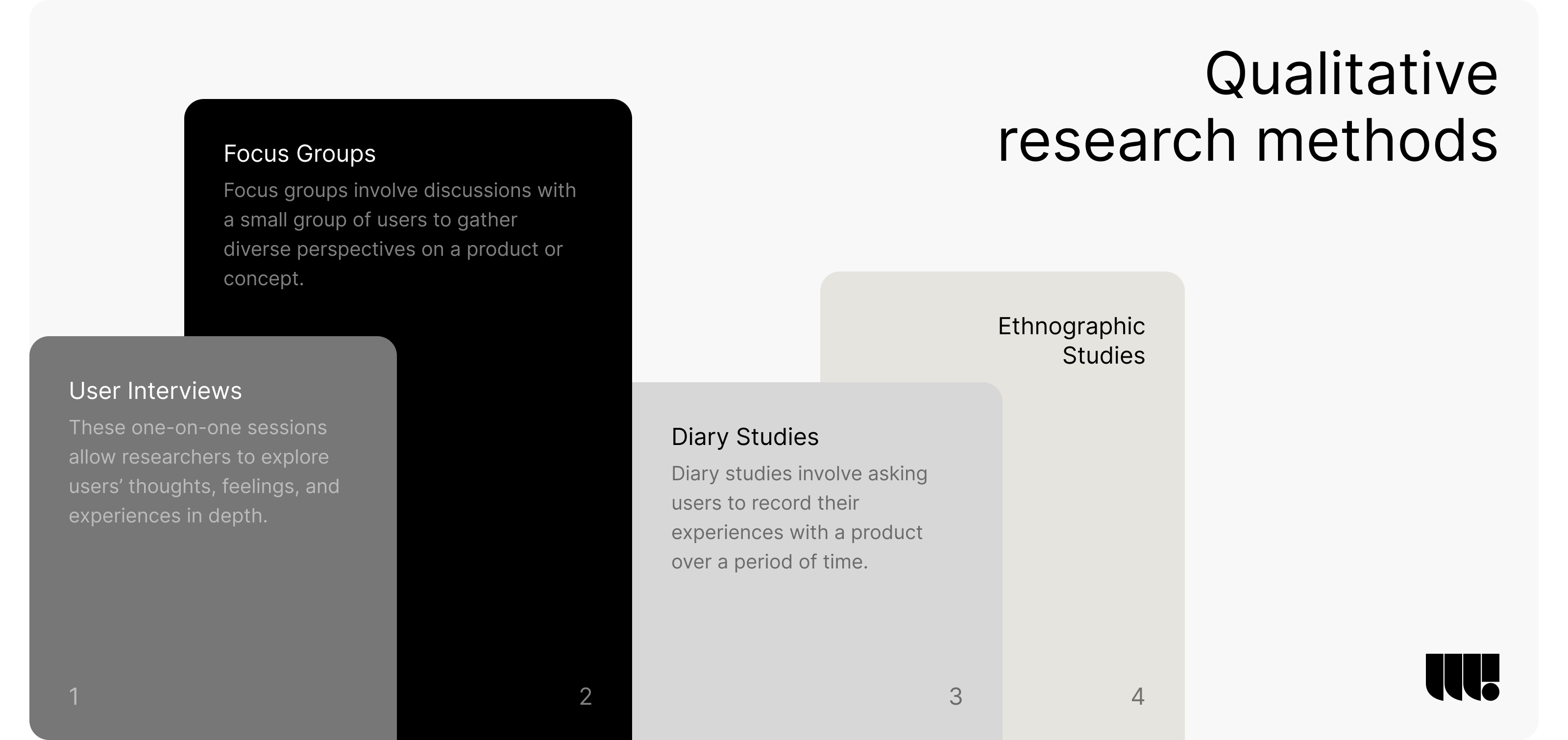
- User Interviews: One of the most direct ways to gather qualitative data is through user interviews. These one-on-one sessions allow researchers to explore users’ thoughts, feelings, and experiences in depth. For example, by asking open-ended questions, a researcher can uncover specific challenges a user faces when interacting with a product. This detailed understanding helps in creating more user-centered designs.
- Focus Groups: Focus groups involve discussions with a small group of users to gather diverse perspectives on a product or concept. This method is particularly useful for exploring user attitudes, beliefs, and motivations. By facilitating a conversation among participants, researchers can observe how users interact with each other’s ideas and identify common themes. For instance, a focus group discussing a new app feature might reveal differing opinions on its usability, leading to a more balanced and well-rounded design approach.
- Ethnographic Studies: Ethnography involves observing users in their natural environment to understand how they interact with a product in real-world contexts. This method is highly valuable for gaining insights into the actual usage patterns and challenges users face outside of a controlled environment. For example, observing users in a workplace setting might reveal how a productivity tool integrates (or fails to integrate) into their daily workflow.
- Diary Studies: Diary studies involve asking users to record their experiences with a product over a period of time. This method provides insights into how users interact with a product over time, highlighting long-term challenges and preferences that might not emerge in a single session. For instance, users might note how their satisfaction with a product changes as they become more familiar with its features, offering valuable data for iterative improvements.
Quantitative Research Methods
While qualitative methods provide depth, quantitative research methods offer breadth by collecting data that can be measured and analyzed statistically. This data is essential for validating hypotheses and making data-driven design decisions.
- Surveys & Questionnaires: Surveys and questionnaires are efficient ways to gather large amounts of data from users. They are particularly useful for identifying trends and patterns in user behavior across a broad audience. For example, a survey might reveal that a significant percentage of users find a certain feature confusing, prompting a redesign of that feature. By using structured questions, designers can quantify user opinions and preferences, providing a solid foundation for design choices.
- A/B Testing: A/B testing involves comparing two versions of a product or feature to determine which performs better. This method is particularly effective for optimizing user interface elements, such as button placement or color schemes. For instance, if version A of a landing page leads to higher conversion rates than version B, designers can confidently implement the winning version. A/B testing provides clear, actionable insights into what works best for users.
- Analytics & Heatmaps: Analyzing user behavior data through analytics tools and heatmaps offers valuable insights into how users interact with a product. For example, heatmaps can show where users click most frequently on a webpage, revealing which elements are most engaging. Similarly, analytics can track metrics like bounce rates, session duration, and conversion rates, helping designers understand what aspects of a product are working well and what needs improvement.
- Tree Testing: Tree testing evaluates the effectiveness of a website’s structure by asking users to find specific information within a simplified text version of the site. This method is particularly useful for assessing the usability of navigation and information architecture. For instance, if users struggle to locate a particular page, it might indicate that the site’s organization needs to be restructured.
UX Design: Bringing Concepts to Life
Once the research phase is complete, the UX design process moves into creating the actual product. This stage involves turning insights gained from user research into tangible designs that users can interact with. It’s where ideas begin to take shape, and user experiences are crafted.
Sketching: Laying the Foundation for Design
Sketching is the first step in visualizing ideas. It’s a quick and flexible way to explore different design concepts without committing to any one approach. Designers use sketching to brainstorm and iterate on ideas rapidly, allowing them to experiment with various layouts, flows, and interactions.
For example, when designing a new mobile app, a UX designer might start by sketching out different layouts for the home screen. These sketches might include variations in button placement, navigation styles, and content organization. The goal is to explore as many ideas as possible to identify the most effective design solution.
Sketching is particularly valuable because it’s a low-fidelity method, meaning it doesn’t require much time or resources. This allows designers to focus on the big picture and overall user flow rather than getting bogged down in details too early in the process.
Wireframing: Structuring the User Experience
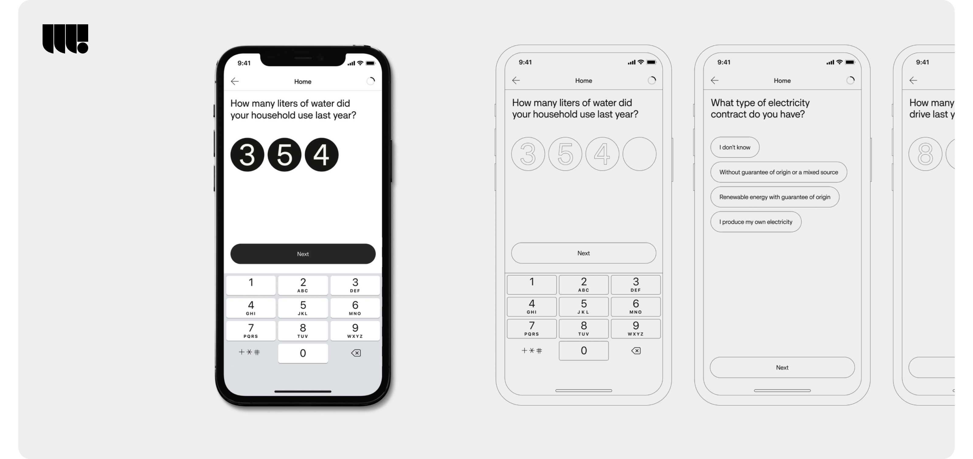
Wireframing takes the concepts from sketching and begins to formalize them into more structured layouts. A wireframe is a visual guide that represents the skeletal framework of a product. It outlines the basic elements and their placement on a page, such as headers, content sections, buttons, and navigation.
For instance, a wireframe for an e-commerce website might outline the placement of the product gallery, search bar, shopping cart, and navigation menu. While it doesn’t include detailed design elements like colors or images, it provides a clear blueprint of how the site will be organized.
Wireframes are crucial because they help stakeholders visualize the structure of a product without the distractions of design details. They also serve as a reference point for developers when building the product, ensuring that everyone involved in the project is aligned on the product’s layout and functionality.
Prototyping: Bringing Designs to Life
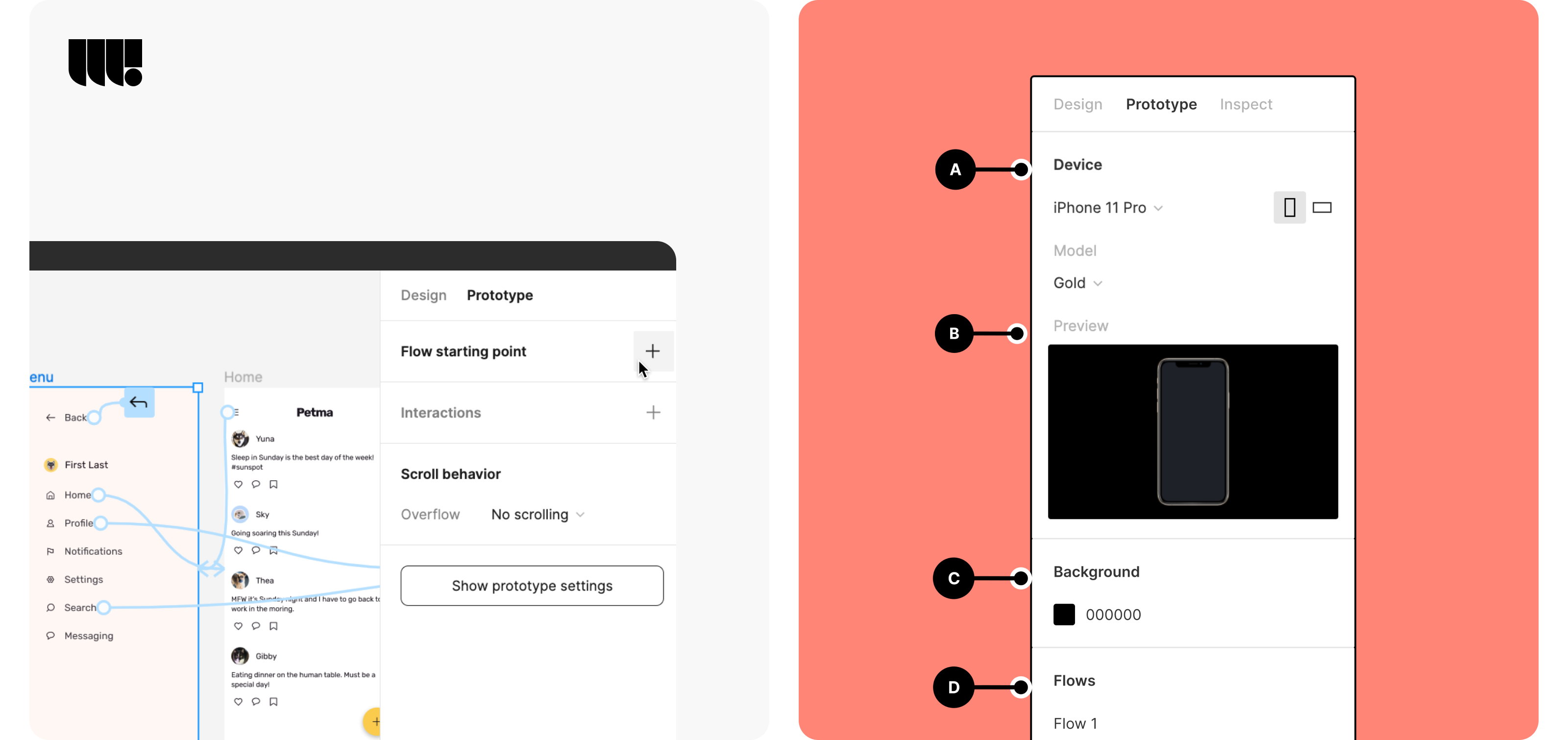
Prototyping is where designs start to become interactive. A prototype is a preliminary version of a product that allows users to interact with it as if it were the final product. This stage is crucial for testing and validating design concepts before full-scale development.
For example, a prototype of a mobile app might allow users to click through different screens, test the navigation, and interact with buttons and forms. Prototyping tools like Figma, InVision, or Adobe XD enable designers to create these interactive experiences quickly.
Prototypes are invaluable because they provide immediate feedback on how well a design works in practice. They allow designers to identify issues with usability, navigation, or interaction early on, saving time and resources in the long run. By iterating on prototypes based on user feedback, designers can refine the product until it meets user needs and expectations.
Mockups: Refining the Visual Design
Mockups are high-fidelity designs that showcase the final visual appearance of a product. They include detailed design elements like colors, typography, imagery, and branding. Mockups are essential for communicating the final look and feel of the product to stakeholders and for ensuring consistency across the product’s visual elements.
For example, a mockup for a company’s new website might include the exact colors, fonts, and imagery that will be used in the final product. It provides a clear representation of how the product will look once it’s fully developed.
Mockups are also useful for identifying any potential design issues before development begins. For instance, they can reveal whether the chosen color scheme has sufficient contrast for readability or if the typography is clear and legible. This ensures that the final product is not only visually appealing but also accessible and user-friendly.
UI Design: Enhancing Visual Appeal and Interaction
With UX design focusing on the structure and flow of a product, UI design is where aesthetics and interaction come into play. It’s about creating an interface that is not only visually appealing but also intuitive and easy to use. UI design is the bridge between the product and the user, ensuring that every interaction is smooth, enjoyable, and aligns with the overall user experience.
Defining the Visual Identity
The first step in UI design is establishing the visual identity of the product. This involves selecting the color schemes, typography, imagery, and overall style that will be used throughout the interface. The visual identity should be consistent with the brand’s personality and appeal to the target audience.
For example, a financial services app might opt for a clean and professional look with muted colors, minimalist design elements, and clear typography. This visual identity communicates trust and reliability, which are crucial attributes in the finance industry. On the other hand, a children’s educational app might use bright colors, playful fonts, and cartoonish imagery to create a fun and engaging environment for young users.
Defining a strong visual identity is essential because it sets the tone for the entire product. It ensures consistency across all touchpoints and helps build a memorable brand experience that resonates with users.
Designing Interactive Elements
UI design involves creating the interactive elements of the product, such as buttons, menus, forms, and other components that users will interact with. These elements must be designed to be both functional and aesthetically pleasing, guiding users through the product with ease.
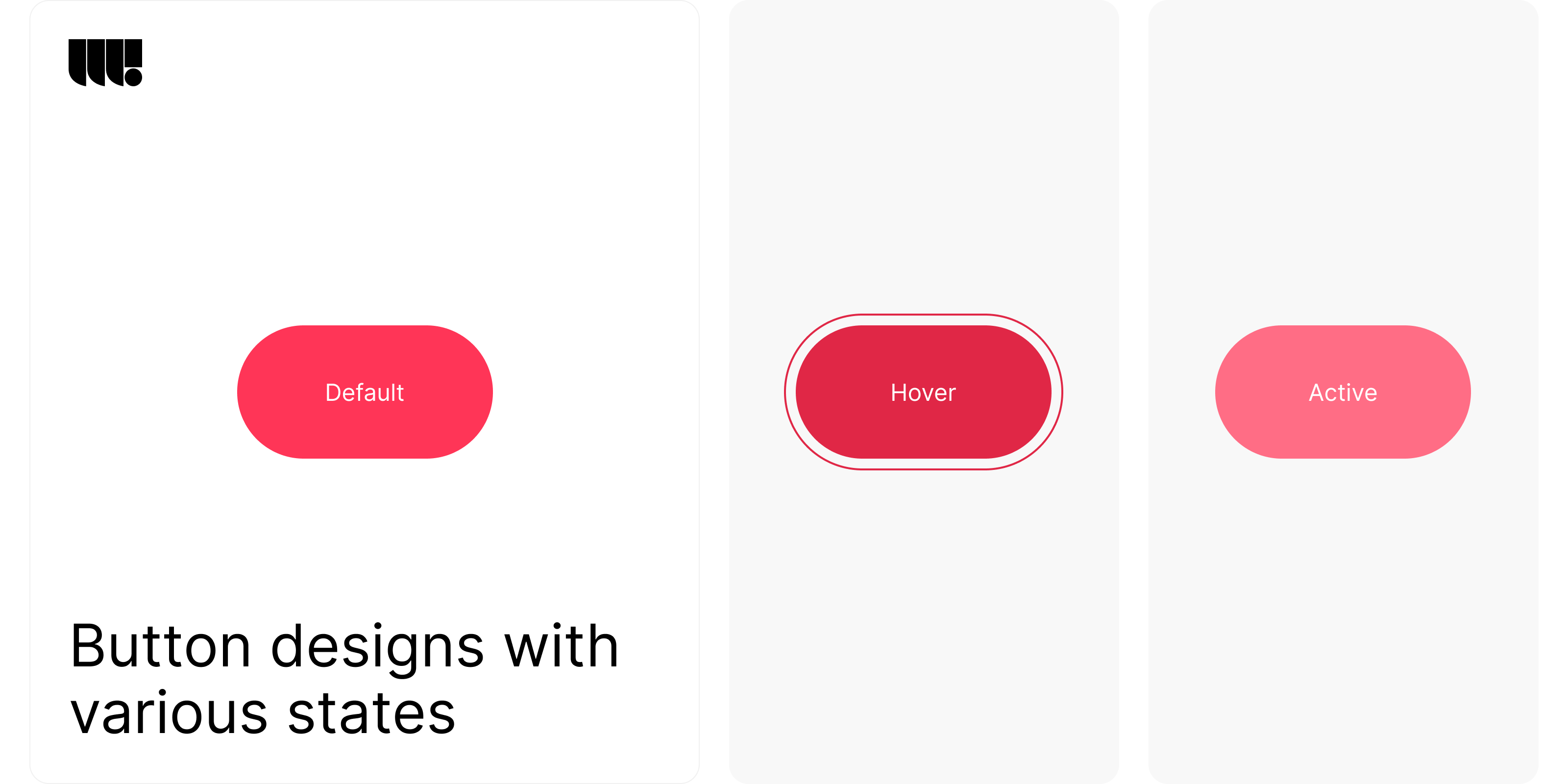
For instance, designing buttons for a mobile app requires careful consideration of size, shape, color, and placement. Buttons need to be large enough to tap comfortably on a mobile device, with enough contrast to stand out against the background. They should also provide clear feedback when clicked, such as changing color or displaying an animation, to confirm the user’s action.
The design of interactive elements plays a crucial role in the overall user experience. Well-designed elements make the product feel responsive and intuitive, reducing friction and enhancing usability. Conversely, poorly designed interactions can lead to frustration and confusion, negatively impacting the user experience.
Creating a Consistent Design Language
Consistency is key in UI design. A consistent design language ensures that all elements of the interface look and behave in a unified manner. This includes maintaining consistent spacing, alignment, color usage, and typography across all screens and components.
For example, if a product uses a specific shade of blue for primary buttons, that color should be consistently applied across all instances of primary buttons throughout the product. Similarly, if a certain font is used for headings, it should be consistently applied to all headings across the interface.
Consistency in UI design helps users build a mental model of how the product works. It reduces cognitive load by making it easier for users to predict where elements will be located and how they will behave. This predictability enhances usability and makes the product more intuitive to navigate.
Balancing Aesthetics with Functionality
While UI design focuses on visual appeal, it’s important to strike a balance between aesthetics and functionality. A beautifully designed interface is useless if it doesn’t help users accomplish their tasks efficiently. Therefore, UI designers must ensure that the visual design enhances, rather than hinders, the overall user experience.
For example, while elaborate animations and visual effects can add flair to a product, they should not come at the expense of usability. Overly complex animations might slow down interactions or distract users from completing their tasks. Instead, animations should be used sparingly and purposefully to guide users, provide feedback, or enhance the storytelling of the product.
Balancing aesthetics with functionality requires a deep understanding of both design principles and user behavior. The goal is to create an interface that is not only visually engaging but also intuitive and easy to use.
Validation: Ensuring a User-Centered Design
After the UI design phase, it’s crucial to validate the design through testing with real users. Validation ensures that the product not only looks good but also functions as intended and meets user needs. This step is essential for catching any usability issues before the product is launched to a wider audience.
Conducting Usability Testing
Usability testing is a core part of the validation process. It involves observing users as they interact with the product to identify any pain points, confusion, or barriers to completing tasks. This type of testing provides invaluable insights into how real users experience the product, allowing designers to make necessary adjustments.
For example, during usability testing for an e-commerce website, users might struggle with the checkout process, leading to abandoned carts. By identifying this issue during testing, designers can streamline the checkout flow, making it more intuitive and reducing friction for users.
Usability testing can be conducted in various ways, including in-person sessions, remote testing, or even guerrilla testing in public spaces. The key is to gather honest feedback from users in a realistic setting to ensure the product performs well in real-world conditions.
Iterating Based on Feedback
Once usability testing is complete, the next step is to iterate on the design based on the feedback received. This might involve making small tweaks to improve clarity or more significant changes to address fundamental issues.
For instance, if usability testing reveals that users consistently overlook a key feature, it might indicate that the feature’s placement or design is not prominent enough. In response, designers might choose to reposition the feature on the page or redesign its visual treatment to draw more attention.
Iteration is a continuous process in design. It involves refining and enhancing the product with each round of testing and feedback, ensuring that the final product is as user-friendly as possible.
A/B Testing for Optimization
In addition to usability testing, A/B testing is another valuable tool in the validation phase. A/B testing involves creating two versions of a design (Version A and Version B) and testing them with different user groups to see which performs better.
For example, A/B testing can be used to compare two different call-to-action (CTA) button designs. One version might use a bold color and direct language, while the other uses a softer color and a more subtle approach. By measuring user interactions with both versions, designers can determine which design leads to higher engagement and conversions.
A/B testing provides data-driven insights that help optimize design elements for better performance. It’s a powerful way to fine-tune the user experience and ensure that design decisions are based on real user behavior.
Incorporating Accessibility Testing
Accessibility is a critical aspect of UI/UX design that ensures the product is usable by everyone, including people with disabilities. During the validation phase, it’s important to conduct accessibility testing to identify and address any barriers that might prevent users from fully interacting with the product.
For instance, accessibility testing might reveal that a website’s color scheme does not provide enough contrast for users with visual impairments. In response, designers can adjust the colors to meet accessibility standards, ensuring that text is readable and interfaces are navigable for all users.
Accessibility testing goes beyond just checking for color contrast. It also involves ensuring that the product is navigable with a keyboard, that screen readers can accurately interpret the content, and that interactive elements are clearly labeled. By prioritizing accessibility, designers create more inclusive products that can be enjoyed by a wider audience.
Final Testing and Corrections: Refining the User Experience
The final testing phase is the last opportunity to refine the product before it goes live. This stage is crucial for ensuring that all elements of the design work harmoniously and that any remaining issues are addressed. The goal is to launch a polished product that meets user expectations and business goals.
Comprehensive User Testing
In the final testing phase, comprehensive user testing is conducted to evaluate the entire product in a real-world scenario. This involves testing the product across different devices, browsers, and operating systems to ensure consistency and functionality for all users.
For instance, a mobile app should be tested on various devices with different screen sizes and resolutions to ensure a seamless experience across all platforms. Similarly, a website should be tested on multiple browsers to check for any compatibility issues that could affect the user experience.
During this phase, it’s important to simulate real-world conditions as closely as possible. This includes testing with users from your target demographic, using realistic data, and mimicking actual user behavior. By doing so, designers can identify any last-minute issues that need to be addressed before the product launch.
Addressing Bugs and Usability Issues
Even with thorough testing throughout the design process, bugs and usability issues can still surface during the final testing phase. Addressing these issues promptly is essential to delivering a smooth and functional product.
Common issues that might arise include broken links, slow loading times, or interactive elements that don’t function as expected. These issues can negatively impact the user experience and must be resolved before the product is released.
In this stage, a dedicated quality assurance (QA) team often works closely with designers and developers to identify and fix bugs. It’s also an opportunity to fine-tune any design elements that may not have performed as expected in earlier testing phases.
Ensuring Content Accuracy and Consistency
Content accuracy and consistency are crucial for building trust with users and conveying a professional image. During the final testing phase, it’s important to review all content, including text, images, and multimedia elements, to ensure that everything is accurate and aligns with the brand’s tone and messaging.
For example, any discrepancies in product descriptions, pricing, or legal information should be corrected before launch. Consistency in content presentation, such as using the same font styles, color schemes, and imagery across the product, helps create a cohesive and polished user experience.
This phase is also an opportunity to review the product for any cultural or regional sensitivities that may need to be addressed, especially if the product is being launched in multiple markets.
Final Accessibility Review
Before the product goes live, a final accessibility review is essential to ensure that it meets all necessary standards and provides an inclusive experience for all users. This review includes checking that all interactive elements are accessible via keyboard navigation, ensuring that images have appropriate alt text, and verifying that color contrast meets accessibility guidelines.
Accessibility tools can be used to automate some of this process, but manual testing is also crucial to catch issues that automated tools might miss. For example, testers can navigate the product using only a keyboard to ensure that all interactive elements are accessible without a mouse.
This final review helps to ensure that the product is not only compliant with accessibility standards but also provides a positive experience for users with disabilities.
Launch: Bringing Your Product to Market
The launch phase marks the culmination of the design process, where the product is introduced to the market. This stage is critical, as it represents the first real interaction between the product and its users. A successful launch not only showcases the product but also sets the tone for its future performance and reception in the marketplace.
Developing a Launch Strategy
A well-planned launch strategy is essential for maximizing the impact of your product release. This strategy should consider the target audience, marketing channels, and timing to ensure that the product reaches its intended users effectively.
Key components of a successful launch strategy include:
- Target Audience Identification: Clearly defining who the product is for and understanding their needs, preferences, and behaviors.
- Marketing Channels: Selecting the most effective channels to reach your audience, such as social media, email marketing, or influencer partnerships.
- Launch Timing: Choosing the optimal time to release the product, considering factors like industry trends, competitor launches, and seasonal demand.
The goal of the launch strategy is to create buzz around the product, attract early adopters, and generate positive word-of-mouth. This can be achieved through pre-launch teasers, exclusive offers, and targeted advertising campaigns.
Preparing for User Onboarding
User onboarding is a crucial aspect of the launch phase, as it helps new users understand how to use the product and get the most value from it. A smooth onboarding process can significantly improve user satisfaction and retention rates.
Effective onboarding should include:
- Guided Tutorials: Step-by-step instructions or interactive tutorials that walk users through the key features of the product.
- Help Resources: Access to help articles, FAQs, or support chat for users who need additional assistance.
- User Feedback Mechanisms: Easy ways for users to provide feedback on their onboarding experience, which can be used to make improvements.
The goal is to make users feel confident and comfortable using the product from the moment they first interact with it. This can help reduce the learning curve and encourage continued use.
Monitoring the Launch
Once the product is live, it’s important to monitor its performance closely. This involves tracking key metrics such as user engagement, conversion rates, and customer feedback to assess how well the product is being received.
Tools such as Google Analytics, Hotjar, or in-app analytics can provide valuable insights into user behavior and identify areas where the product may need improvement. For example, if users are dropping off at a particular stage of the onboarding process, this could indicate a usability issue that needs to be addressed.
Monitoring the launch also includes keeping an eye on social media and review sites for user feedback. Positive reviews can be amplified through marketing efforts, while negative feedback should be addressed promptly to mitigate any potential damage to the product’s reputation.
Post-Launch Support and Updates
The launch is just the beginning of the product’s lifecycle. Post-launch support and regular updates are essential to maintaining user satisfaction and adapting to changing user needs.
Post-launch support might include:
- Customer Service: Providing users with multiple channels to seek help, such as live chat, email support, or phone lines.
- Product Updates: Rolling out updates that fix bugs, improve performance, or add new features based on user feedback.
- Community Building: Creating a community around the product, such as a user forum or social media group, where users can share tips, ask questions, and engage with the brand.
By continuously supporting and improving the product after launch, companies can build long-term relationships with their users, leading to higher retention rates and customer loyalty.
Conclusion
The design process doesn’t end with the product launch. It’s a continuous journey of learning, iteration, and improvement. By following the steps outlined in this guide, designers can create products that resonate with users and meet their needs in meaningful ways.
As you move forward, remember that each stage is an opportunity to gain deeper insights into your users and refine your product. Whether you’re launching a new product or iterating on an existing one, the principles of thoughtful design will guide you toward creating solutions that are not only innovative but also impactful and user-centric.


